99designs. “Logo Design for WET.” 99designs, 2023, 99designs.com/inspiration/branding/surf. Accessed 12 Apr. 2023.
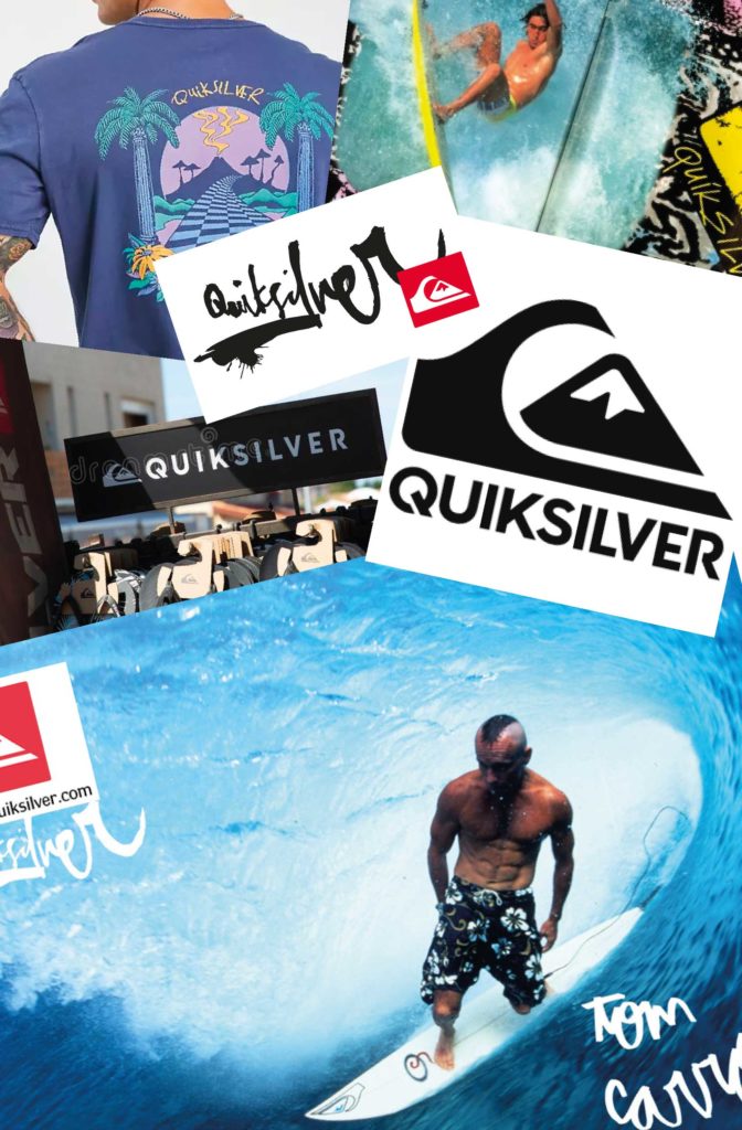
“About Us.” Quiksilver.com.au, 2023, www.quiksilver.com.au/customer-service-corporate-information-about-us.html. Accessed 12 Apr. 2023.
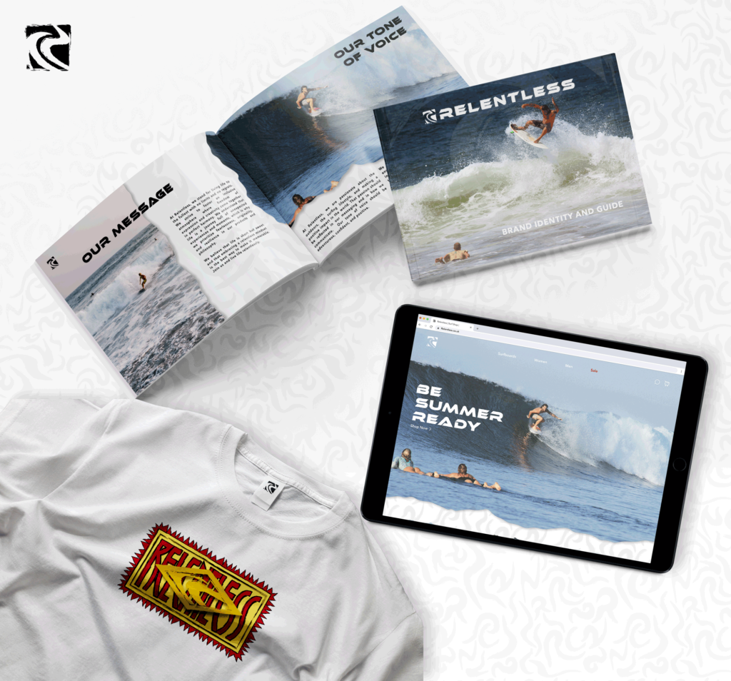
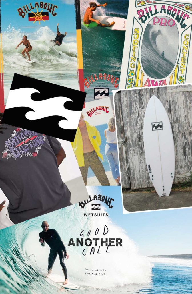
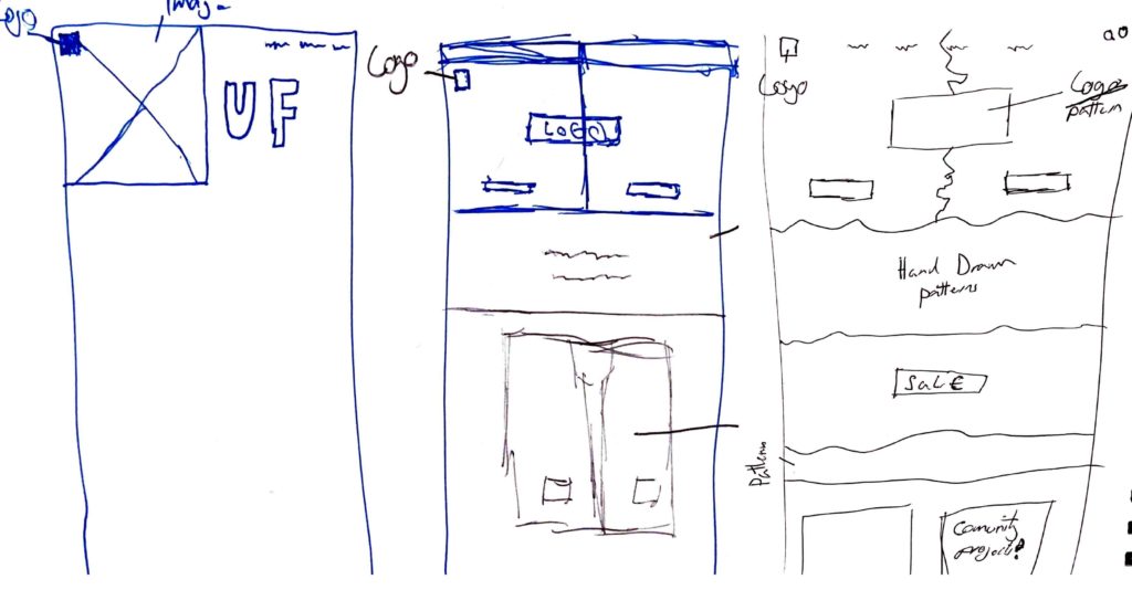
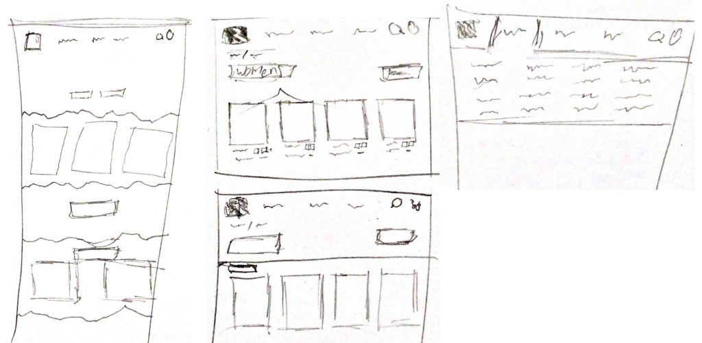
“Billabong Visual Standards Guide.” Issuu, 13 Dec. 2017, issuu.com/julianaserejogaleotti/docs/billabong_brand_booklet3_visual_sta. Accessed 12 Apr. 2023.
“Board Shorts Handmade in the USA since 1961 – Birdwell Beach Britches.” Birdwell, 2023, www.birdwell.com/. Accessed 12 Apr. 2023.
Brad. “Company Profile: Billabong – Surfd.” Surfd, 10 Apr. 2021, surfd.com/2021/04/surf-brand-profile-billabong/. Accessed 12 Apr. 2023.
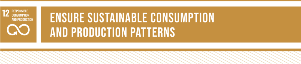
“Goal 12 | Department of Economic and Social Affairs.” Un.org, 2023, sdgs.un.org/goals/goal12. Accessed 7 May 2023.
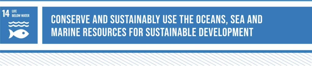
“Goal 14 | Department of Economic and Social Affairs.” Un.org, 2023, sdgs.un.org/goals/goal14. Accessed 7 May 2023.
“Home – Sustainable Web Design.” Sustainable Web Design, 28 Mar. 2023, sustainablewebdesign.org/. Accessed 12 Apr. 2023.
Kelly, Christopher. “THE INTRIGUING RELATIONSHIP between FASHION & SURF CULTURE.” CULTED, CULTED, 23 Nov. 2021, culted.com/the-intriguing-relationship-between-fashion-surf-culture/. Accessed 12 Apr. 2023.
“O’Neill – the Original California Surf Brand.” O’Neill UK, 2022, uk.oneill.com/?gclid=CjwKCAjwrdmhBhBBEiwA4Hx5g0XjUbqDgY7dYOtBn1c7J6aNw-NaDYGGUUYkCTN02_r1MabTvZubohoCmqMQAvD_BwE. Accessed 12 Apr. 2023.
“Outerknown.” Outerknown, 2023, www.outerknown.com/. Accessed 12 Apr. 2023.
Passenger. “Passenger Clothing Official ® | Made to Roam.” Passenger, 2022, www.passenger-clothing.com/?gclid=CjwKCAjwrdmhBhBBEiwA4Hx5g44-Uhf7KkvqH0TJ2f0mn2n0HUUD04z-65soG5z6Ih8A3Fe1gJ89jBoCcogQAvD_BwE. Accessed 12 Apr. 2023.
“Quiksilver.” Quiksilver.co.uk, 2023, www.quiksilver.co.uk/. Accessed 12 Apr. 2023.
“Rip Curl Europe | Shop Wetsuits, Boardshorts and Bikinis | Rip Curl Europe Online Store.” Ripcurl.eu, Rip Curl, 2023, www.ripcurl.eu/en/. Accessed 12 Apr. 2023.
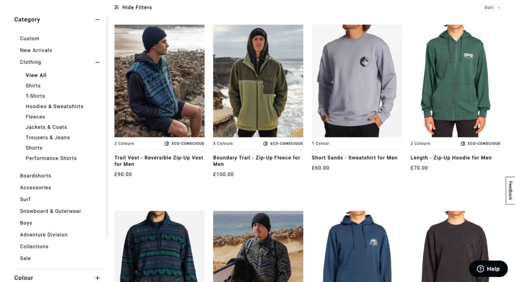
“Saltrock.” Saltrock, 2023, www.saltrock.com/. Accessed 12 Apr. 2023.
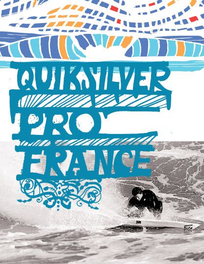
“Surf Blog – the History of Quiksilver.” Surfholidays.com, 2015, www.surfholidays.com/blog/the-history-of-quiksilver#:~:text=In%201969%20an%20Australian%20wetsuit,And%20so%20Quiksilver%20was%20born. Accessed 12 Apr. 2023.