Overview: In this project, I create and develop a craft beer brand. I cover all of the branding and packaging design implementing my personal design styles and applying them to the craft beer market. This project allowed me to explore Interactive packaging and learn new software such as Adobe Areo. The final outcomes of this project can be viewed in the Embedded Figma file above, I produced 3 unique craft beers that all tied together under one recognisable brand. I also used two types of AI software during this project, one to analyse the shelf appeal of existing brands using heat-mapping and an AI image creator.
THE BRIEF
TIME MANAGEMENT & ORGANISATION
SWOT

gantt chart

When taking on a big project, it’s always important to have effective planning strategies to ensure success. Here I have used a SWOT analysis to inform the production of my Gantt chart. By using the SWOT system, I was able to make informed decisions and adjustments to my plan. This allowed me to create a more effective and efficient plan, reducing the risk of any potential issues or delays during the project’s execution.
MARKET TREDS
Design trends
Article Analysis: 1) Arthur, I. (2022). 2022 Beer Branding Trends Part 4: Package Design Trends. 2) CODO Design. (2023). 2023 Beer & Beverage Branding Trends Review. 3) Baliga, V. (2022). 7 Beer Label Design Trends Foaming Over in 2023.
I have highlighted some of the key findings from these three articles and summarised them:
Elevated Quality in Branding and Packaging:
- Craft beer branding and package design quality has reached an all-time high.
- New breweries are investing in proper branding and packaging.
- A shift from previous years where branding was less emphasized.
Blurring of Category Lines:
- The blurring of category lines is leading to better design practices in the craft beer industry.
- Consumer packaged goods (CPG) branding practices are influencing beer branding.
Illustration:
- Illustration is making a comeback in craft beer packaging (Beavertown, Tiny Rebel).
- Breweries are investing in high-quality, fully-illustrated packaging.
- The current trend is characterized by immersive and professional illustration work.
Minimalism:
- Minimalism is a common design trend in the industry.
- The challenge is to stand out in a market where many breweries adopt minimal aesthetics.
- “Minimal Plus” involves maintaining minimal design but adding a distinctive element to differentiate. – this could be a strong design choice for this project.
Interactive Packaging:
- Interactive packaging encourages physical engagement with the beer can or bottle.
- Often, consumers are prompted to share their interactions on social media.
- It enhances customer experience and can work effectively in marketing.
In summary, the articles highlight the shift towards high-quality branding and design in the craft beer industry, the resurgence of illustration and the trend of interactive packaging. Interactive packaging is something that I want to learn more about so will commit a section of the research to how I can utilise this in the project. It was also interesting to see that Minimal plus designs are a common design choice and have proven to be successful, I want to try and incorporate this style into my own designs. These trends reflect the evolving landscape of craft beer branding and packaging.
interactive packaging
WHAT IS IT?
Interactive packaging is designed to get users actively involved with products in order to create interest and engagement. It also helps brands build stronger customer relationships and memorable brand experiences (Springfieldsolutio, 2021). Interactive packaging can be broken down into different techniques and styles (Mosca, 2022) one of which is the use of Augmented Reality (AR).
AR in packaging has become ever more popular as most people have access to smartphones that can use their cameras to interact with product packaging in a 3d environment (Fedko, 2020). As these new marketing technologies develop so does the user’s mindset. A study in 2015 found that “84% of respondents say it is somewhat or very important that the company they buy from is innovative” (News Editor, 2015). For this project, I want to take a deeper look into AR and try to use it in beer packaging.
19 Crimes is a prime example of innovative AR user engagement. By simply scanning their wine bottle labels with a smartphone, users unlock captivating stories and animations. The images come to life as the customer scans the bottle, narrating the intriguing tales of incarceration that contribute to the brand’s core identity.
Another success story can be found in Jack Daniel’s approach. They have created a comprehensive brand narrative with stunning animations that draw customers into a rich storytelling experience. I was personally captivated by the augmented reality they’ve incorporated, and I’m inspired to explore creating a similar interactive packaging concept for Folklore. Integrating interactive elements into Folklore’s design in an oversaturated market could be the key to setting it apart and capturing consumer attention.
JACK DANIELS
19 CRIMES
BEVERTOWN REVIEW

The AOI. (2021). The AOI - Illustrating Beavertown: an interview with Nick Dwyer. [online] Available at: https://theaoi.com/2021/09/30/illustrating-beavertown/
I found an interview with Nick Dwyer, the Illustrator of Bevertown Brewery. I believe that his views and opinions on design in the craft beer market are valuable to this project. The interviewer asked Nick the question:
“Do you think illustration has become pivotal to craft beer branding in the last decade?”
In his response, Nick Dwyer talks about the pivotal role of illustration in craft beer branding over the last decade. He says “My illustrations are hardly groundbreaking innovations, but the fact they are wrapped around a can of beer is what made them exciting to people in the first place” (The AOI, 2021). Having excitement and Intrigue is what seems to pull customers to a product.
Dwyer believes that breaking away from everyday norms in food and drink packaging has a notable impact, and he highlights the ability of illustrations to tell stories, set scenes, utilise vibrant colours, and bring joy to consumers during their beverage enjoyment.
maximalism VS minimalism


In the realm of packaging design, the ongoing debate between maximalism and minimalism reveals interesting dynamics. Webflow (2023) talk about the two design styles saying “Maximalism breaks free from the restraints of minimalism and leaves room for spontaneity. While minimalism speaks to us in serious and hushed tones, maximalism shouts from a loud and raucous party” and this can be seen in beer packaging. A good example is Beavertown’s packaging, with its bold use of colours and illustrations, it creates a visually striking presence on the shelf. While on the other hand, minimalism embraces simplicity and clean aesthetics, appealing to a broader demographic, including an older audience appreciative of timeless design principles (Cutler, 2023). For this project I want to use a hybrid of both styles, still having a strong shelf appeal while maintaining simplicity.
shelf appeal


Shelf appeal is crucial for any consumer product, and craft beer is no exception. I went to my local supermarket to first, find some design inspiration but mainly to test the shelf appeal of existing brands. Any brand needs to have an eye-catching design to appeal to its intended customers. However, the Beer market is very oversaturated, and as you can see from the image on the left, it is hard to stand out.
After taking a wide shot of the shelf I uploaded it to “Attention Insight”. This website uses its own AI software to create heatmaps of images to show the most eye-catching parts of the image. I uploaded the image of the shelves and this is what it produced. The results were very clear and decisive with the head maps focusing on 2 main points of the image.


The AI heat mapping software very clearly picked Brewdog’s “WINGMAN” Session IPA. It’s visually skriking colours play a big role in its shelf appeal pulling customers’ eyes straight to it.
TARGET AUDIENCE
DEMOGRAPHIC
Age: According to Watson on ‘Shifting Demographics Among Craft Drinkers’ (2018) Millennials account for over 50% of the craft beer market and this is backed up by statistics from Statista (2022). DSM Food and Beverage give a good idea about why craft beer has become so popular with this age group: ‘Nearly half of our survey respondents drink craft beer because they like to try something new. With craft beer, consumers can experiment with a huge diversity of beer styles and taste profiles.’ (food-beverage, 2020)
Gender: Watson also talks about the gender demographics of the market. He found that craft beer drinkers were 31.5% female and 68.5% male. ‘When you add that all up, it suggests that from 2015 to 2018, craft has added ~14.7 million drinkers, of which a bit below half (~6.6M) were women'(Watson, 2018). If these numbers are true then there is a clear logic behind larger beer companies targeting the brand and marketing towards men.
PSYCHOGRAPHIC
After reviewing several studies, I created a list of customer psychographic tendencies.
- Adventurous Tastes: Open to trying diverse and unique beer flavours.
- Beer Knowledge: Informed about brewing processes, ingredients, and various beer styles.
- Social Community: Enjoy sharing beer experiences, participating in events, and brewery visits.
- Localism: Prefer supporting local, independent breweries for authenticity.
- Values and Lifestyle: Align with values like sustainability and environmental consciousness.
- Food Pairing Interest: Appreciate pairing beer with different types of food.
- Tech-Savvy: Often use social media and beer-related apps to connect and share experiences.
- Individualistic: Value the freedom to choose from a diverse range of craft beer options.
Personas
I have created user personas based on the Demographics and Psychographics of the craft beer market. I also used my research from one of my blogs to inform what kinda of Archetypes each person would fit. you can read my blog where I talk about Jungian Archetypes in greater detail.


CREATING A BRAND
THE STORY

The legend of Robin Hood is a well-known tale in English Folklore stemming from his first mention in literature of the 14th century (Marshal 2016). The ballads and folklore from this time depict a charismatic outlaw who hid within Sherwood Forest. At the heart of this legend is a champion of justice (Hilton, 1958), an archer and swordsman who ‘robs from the rich and gives to the poor’. Howard Pyle’s work, “The Merry Adventures of Robin Hood” (1883), helped contribute to shaping the modern perception of the character. This iconic figure has become synonymous with themes of rebellion, justice, and the triumph of the common people against oppressive rulers. so much so that he has his own statue within the walls of Nottingham Castle.
Dr Basdeo’s historical examination (2021) delves into the potential real-world origins of the Robin Hood myth, suggesting a connection to the socio-economic challenges prevalent in medieval England. At its heart, the legend represents to so many a hope of justice and equality, something that is still prevalent in our lives today.
The stories of Hood and his ‘Band of Merry Men’ have been widely adapted in literature and in Hollywood, with over 70 movies and TV shows made based on this legendary character (Hayner, 2019).
For me personally, my first instance of Robin Hood was watching the legendary 1973 Cartoon created by Disney. This timeless classic has been watched by many generations of children across the world and the cartoon Fox has become one of the most iconic looks of Robin Hood.
Throughout all the different adaptations of the story, Robin Hood is always depicted as an archer with the classic tale of stealing from the rich and giving to the poor.


LOGO DESIGN
INITIAL LOGO SKETCHES


I wanted the story of the brand to run throughout the design so I had 2 ideas, one was to create a logo based around an arrow head using F and L from Folklore. The second idea was to create an icon logo focused on archery targets. After finding some simple reference images I sketched out these ideas and found that I liked the idea of an archery target. I also realised that the shape of it resembled an O and could fit perfectly in some custom typography. I had an idea to create my own
custom art deco style font for the folklore logo and started to create some sketching using gridded paper. After creating multiple sketches trying to configure my custom font I was ready to try it out in Adobe Illustrator.
CREATING MY OWN TYPE-FACE


I used the same system as I did with my sketches, using grids. Having the ability to snap point to grids was incredibly useful for creating this font. I simply used the Pen tool to create each letter sticking to strict dimensions so each letter was the same measurements as the last. I also implemented my first idea of making the O resemble an Archery Target. I also liked the idea of linking the L and the K and then having the next L lead into the base of the O. This gave the whole Logo a more cohesive look pulling it together.
MAKE IT STAND OUT


In an overcrowded industry like the craft beer market, it’s hard for smaller brands to be able to make themselves stand out. For this reason, I have experimented with some techniques to help elevate the logo and draw attention to the brand. First, I look at giving the logo a solid drop shadow. I applied the drop shadow and then had a solid outline to separate the shadow from the logo. Instantly this gave the logo an entirely new look making it pop off the page and separate it from other craft beers.
Another way I looked at making the logo stand out is by applying a technique that has become a signature look of mine. I have used it across several projects and in my own personal branding. I use a rough and grungy brush stroke to outline the Logo and create a ripped effect adding depth and texture to the overall look. In this case, the ripped effect coincides with the overall look of the brand. I then used both of these techniques to produce the final logo for Folklore Brewery.
FINAL LOGO
LOGO TYPE

ICON LOGO

REFLECTION

Overall I am really happy with how the final logo came out because it really gives the message of the brand through its designs. It is rough and torn with a modern look combining the history of the story with the modern-day brand. Adding the extra elements to the logo, the outline and the drop shadow, assist in elevating it above the brand in the market. the symbolism of the Icon logo and an archery target reinforce the brand story and convey to the customer the life of an outlaw.
PACKAGING DESIGN
WIREFRAMING

To begin the designs for the 330ml can I sketched out potential ideas. these sketches were meant to be rough and I used them to just get all of my idea down onto paper. I played with some different layouts but also with the typography I wanted to use. I liked the idea of using a San Serif front for the main part of the label as it gives the connotation of being older and more traditional thus bringing that story through the designs in every way. I also played with some different design styles, above you can see some more minimal designs with little background design. In the other image, you can see a more overbearing design with a lot going on. I also planned some interactive elements like the idea of showing the customer how to convert the pull ring into a fishing hook. After doing these sketches and comparing them I was set on having some kind of illustrated background and for that, I would turn to AI.

AI GENERATED ART
USEABILITY
After conducting market research into design trends in the craft beer industry, I now understand the pivotal role visuals will play in conveying the story of Folklore Brewery. Recognising my limitations as a non-illustrator, I am looking for a solution that can align with the project’s vision without compromising the quality of the brewery’s packaging. AI-generated art presents itself as a viable alternative, I believe that AI-generated artwork could be a solid alternative and might provide some assets that can be used in folklore packaging.
What is the legality of using AI art? Unlike traditional artwork, where ownership is typically straightforward, AI-generated art poses unique challenges (Planker, 2023). From the research i have done it seems that determining authorship and ownership can be complex. The World Intellectual Property Organisation (WIPO) have talked about how legal frameworks are currently evolving to address issues in the field of AI-generated art. Therefore I believe that for this project it is crucial to stay abreast of developments in intellectual property law. Bellow I have been researching the strengths and weaknesses of using AI artwork in this project.
STRENGTHS
- Time Efficiency: One of the significant strengths of AI-generated art lies in its rapid production. it can create almost anything in as little as 30 seconds.
- Cost-Effective: Eliminating the need to hire a professional illustrator can significantly reduce potential costs in the future. This can really help the project with budget constraints.
- Copyright Non-Infringement: AI-generated art is created without direct reference to existing copyrighted material (Kelly, 2022), reducing the risk of unintentional infringement.
WEAKNESSES
- Limited Design Process: There is an absence of a human-centric design process, this may restrict creativity and depth in the meaning behind the designs.
- Ethical Issues: AI-generated art raises ethical considerations, particularly concerning the displacement of human artists (Center for Media Engagement, 2023).
- Ownership Ambiguity: Since AI creates the art, determining ownership becomes intricate and as I have already mentioned the laws surrounding this are still evolving.
OUTCOME
For this project, where professional illustration skills are lacking, AI art can help fill the gap and be solid placeholder images across the packaging designs. However, I must take the ethical issues into account, and as Folklore Brewery advances beyond the conceptual stage I recommend outsourcing specific aspects to a professional illustrator to ensure a proper design process and ownership of the packaging designs for folklore brewery.
IMAGES

To create the Images I used Bing Image Generator, a software created by Microsoft that creates high-quality images so long as it has good input. I had to play around with the different prompts until I finally got what I wanted. What worked for me was something along the lines of “A very basic sketch of Robin Hood”. I liked the look of the sketches and thought they fit the rough look of the logo and would coincide with the rest of the brand. I managed to generate over 20 different images before I found 3 that I was happy with. the ones shown above are some examples of images that I did not end up using.

These three designs are the ones I decided to take forward and use as part of the packaging design. I had a Robin hood (left) represented by his iconic hat and bow, Friar Tuck (middle) shown as a hooded monk-like figure, and Little John (right) shown as a larger character wielding an axe. Together they have a very cohesive look, I specifically chose them for that reason, they look like part of a set. I was now set and ready to start developing my ideas and creating the packaging designs.
inItial design

At first, I was keen on experimenting with minimalistic design like I had sketched by incorporating the AI-generated images as the main focus. I created some custom typography to match the logo’s design style, aiming for a cohesive appearance across all the designs. However, I found that these initial attempts seemed somewhat lacklustre, and so I knew there was a need for significant changes to reach a point where I’d truly be satisfied.
One aspect that stood out as ineffective was placing too much emphasis on the images, which, in turn, detracted from the crucial typography. Additionally, I wasn’t thrilled with the typography’s size. To improve the readability, I realised that the “IPA” needed to be closer together and larger.

The basis of the new layout came from one of my sketches where I used the old mathematical theory of the Golden Ratio (sometimes called ‘the divine ratio’) to create an aesthetic layout. The Golden Ratio influences how a user views and absorbs information in different ways (Mads Soegaard, 2015).
Focal Points: The Golden Ratio helps identify key focal points within the design. These points can be seen in ratio grid lines.
Flow and Direction: The Golden Ratio can be used to determine the flow and direction of the viewer’s gaze. Design elements placed along the ratio’s lines or at its key points tend to attract attention and guide the viewer’s eyes in a natural and flowing manner.
Hierarchy of needs: By applying the Golden Ratio, you can establish a hierarchy of information within the design. Important elements, such as the Icon logo, can be strategically placed in relation to the Golden Ratio, ensuring that they catch the viewer’s attention without overwhelming it. I looked into the Hierarchy of Information in my blog here (https://rb.gy/y8xhfr)


I also spent time working on the back of the can. Even though it’s often overlooked, it’s an important place to share the brand’s story and provide necessary info like nutrition details. To reinforce the overall brand identity I added the logo type horizontal logo. To sum up the brand in a few words, I came up with a slogan “Folklore Brewery: Crafting Tradition, One Sip at a Time” It’s a simple phrase that goes with the logo and captures what the brand is all about.
I have also included a smaller version of the background image on the back. I thought that this element of the packaging could be used as an interactive element. This, along with a short story, helps customers connect with what the brand is about. I made sure to include all the nutrition info. This way, our customers can make informed choices when enjoying our product.


I then repeated the process with the Lager and the ALE. Again I was playing with the colours always changing and adapting them.


When I showed my designs to some peers, they suggested that I try and elevate the background image. the first thing I tried was drawing a very rough outline and making it a different colour. I again used my custom grunge brush
stroke to give the effect the same ripped look as the logo. Another thing that was mentioned was that the main heading “IPA” was too small and when you zoomed out it was too small to read. So I made it larger and played with the spacing again until I was happy it had good readability.

The final touches for my initial designs included adding a grunge texture overlay that brought the whole design together to give it that overall folklore look.
Throughout the initial design, I had been playing with different colours for the different beers never fully settling on something I was 100% happy with. I finished these designs in time for a presentation of my progress to my peers. I was hoping to gain some feedback on the colours I had chosen.


feedback

Two of the comments from this project refer to my use of colours. One person rightly pointed out that my colours were the opposite of colourblind friendly. It is important to me for my design to be as accessible as possible so I will need to conduct colourblind friendly research. this may also help me answer the other response that said the colour “don’t jump out at me”. you can read this and feedback from my other project in my blog from that week.
COlour
MY REACTION
My feedback led me to reassess my use of colours on each label. According to Lischer (2023), understanding colour psychology is pivotal in establishing a brand’s visual identity, while the work of Lacey (2004) emphasises the necessity of accessibility in design to cater to diverse consumer needs like colourblindness. Both of these points need to be examined further starting with colour psychology.
According to Lischer (2023), colour psychology is, broadly, “the study of how colour impacts the way we perceive the world” and consequently how customers interact with brands/products. Lishcer notes that emotions play a crucial role in customer’s decision-making, and colours can evoke specific feelings. With “85% of customers considering colour a key factor in brand selection”(2023), Lischer recommends integrating colour psychology into the design practice of brand designers.
For Folklore, a craft beer brand, this idea of colour psychology is going to be imperative for making it stand out. Lischer goes on to talk about how different brand colours connote different emotions to a customer. For example, the colour red connotes Power, Danger, and Strength, while blue shows Trust, Dependability and Coldness.

ACCESSIBILITY
One of the bits of feedback my designs received was how the colours I had chosen were not colour-blind friendly. 1 in 12 men in the UK has some type of colour deficiency according to Colour Blind Awareness (2022), seeing as my main target audience is men this plays a crucial role in my colour choices and overall designs. I know a design who has the “Protanopia” vision meaning he can’t see any colour affected by red. When I showed him my design he agreed with my feedback saying the design looked brown and didn’t jump out at him. He then showed me an app that overlayed the camera with a filter to create the effect of colour blindness (see image below). Being able to see my design from his perspective gave me the realisation of how important it is to design accessibly and inclusively. To create a more effective design I need to look deeper into the issue.


The next thing I did was use the filter to take photos of the shelves of craft beer in the supermarket. As you can see the clearest and most visual colour was the “Brewdog” brand. both its “punk IPA” in blue and its “Wingman IPA” were very clearly the most appealing and the designers had been designing inclusivly when creating the labels. I was surprised to find that the rest of the brands did not have the same appeal to then. Many of the labels that featured a lot of red, orange and green fell into the background and didn’t create any appeal for someone with colour blindness.
To be able to design for the largest market possible I researched what the most common types of colour blindness are. Colour Blind Awareness says that “The most common forms of colour blindness are collectively known as ‘red/green colour blindness’. Although ‘red/green colour blindness’ is a common term, there are different types and severities” (2022). The official names for the two most common types are Protanopia and Deuteranopia. Both of these types cannot see colours affected by red. My goal was to create a colour palette visible and effective for the 8% of men (2022) affected by colour blindness.


I used the Protanopia and Deuteranopia colour wheels to choose a new set of colours for my beer labels. these are also Pantone colours that can work seamlessly between RGB and CYMK making it simple and easy to transfer designs from digital to print. I used a range of blues as I wanted them to be the main focus of the brand. I chose to use the blue’s firstly because they are inclusive and accessible but also because of the colour phycology principles. customers who will see the blue design will associate that with, reliability, coolness, trust, and loyalty.


The main design of the “Robin Hood IPA” features a full blue colour palette, which aligns with the overall brand aesthetic. To give it a strong shelf appeal, I used similar colour choices as BrewDog’s “Wingman IPA” for Folklore’s “Little John Ale”. The “Little John Ale” still matches the branding of Folklore, with the main light blue colour used on the “Robin Hood IPA”. However, I used a deep purple for the “Friar Tuck Lager” to create some differentiation in the branding. This colour choice might not be colour-blind friendly, so I plan to open the colour-blind overlay and check.

I used the overlay app to give myself the view of someone with red/green colour blindness. I was more than pleased with the results. First, “Robin Hood IPA” had little difference, the saturation was lessened with the Protanopia/Deuteranopia view but it was still clearly visible and recognisable. Next, the “Friar Tuck Lager”. my initial concerns were right, the purple colour wasn’t the same with the overlay applied, however, the deep blue that was visible instead was still clear and saturated meaning that for my 8% of the colourblind audience, it would still be a recognisable and eye-catching design. Finally, the “Little John Ale” label was a 1:1 perfect match for colour. It was the same in both versions and a successful design.
interactive element
ADOBE AERO

When trying to create the interactive packaging I first wanted to learn how to use some of the popular software in the industry. Adobe Areo is a platform that enables the creation of 3D Augmented Reality experiences on mobile devices. It works seamlessly with the other Adobe products such as Dimension, a 3D software I have experience using.
Before even starting the work in Areo, I would need to create some 3D assets. Dimensions give a designer a large amount of free-to-use assets one being a 330lm drinks can, perfect for this project. I simply dragged and dropped it into the scene then uploaded my label design as a material.
Once the label had been uploaded as the can’s base material a few minor adjustments were made to its positioning and scale. When I was happy with the results it was ready to be exported for Areo, a feature of dimensions that allows assets to be prepared for use in AR environments. The asset gets exported to the creative cloud so that it can be easily accessed from any device.


I then installed Adobe Areo on my phone and logged into my account so I would have access to my creative cloud. to create a scene I first had to align the camera to a flat surface to act at the ground for the assets to be placed on. This took some fiddling, trying to make it seamlessly fit on the table. I had to reset it multiple times until I got it perfect. The next step was to simply add in my assets through the creative cloud and scale it so it was the accurate size of a 330ml can.
In the video, you can see me using the prototype and moving around the can. I was very impressed with the quality of the assets, you can see all of the intricate details of the can and the writing. However, Adobe areo has some limitations and I would need to have a deeper thing about the process of using the interactive packaging.
STORYBOARD


1)A customer sees the can and scans the image on the back to open a link.
2)The Link asks the user to open Adobe Areo (they must install it if they haven’t already)
3)After opening Areo it will ask their permission to continue.
4)The user is then prompted to set the surface of the scene for the asset to be placed.
5)The user can now view the interactive can and delve into folklores story.
RECOMMENDATIONS
The interaction elements for this project were hampered by time constraints and limitations from the software. Adobe Areo, while easy to use, limits the accessibility of my intended users. this is first because it isn’t currently compatible with Android Products but also because it requires the user to download the app to be able to open my scene. If I was to do this project again I would use a more accessible software like Reality Converter.
UN STG GOAL'S
Any brand must be able to apply itself to sustainable development and Folklore will do the same. STG goal 17 “Strengthen the means of implementation and revitalize the Global Partnership for Sustainable Development” Can be used as a guide for this brand to align with sustainable practices. There are many ways this can be done:
Supply Chain Transparency: By prioritising transparency in the supply chain of Folklore, we can highlight the journey of our ingredients, showcasing a commitment to global partnerships and responsible sourcing.
Global Collaboration: Collaborations with other breweries, suppliers, and organizations. These partnerships contribute to a collective effort in the industry towards a more sustainable future.
Community Engagement: Folklore should be actively engaging with local and global communities. This involvement includes supporting local farmers and contributing to community development projects.
Partnerships for Sustainable Development: Folklore should establish partnerships and collaborations with organizations and charities dedicated to sustainable development.

SPIRIT LINE CONCEPT
THE IDEA
In the brief for this project, one of the objectives laid out was to produce a concept for the brand to break into the Spirits Market. Over the course of this project, this idea had developed and the Client wanted to create a small batch of flavoured Vodka to give as Christmas gifts. This section highlights how I used the branding I had created to design unique and fitting labels that break out of the craft beer market but keep the brand story and identity.
BREWDOG
Within the last year BrewDog, one of the most popular craft beer brands in the UK, has ventured into the Spirits market. Diversifying into a different market can be difficult from a branding perspective, especially with the craft beer market and the spirits market. As the market changes so will the audience and thus the design must be adapted to meet that. The reason I am looking at BrewDog is that they have applied these principles effectively and produced new and clean designs intended for a slightly different audience while remaining cohesive in their branding.


DESIGN


I applied the principles I established when examining Brewdog and utilised my branding guidelines to initiate the design process. I knew that these designs would require a fresh approach with a cleaner and more simplified appearance. My first idea was to create the background element by stacking the Folklore logo.
This breaks up the label design while also incorporating details, colour, and brand recognition. The layout for the beer labels was carefully researched and aligned with the divine proportions, and I replicated this for the Vodka labels. Utilising the name layout style, with the icon logo on top and the Typography in the centre, reinforces Folklore’s brand identity.
OUTCOME


FINAL CAN DESIGNS

RELECTION
What Went Well:
When meeting with the client to show progress on the project there was also very positive feedback. the client approved of the designs I created and found that they aligned with this vision for the brand.
Furthermore, the research undertaken proved to be instrumental in enhancing the designs. The level of research that I undertook in this project had a clear impact on my designs for the better. from my research into maximalism to my colour psychology research, all of it had a clear visual impact.
Meeting Objectives:
- Objective 1: “Create a unique craft beer brand inspired by the legends of Robin Hood and his band of Merry Men.”
- I successfully achieved this objective by developing a range of beers, each uniquely inspired by a different member of Robin Hood’s legendary band.
- Objective 2: “Design captivating and distinctive labels and packaging for each beer variety, reflecting their unique characteristics and the overall theme.”
- I achieved this objective through my dedication to my shelf appeal research visually appealing designs.
- Objective 3: “Develop branding elements that evoke the essence of the outlaw lifestyle, heroism, and camaraderie associated with Robin Hood.”
- The unique style of ripped and torn design captured the essence of the outlaw lifestyle, successfully aligning with this objective.
- Objective 4: “Create concepts for the brand to expand and develop into other areas of the alcohol market.”
- Diversifying into other areas of the alcohol market was achieved by creating the label for a small batch of flavoured vodkas, as per the client’s request.
Areas for Improvement:
Given more time I would have had a deeper exploration into interactive packaging. Although the use of Adobe Aero was chosen initially, its limitations became apparent during the project. Learning from this experience, dedicating time to a different software may give more freedom and better results.
Recommendations for Future Development:
- Interactive Packaging Development: I recommended investing more time into the development of interactive packaging. This could include exploring innovative features that could bring attention to the brand and boost its sales
- Professional Illustration: Consider hiring a professional illustrator to create illustrations instead of relying solely on AI-generated art.
All assets were given to my Client in a handover document you can view here
BIBLIOGRAPHY
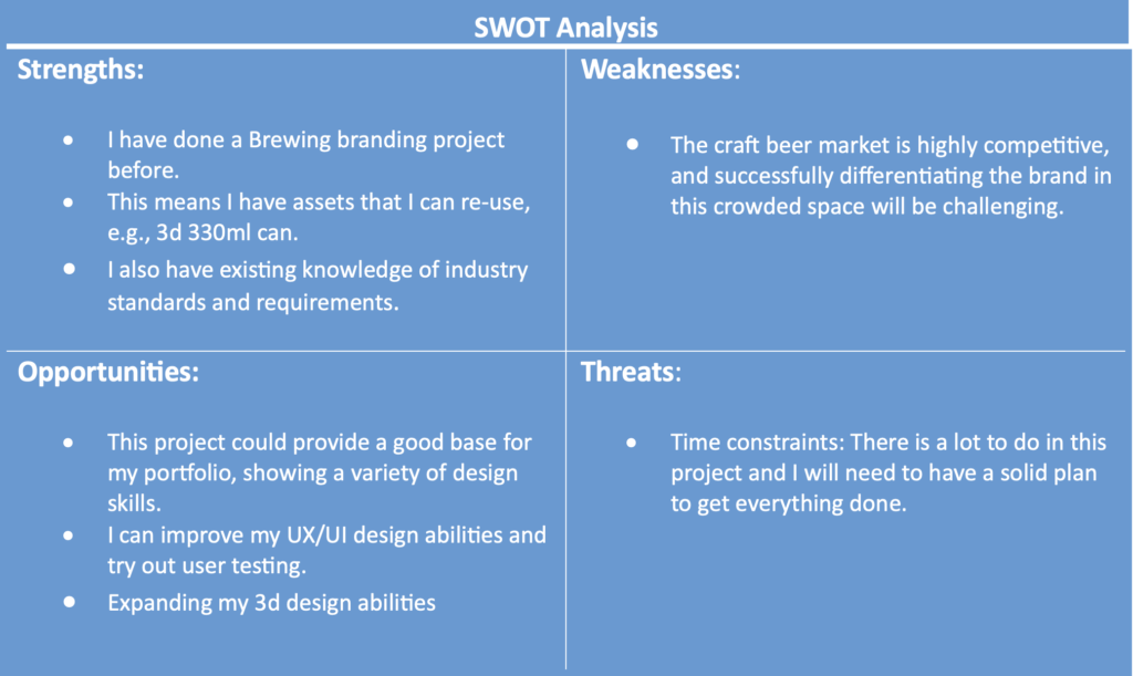
@food-beverage. (2020). What makes craft beer so popular with millennials? | DSM Food & Beverage. [online] Available at: https://www.dsm.com/food-beverage/en_US [Accessed 17 Nov. 2023].
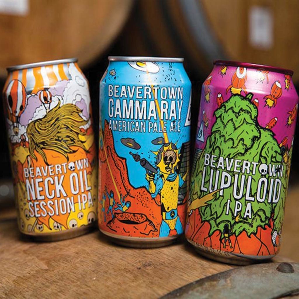
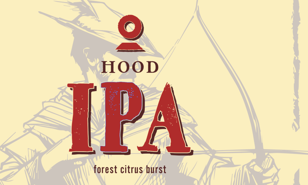
Arthur, I. (2022). 2022 Beer Branding Trends Part 4: Package Design Trends. [online] Craft Brewing Business. Available at: https://www.craftbrewingbusiness.com/business-marketing/2022-beer-branding-trends-part-4-package-design-trends/ [Accessed 4 Nov. 2023].
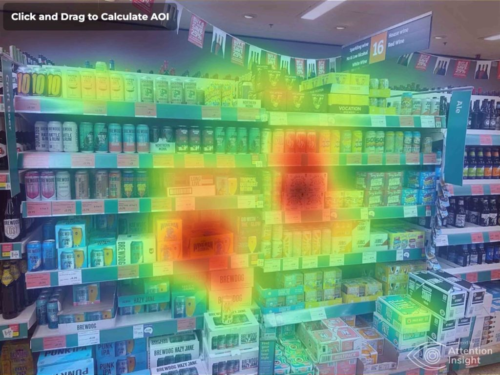
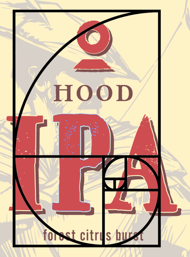
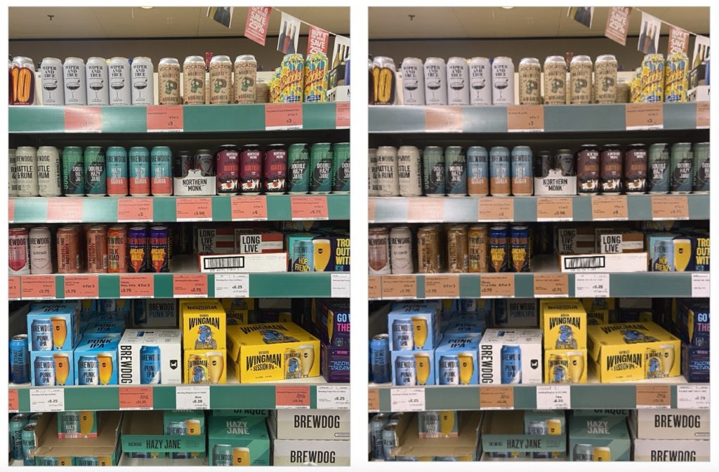
Attentioninsight.com. (2023). Attention insight. [online] Available at: https://app.attentioninsight.com/single-analysis/ [Accessed 17 Nov. 2023].
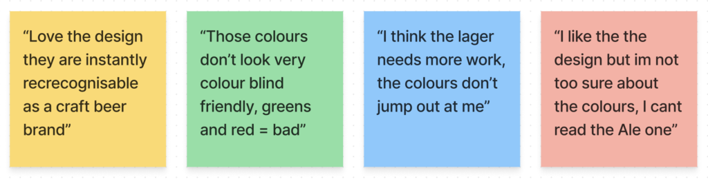
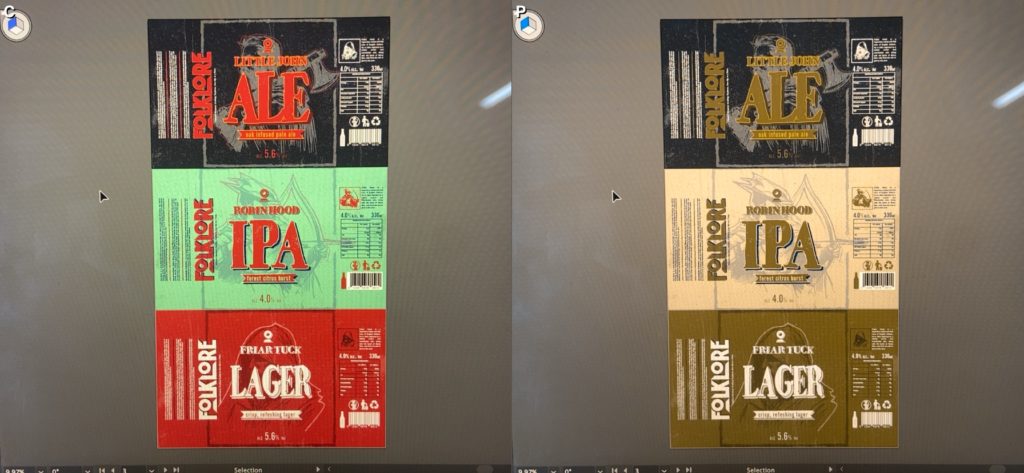
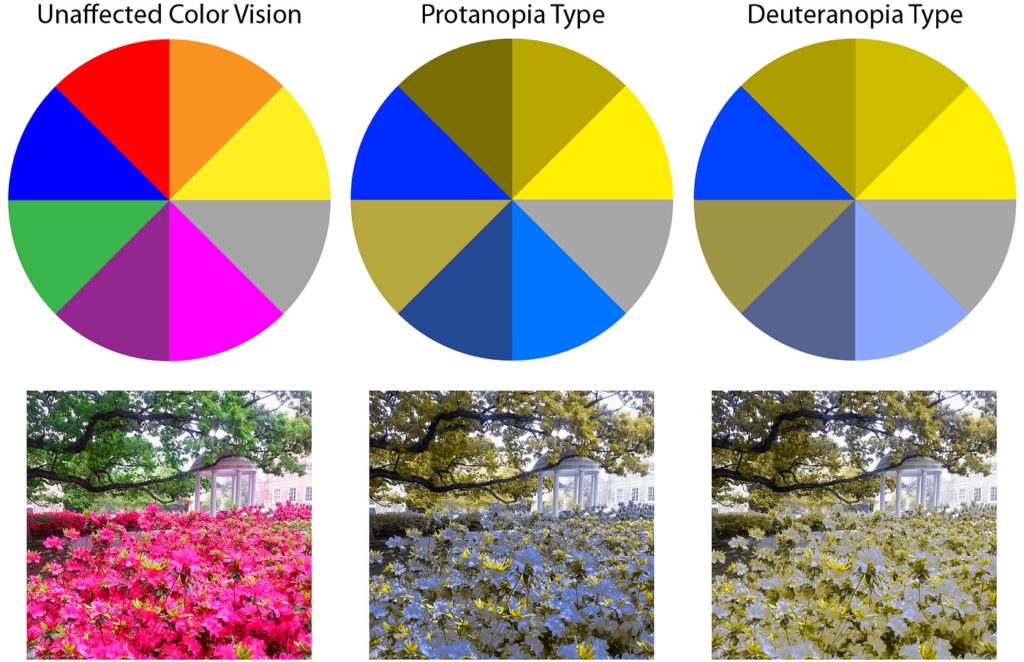
Colour Blind Awareness. (2022). About Colour Blindness – Colour Blind Awareness. [online] Available at: https://www.colourblindawareness.org/colour-blindness [Accessed 13 Dec. 2023].
Customerthink.com. (2023). News Editor | CustomerThink. [online] Available at: https://customerthink.com/author/news/ [Accessed 29 Nov. 2023].
Cutler, C. (2023). How to choose between minimalist or maximalist graphic design? [online] CuCo Creative. Available at: https://www.cucocreative.co.uk/articles/how-to-choose-between-minimalist-or-maximalist-graphic-design [Accessed 29 Nov. 2023].
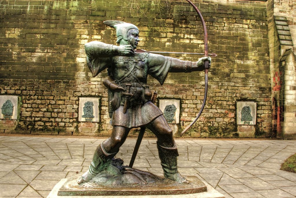
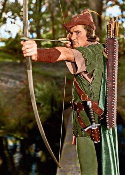
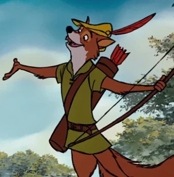
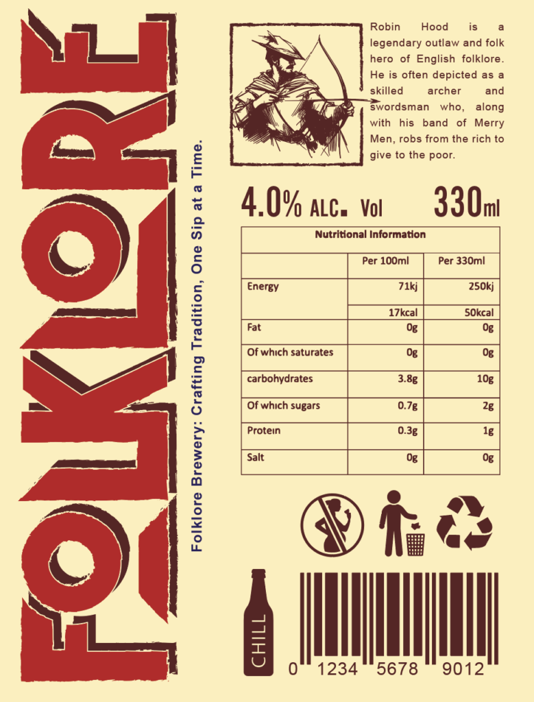
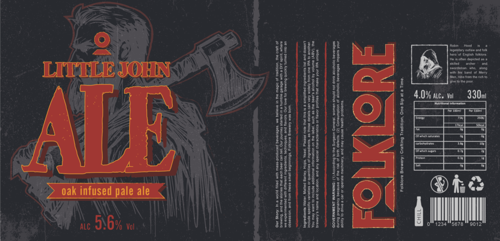
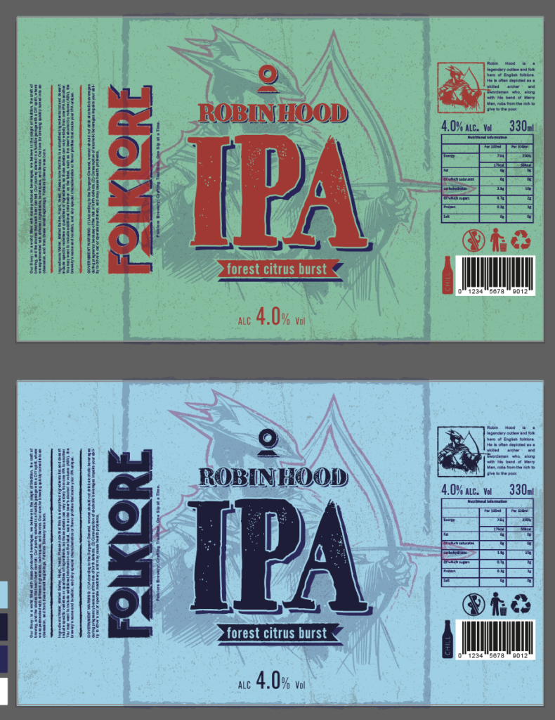
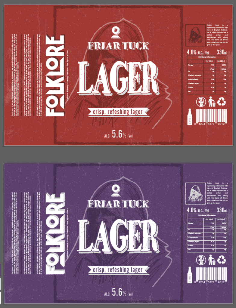
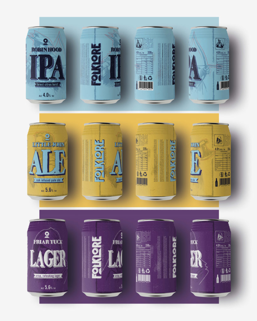
Dr Stephen Basdeo (2021). Robin Hood: The Academic Study of a Medieval Legend. [online] Reynolds’s News and Miscellany. Available at: https://reynolds-news.com/2021/11/09/robin-hood-study-of-a-legend/ [Accessed 27 Nov. 2023].
Dube, N. (2020a). What Is Interactive Packaging? [online] Industrialpackaging.com. Available at: https://www.industrialpackaging.com/blog/what-is-interactive-packaging [Accessed 27 Nov. 2023].
Dube, N. (2020b). What Is Interactive Packaging? [online] Industrialpackaging.com. Available at: https://www.industrialpackaging.com/blog/what-is-interactive-packaging. [Accessed 29 Nov. 2023].
Fedko, D. (2020a). Augmented Reality (AR) Packaging – Guide with Examples. [online] WeAR. Available at: https://wear-studio.com/augmented-reality-for-packaging/ [Accessed 27 Nov. 2023].
Fedko, D. (2020b). Augmented Reality (AR) Packaging – Guide with Examples. [online] WeAR. Available at: https://wear-studio.com/augmented-reality-for-packaging/ [Accessed 29 Nov. 2023].
Gould, J. (2007). Minimalism maximalism Minimalism maximalism. [online] Available at: https://scholarworks.rit.edu/cgi/viewcontent.
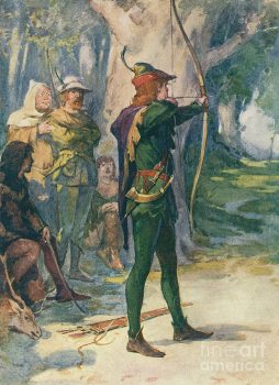
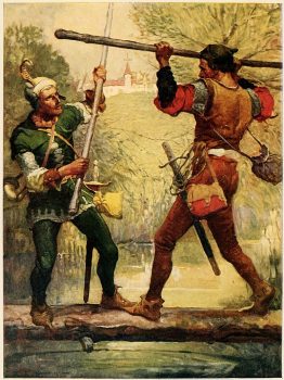
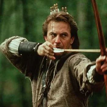
Gutenberg.org. (2023). The Project Gutenberg eBook of The Merry Adventures of Robin Hood, by Howard Pyle. [online] Available at: https://www.gutenberg.org[Accessed 27 Nov. 2023].
https://www.facebook.com/thespruceofficial (2019). An Explanation of What Maximalist Decor Actually Is. [online] The Spruce. Available at: https://www.thespruce.com/what-is-maximalist-style-4685629 [Accessed 29 Nov. 2023].
IntoTheMinds (2021). Augmented reality experience with 19 Crimes wine bottle. YouTube. Available at: https://www.youtube.com/watch?v=2B8CbudFor0 [Accessed 27 Nov. 2023].
Jack Daniel’s. (2019). Jack Daniel’s Tennessee Whiskey Augmented Reality. [online] Available at: https://www.jackdaniels.com/en-us/jd-ar [Accessed 27 Nov. 2023].
Jones, T.S. (1997). Robin Hood: A Complete Study of the English Outlaw. The Journal of English and Germanic Philology, [online] 96(1), pp.114–117. Available at: https://go.gale.com [Accessed 27 Nov. 2023].
Jstor.org. (2023). The Origins of Robin Hood on JSTOR. [online] Available at: https://www.jstor.org/stable/650091 [Accessed 27 Nov. 2023].
Mads Soegaard (2015). The Golden Ratio – Principles of form and layout. [online] The Interaction Design Foundation. Available at: https://www.interaction-design.org/literature/article/the-golden-ratio-principles-of-form-and-layout [Accessed 9 Dec. 2023].
Moving People to Action – Challenging and Supporting People to do the Most Important Work of their Lives. (2018). [online] Available at: https://conorneill.com/2018/04/21/understanding-personality-the-12-jungian-archetypes/ [Accessed 13 Dec. 2023].
Nih.gov. (2023). Types of Color Vision Deficiency | National Eye Institute. [online] Available at: https://www.nei.nih.gov/learn-about-eye-health/eye-conditions-and-diseases/color-blindness/types-color-vision-deficiency [Accessed 13 Dec. 2023].
Planker, A. (2023). The Legal Implications of AI Generated Artwork. [online] Cardozo AELJ. Available at: https://cardozoaelj.com/2023/03/08/the-legal-implications-of-ai-generated-artwork/ [Accessed 29 Nov. 2023].
Ross, B. (2020). Linchpin SEO : Craft Beer Industry Trends Shaping The Market. [online] Linchpin SEO. Available at: https://linchpinseo.com/blog/trends-shaping-the-craft-beer-industry/ [Accessed 4 Nov. 2023].
rwm-admin (2022). Dissecting the Craft Beer Consumer – Glacier. [online] Glacier. Available at: https://glacier-design.com/dissecting-the-craft-beer-consumer/ [Accessed 17 Nov. 2023].
Staff, A. (2023). Is AI Art Good or Bad for Artists? [online] NightCafe Creator. Available at: https://nightcafe.studio[Accessed 29 Nov. 2023].
Statista. (2022). Craft beer share of U.S. beer market 2022 | Statista. [online] Available at: https://www.statista.com/statistics/1093653/craft-beer-dollar-share-of-us-beer-market/ [Accessed 17 Nov. 2023].
The AOI. (2021). The AOI – Illustrating Beavertown: an interview with Nick Dwyer. [online] Available at: https://theaoi.com/2021/09/30/illustrating-beavertown/ [Accessed 17 Nov. 2023].
The Regulatory Review (2023). AI Art Is in Legal Greyscale | The Regulatory Review. [online] The Regulatory Review. Available at: https://www.theregreview.org/2023/01/24/penava-ai-art-is-in-legal-greyscale/ [Accessed 29 Nov. 2023].
Thurnell‐Read, T. (2022). Gender and craft drinks. Sociology Compass, [online] 16(9). doi:https://doi.org/10.1111/soc4.13018.
Watson, B. (2018). Shifting Demographics Among Craft Drinkers. [online] Brewers Association. Available at: https://www.brewersassociation.org/insights/shifting-demographics-among-craft-drinkers/ [Accessed 17 Nov. 2023].
Webflow. (2023a). Maximalism: How designers are turning up the volume of their work | Webflow Blog. [online] Available at: https://webflow.com/blog/maximalism-web-design [Accessed 29 Nov. 2023].
Webflow. (2023b). Maximalism: How designers are turning up the volume of their work | Webflow Blog. [online] Available at: https://webflow.com/blog/maximalism-web-design [Accessed 29 Nov. 2023].
Wipo.int. (2017). Artificial intelligence and copyright. [online] Available at: https://www.wipo.int/wipo_magazine/en/2017/05/article_0003.html [Accessed 29 Nov. 2023].