
DM7906: Interaction Design
Project Overview
During this project I embarked on creating the ultimate companion app for indoor climbing using a base of human-computer interaction (HCI) and the theories of interface design. At the centre of the app is the main feature called “Climb Generator”. This feature uses computer vision, images processing and machine learning to allow users to create personalised unique routes based on their abilities
The Crux app also features an integrated social platform designed to foster a supportive community, allowing climbers to share their accomplishments and create connections. I utilised the prototyping software “Figma” during all stages of the design process. Figma allowed for a fully rendered prototype of the Crux app to be created and remained consistent in design and layout.
The brief
Create a prototype App for ‘Crux’, a climbing app that allows climbers to scan walls and generate unique routes.
Requirements:
– A complete site map of the app and all its features.
– A prototype produced in Figma.
– A social aspect of the app allows climbers to share routes with friends.
– Research into integrating AI into the app.
Aims and Objectives
Aim: Using interaction design theory, develop a prototype app for Crux.
Objectives:
1: Understand the target audience for the Crux app
2: Analyse successful interaction design theories
3: Produce a prototype of the Crux app
Project Management
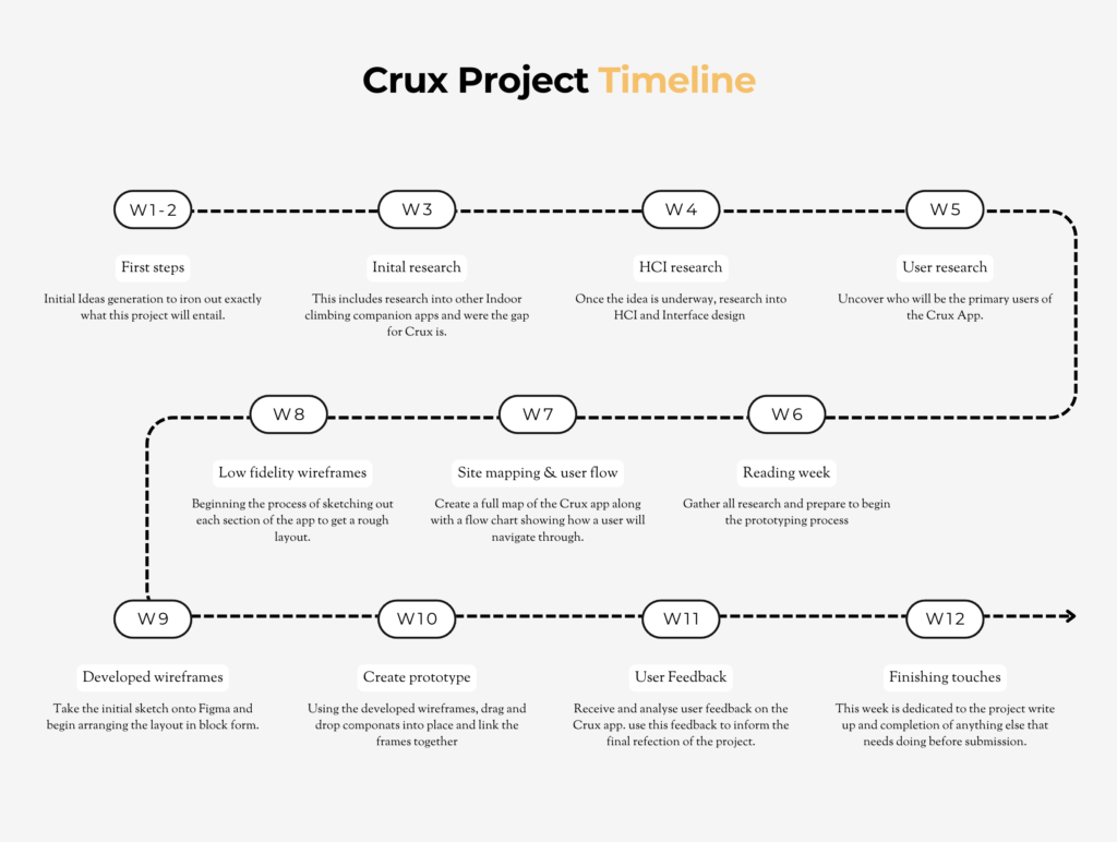
initial ideas
User Research
who is the target audience
According to the Association of British Climbing Walls (2023), the UK’s indoor climbing industry is significant and growing, with around 1 million people participating in the sport each year. Of this number, over 100,000 are regular climbers, indicating a devoted and passionate group. Climbing’s popularity is also visible in online activity, with search keywords such as “Climbing,” “rock climbing,” and “climbing walls” receiving an average of 19,100 searches each month in the United Kingdom (White, 2021). This digital footprint demonstrates the popularity and involvement of indoor climbing activities.
The demographics of the customer base for indoor climbing present some notable findings. According to Statista (2022), customers aged 25 to 34 make up the largest proportion of regular climbers in the UK, in total 29% of the whole climbing community. This age demographic is shown to be the most active and involved, with climbing enthusiasm often increasing with age until reaching this age range. Data from Indoorclimbing.com (2018) finds that climbing involvement declines as age increases beyond the 25-34 category, however, there is still a large community of older climbers.
The demographic age range of 25-34 can be grouped into the definition of millennials. Millennials are defined as individuals born roughly between the early 1980s and the mid-to-late 1990s, aligning with the popular age range of UK indoor climbers (Arnett, 2016; Poushter, 2016). For this project, the term millennials goes beyond the name classification as the group has had an extensive influence on modern interfaces. A study by Parker and Castle (2019) shows that the attitudes, behaviours, and technical sophistication of millennials have led to the evolution of interface design. As a result, modern interface design has prioritised user engagement, smooth navigation, and visually appealing aesthetics, all of which are important considerations for the Crux app.
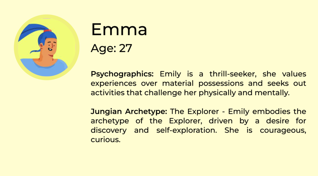
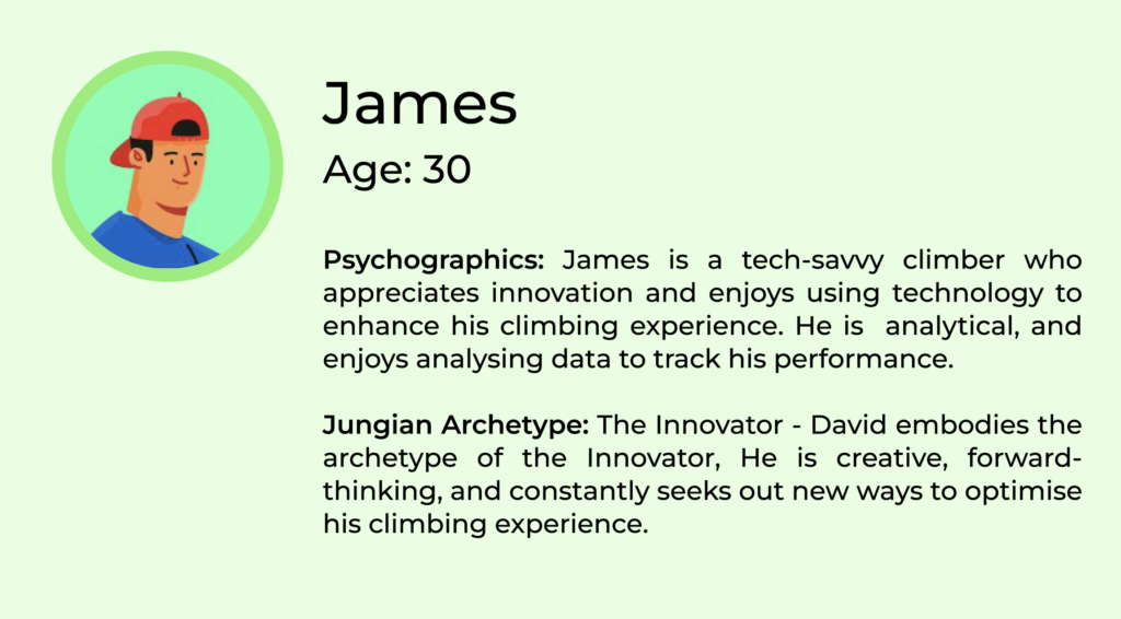
user personas
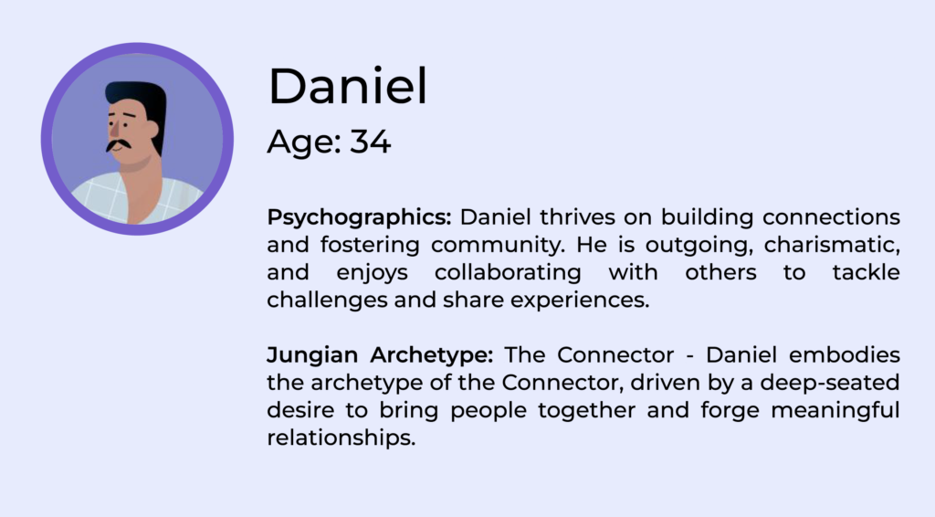
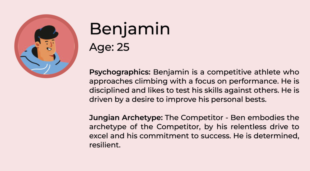
Based on this demographic research user personas can be created. These personas aim to encompass both primary and secondary target audiences. they include the user’s demographic, psychographics and how they fit into Jungian archetypes.
Competition research
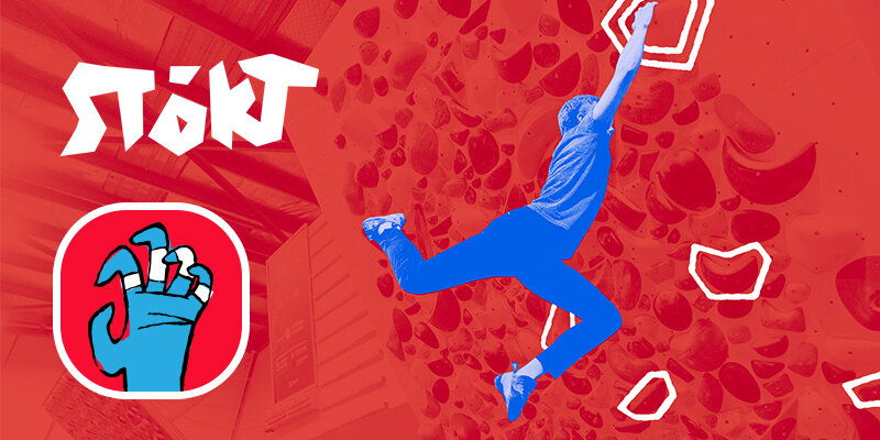
'STOKT'
Stokt is a climbing app designed around a vast database of climbing walls with hundreds of routes for each location. The app is location-based, so users who want to access the app must climb at centres that are pre-loaded onto the app. If the user doesn’t climb at a location on the Stokt Database then they can request a review and potentially have it added. Stokt also has personal shipments and helps climbers track their climbs and progress. The app features an extensive social network that allows climbers to share their experiences and challenge one another. Climbers are also able to track their gear inventory and will give personal recommendations on products to purchase.
what they do well
- The use of social interaction with other climbers. instead of just liking someone’s achievement you can send other forms of praise helping enhance the community feel of the app.
- The interface design is smooth and easy to navigate at times. The common use of negative space highlights how the user should progress through the app’s features.
- the idea of giving the user the ability to inventory their gear enhances the user’s incentive to return to the app.
what they don't
- The app relies on customers using locations that pre-exist on Stokt’s database. this means that any customers who don’t live near one of these centres cannot use the app at all.
- The process for a customer requesting a new centre to be added to the database is very lengthy and can take months, by which time the customer has moved on.
Interaction Design
Interaction design is a discipline which builds user-centric interactions using digital interfaces. Teo Yu Siang (2015) defines it as designing interactive systems and products to facilitate seamless interactions between humans and technology. Interaction design aims to improve user happiness by assuring the usability, accessibility, and attractiveness of digital goods. Interface design has a significant influence on our daily lives. From accessing smartphones to the displays in cars, interface design shapes how we interact with all technology. Effective interface design not only improves the performance of digital products but also increases user satisfaction (Tiller, 2020). Furthermore, interaction design extends beyond digital technology, influencing the design of physical products that include integrated digital interfaces.
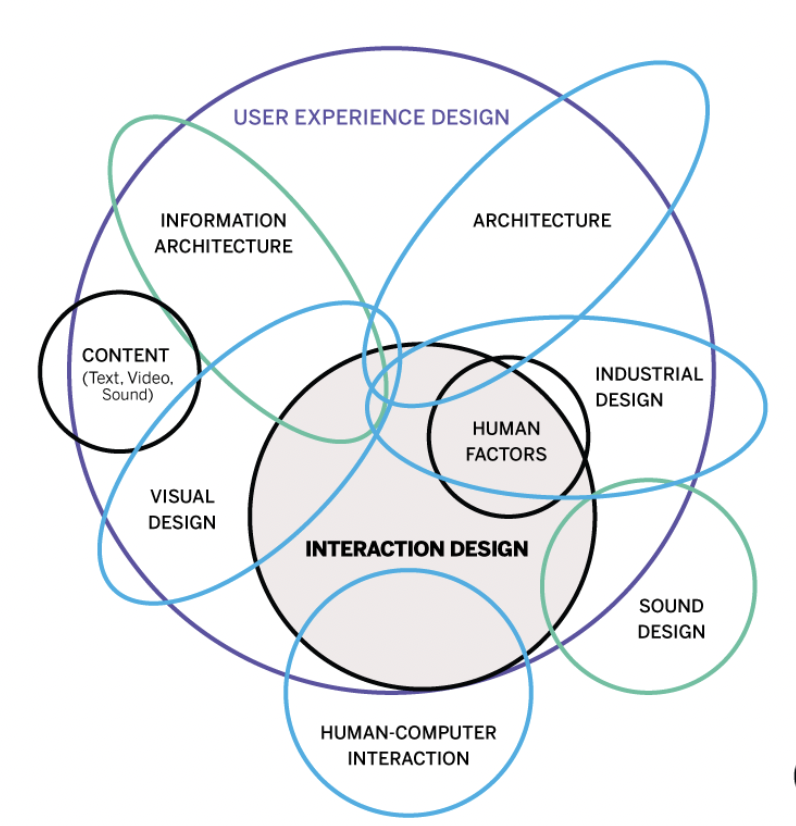
HCI
Human-Computer Interaction (HCI) is the foundation for several design disciplines, including Interaction Design, UX design and UI design. The Interaction Design Foundation (2016) defines HCI as the study of how people interact with computers and the extent to which computers are or are not designed for successful interaction with humans. HCI can be traced back to the early days of computing when academics began to investigate how people and computers might successfully interact and collaborate. Douglas Engelbart’s debut of the mouse and graphical user interface in the 1960s was a turning point in HCI, bringing in natural methods to communicate with computers (Xiao, 2017). The diagram from The Interaction Design Foundation (2016) displays the natural evolution of HIC and how it has become a multi-disciplined area of design.
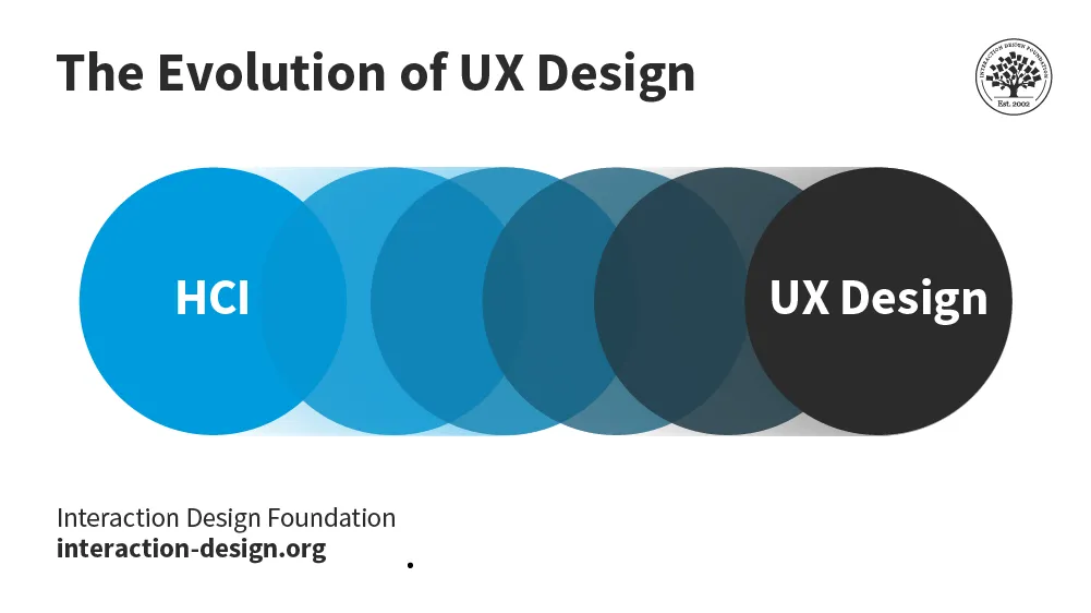
(The Interaction Design Foundation, 2016)
key concepts
Using the previous studies reviewed, several key concepts and Drawing from Guimaraes (2023) and Teo Yu Siang (2015), several fundamental principles for interaction design can be drawn.
- Usability: Usability focuses on how easily and efficiently users can navigate while engaging with a system or product. A user-centric approach guarantees that interfaces are intuitive, clear, and simple to navigate for a specific audience.
- Affordance: This refers to a user’s abilities or behaviours in response to visual or sensory cues provided by an interface or product. Design components should clearly show their function, directing users through the process.
- Feedback: Visual, aural, or tactile feedback can indicate the impacts of user inputs, and assist the overall success of the designs. feedback is necessary for any interaction design project.
- Accessibility: Designing digital products to be useable by people with a wide range of abilities and demands is another key component for any project. Designers work to reduce obstacles to access by using inclusive design strategies such as offering alternate input methods and supporting a wide range of sensory, motor, and cognitive skills.
These essential principles serve as the cornerstone for interaction design and for this project, helping to create engaging, intuitive, and user-centred designs.
Site Mapping
I used the research in the book ‘Communicating Design: Developing Web Site Documentation for Design and Planning’ (Brown, 2015) to help me create the early stages of development for my App. I took several photos of pages I found useful for later reference. Brown explains that site mapping does not need preparation time nor extensive information and detail. site maps are meant to be a stripped-down overview of the app and its features. ‘In its essence, a site map is a collection of shapes representing different areas of the site connected by lines’ (Brown, 2015). Using the principles outlined in this book, I created a basic site map for Crux. The app will function with a central dashboard, allowing the user to quickly get where they need to. The dashboard will link to all aspects of the app through quick links. The app will contain 4 key features. Firstly, the key aspect of the app will be its ability to scan the climbing wall and generate routes for the users based on their preferences. This will link directly to all other parts of the app, for example, data collected from the user’s climbs will be collected and displayed as statistics. Users can share their climbs, stats or options with other climbers through the social side of the app which helps foster a core community of indoor climbers.
User Flow
Using both the site map and the user research allows for user flow diagrams to be created. According to The Interaction Design Foundation (2016), user flow diagrams ‘depict the path a user can take to complete a task while interacting with a product‘ meaning anything that blocks the natural flow of the app can be negated. For the Crux app, a clear path of navigation for a new user can be split into 5 sections. The first section (purple) highlights the onboarding process for the user, this includes the signup process that would be kept standard as for most apps. users would be able to do a ‘quick sign up’ by using other social apps like Facebook or X. The second section (yellow) shows the early stages of the app, where the user can opt into a quick tutorial that will explain how the app functions and how to navigate. In the third section (green) the user will be exploring the app and its features before creating their first climb. The 4th section (blue) shows the user playing with the climb creation function and adjusting it to their preferences. Finally, the last section (red) shows the user engaging with other functions such as the social side of the app. overall this user flow has helped iron out anything that was blocking the natural progression of the app.
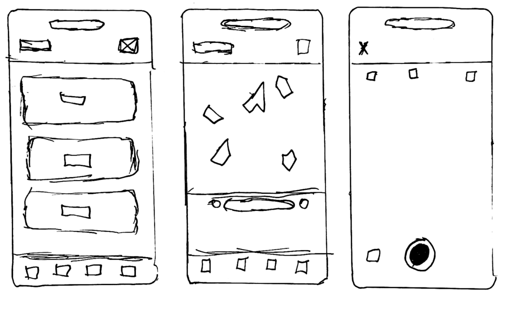
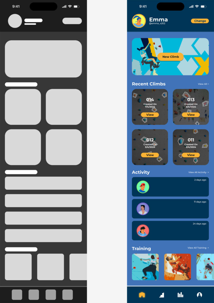
Low-Fidelity Wireframes
For me, the first stage of design always comes in the form of extremely rough sketches. Here is a small collection of the initial ideas for the look and overall design of the Crux app. On the right, I began by creating the structured layout for the central dashboard of the app. I want this dashboard to have links across all parts of the app for ease of use. I have attempted to make sure that the links to different sections use different shaped boxes, signifying to the user the separation between the parts of the app.
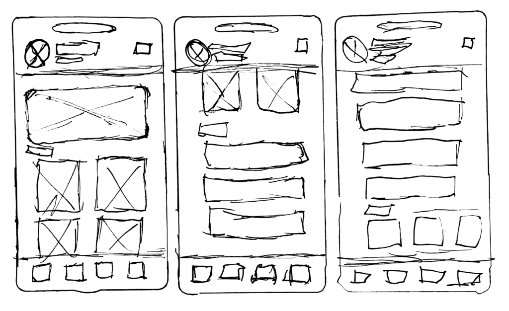
Heigh-Fidelity Wireframes
This prototype is fully interactive, feel free to click and scroll through the sections of the app.
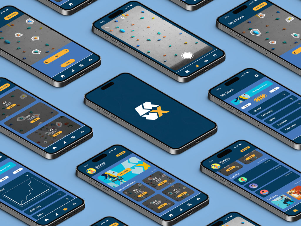
Using the jumping-off point of the Low-Fidelity wireframes I began designing in Figma. For the early stages of design simple grey boxes are all that is needed to display the layout and the flow of the app. Scrolling down the ‘dashboard’ page (bottom left on the nav bar) you can view the sections of quick links to allow the user to move quickly to their desired area. By clicking through the other buttons on the navigation bar you can view the ‘my climbs’ fetature, the statistics page and the social feature of the app. Each of these pages has been designed with a rough outline for the development of the full prototype.
Climb generator Technology
The focal point of high-fidelity wireframes is displaying the process a user undertakes to generate their unique climbs. This is the app’s main feature and will require a mixture of technology. Below is a list of three technologies crucial for this function.
Computer Vision, defined by IBM (2024), getting AI to learn to interpret and understand the visual world as humans do. For example, computer vision will be crucial for analysing images of indoor climbing walls to identify key features such as holds and route structures.
Image Processing Techniques, such as those described by Kumar (2021), would be applied after the user has captured the image to enhance the quality of the images, remove noise, and improve the accuracy of the Computer Vision AI. This would ensure that the function can effectively recognise information from the images.
Machine Learning will also play a pivotal role in allowing the AI to recognise different types of climbing holds, routes and difficulty levels based on the user’s locational data (Sloan, 2021). These machine learning models will allow the Crux app to automatically classify routes and provide a personalised experience to the user.
affordance
The Interaction Design Foundation (2016) defines affordability as ‘what a user can do with an object based on the user’s capabilities’. Affordances in UX/UI design allow users to engage with digital objects in natural ways, resulting in seamless functionality. The importance of affordances in both UX & UI design is emphasised by UXPin (2023), highlighting how designers should imitate real-world interactions to aid users in comprehending the functionality of digital interfaces. For instance, sliders that resemble physical sliders imply that they may be moved or dragged, and buttons that seem raised through drop shadows suggest that they can be pressed.
Nielsen (2004) offers a practical example of affordance in action with an explanation of how hyperlinks in online interfaces are shown visually by blue text and underlining. This exact example shows how affordances can spread throughout the entirety of UX/UI design and show how user-driven design is. Effectively making use of affordances is going to be crucial to the Crux app’s design to maximise user flow. For example, using buttons with shadow effects will enable users to click or press facilitating easy navigation around the application interface.
Components
navigation bar
A navigation bar is a crucial part of any mobile/tablet app and is most commonly featured at the bottom of the user’s screen. According to Jakob’s Law ‘Users prefer your site to work the same way as all the other sites they already know’ (The Nielsen Norman Group, 2017). The importance of this theory resonates with all elements of UI design, which is why apps use navigation bars at the bottom of the screen where the user’s thumbs can reach. For the Crux navigation bar, there is only a need for 4 menu icons, The Home, Climbs, Statistics and Social. Each of these icons has been designed to represent the page the user will be directed to.
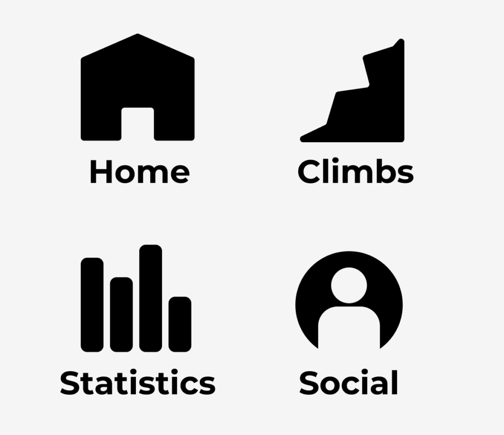
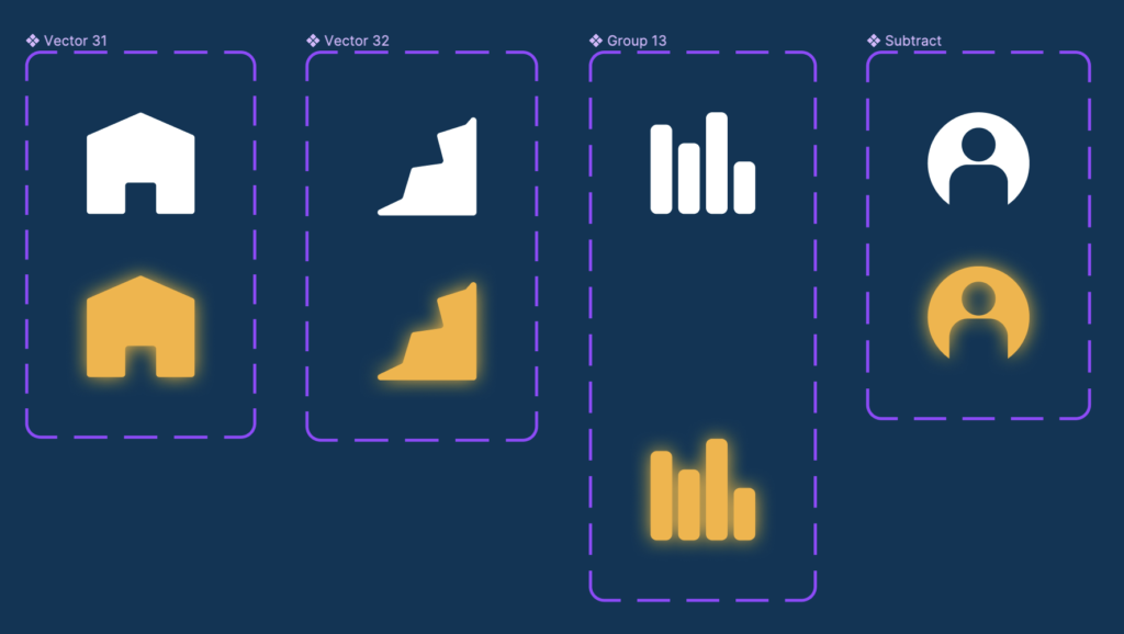
For the creation of the Crux prototype, Figma has been the software of choice. this is because one of the main functions of Figma is the ability to create ‘Components’. This feature allows for micro-animations to be completed within any frame. This means that for the navigation bar, I was able to create 2 variants of each icon, one signifies that the user is on that page by highlighting the icon, and the other is the standard look.
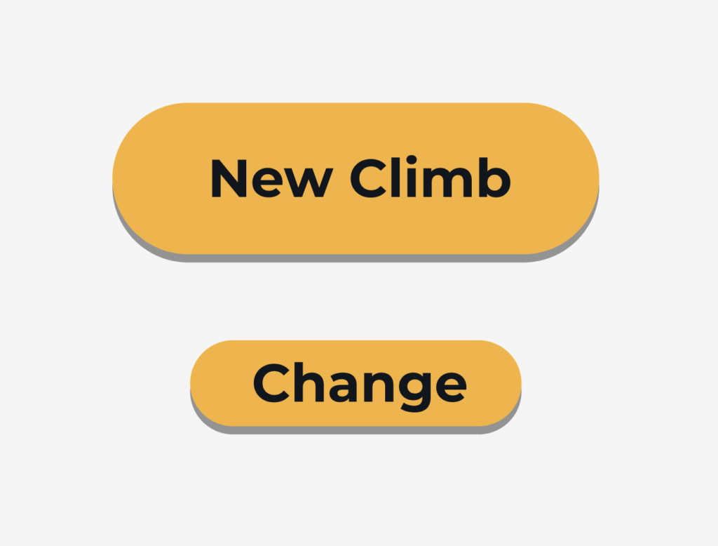
Buttons
Using affordance to aid the design, the buttons used in the Crux app come with a drop shadow, enabling users to ‘push’ the button like a physical object. Once again the buttons are made into Figmas components. However, there are no micro-interactions, and the components allow for assets to be dropped into any frame keeping a uniform and streamlined aesthetic.
Smart Animate
Using Figam’s Smart Animate prototype function within individual components allows for micro animations to be used within a single frame. Micro animations are important to enhance the overall user experience in the interface (Feo, 2023). They provide various advantages in UX design, especially in terms of feedback, and affordance. Micro animations can provide users with immediate feedback, indicating that their interactions have been registered. They can highlight important features, explain functionality, or show hidden material (example on left), all of which improve the interface’s overall usability and clarity.
Accessibility
A vital element for any Interface design is that it’s accessible to all users (Nielsen Norman Group, 2020). This can be done in a multitude of ways. For example making use of negative space to signify specific action, like a button, can help people with visual impairments. This is also applied to the colours used in Crux’s Branding, yellow and blue are colours widely associated with positive accessibility for colourblindness.
Prototype design
Home Page
Once I was happy with the initial high-fidelity designs, the process of converting them into a fully rendered prototype began. I used the Crux brand bible to implement colours, logos, and brand assets into the interface.
Creating the components before beginning the layout design allowed me to drag and drop assets into place and ensure consistency.
Hierarchy of Information
When adding content to the interface framework, I decided to adhere to a clear hierarchy of information to assist users effectively. Gordon (2021) highlights grouping as a crucial part of structuring an app and directing the user’s attention. So in the layout of the Crux app, you can see designated groupings based on the needs of the user. for example, having the ‘New Climb’ panel at the top allows the user to quickly navigate to the main feature of the app. Utilizing white space further reinforces these groupings, giving a clearer structure of the page’s structure. By establishing this well-defined hierarchy of information on the home page user engagement and satisfaction can be maximised
social page
This part of the app aims to create a space for users to share their accidents within the wider climbing community. Users will be able to connect with their friends or other popular users. The design of this page follows the rule of Jakob’s Law by creating a system of scrolling through posts and interacting with them similar to the popular social apps.
Once the user navigates to this page they can view recent posts and engage through liking, commenting, saving or sharing. By encouraging user-to-user interaction the App can create an active and thriving community.
climb generator
Giving the user the ability to save their climbs gives incentive to return to the app and try to beat personal bests. From this page, the user will be prompted to ‘create new climb’. this will allow the app to access the user’s device camera and take a photo of the wall they intend to climb. once the user has taken the image they will be presented with a menu screen that allows them to customise the route. Users can shuffle through randomly generated routes (seen highlighted) and change the difficulty and technicality of the climbs. The user can also time themselves or note down aspects they find difficult. There will also be a prompt for the user to share their climb with friends.
Final Prototype
User feedback
Feedback from users plays an essential role in developing all human interfaces, ensuring that the end product fills the needs of its users. By incorporating user feedback, designers can discover usability flaws and understand user preferences, resulting in more intuitive and effective interfaces (UX Design Institute, 2023). I allowed 6 separate users to interact with the Crux app prototype. I would observe their movement and give a small feedback card for them to leave their opinions.
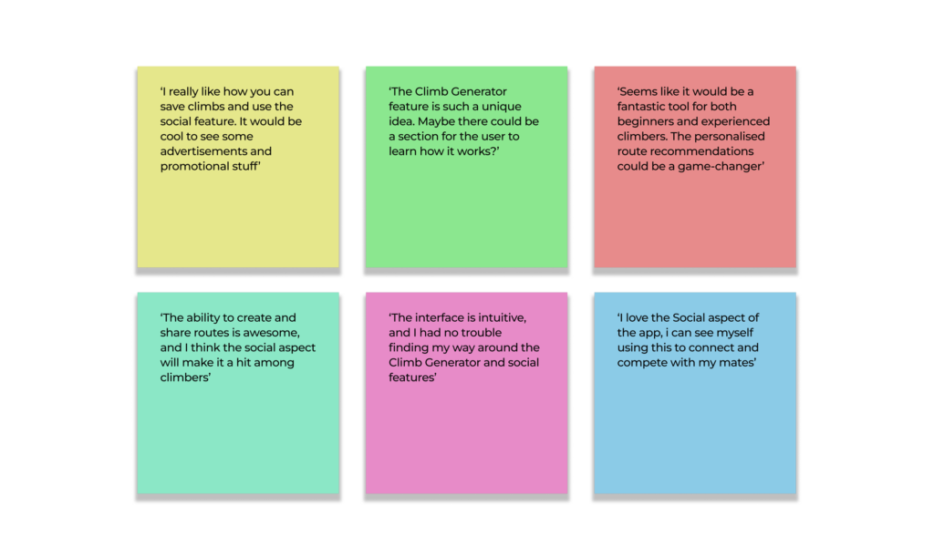
After observing users’ behaviour and reading their feedback there are a lot of positive responses. for example, the users loved the social feature, the climb generator and the easy-to-navigate interface. However, there were several responses that have shown areas of improvement:
Promotional Content: One of the users mentioned an interest in seeing some advertisements within the app. While using paid advertisements helps generate revenue for some apps, I think it’s more important to consider the user experience and not allow promotions to distract users.
Climb Generator Tutorial: Another suggestion was to create a short tutorial or information guide to help users understand the function of the climb generator. This was an idea I had during the early stages of design so incorporating something like this would be easy to add into the interface.
Overall, collecting this user feedback has allowed me to understand that the Crux app functions correctly and as intended. the adjustments that have been mentioned are easily corrected and implemented.
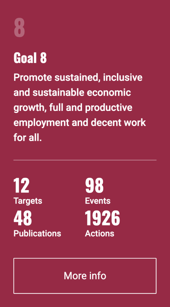
SDG goal 8
The project aligns with SDG Goal 8 set out by the UN. goal 8 aims to foster long-term, inclusive, sustainable economic growth and decent work for everyone (Un.org, 2023). Crux promotes well-being and productivity by increasing physical exercise and social connection, both of which are critical components of economic growth. Furthermore, the app’s development process, which involves producing a functioning prototype using Figma, helps to the digital economy by cultivating technological and design skills.
Reflection
What Went well
Incorporating Crux Brand with the UI: As the branding for Crux had already been created it was vital to maintain brand constancy. The cohesive visual identity not only enhances the aesthetic appeal but also reinforces brand recognition.
Consistency Across the App: Maintaining consistency throughout the app’s many pages and sections resulted in a smooth user experience. This consistency allows users to use the Crux app easier and decreases the learning curve associated with utilising new features.
In-Depth Design Process: The design process included all necessary steps to produce the crux prototype. Each stage of the process, from early concepts to final prototypes, was meticulously planned and executed, resulting in a well-rounded app.
Adherence to Timeline: Being able to stick to the timeline ensured that all sections of the process were completed to the best of my ability. it also meant that all of the project milestones were achieved and kept the momentum.
Positive User Feedback: The users who tested the prototype responded positively to the ideas and functionality of the app. They appreciated the innovative features like the Climb Generator and the social aspects, which validated the core concepts of the app and provided encouragement for further development.
areas of improvement
Expanding the Prototype: I believe that, with some extra time, the final prototype could have been expanded in many ways. this time would allow for additional features to be displayed making the entire prototype complete.
Applying User Feedback: Extra time would have also enabled me to introduce the user feedback into the prototype. This process is vital for improving the app’s usability and functionality based on real user insights.
Collecting More User Feedback: Having the opportunity to collect more user feedback would have provided a broader perspective on the app’s strengths and areas for improvement. being able to get opinions from climbers and UX experts would be great for Crux.
recommendations
The next steps of this project would consist of several factors. For starters, it would be helpful to develop the prototype to include new features and improvements. This update would strengthen the app’s functionality, increasing its user appeal. Furthermore, including more user feedback throughout the design process is critical. Investing more time in iterative development cycles based on user insights can improve the app’s usability and guarantee that it satisfies user demands more efficiently. Increasing attempts to obtain input from a bigger and more varied range of users will give wider perspectives and aid in the discovery of new insights for future improvements.
Conclusion
This project accomplished all of its key objectives as laid out at the beginning. Understanding the target audience was completed through extensive research and direct user input, ensuring that the Crux app met the needs of climbers of all levels. The second objective was to use interaction design theories to help contribute to the development of an intuitive and user-friendly interface, which improved the overall user experience. While the prototype got positive feedback by demonstrating the main functionality to users, more development and refining is required. Expanding the prototype and incorporating further user feedback will improve its robustness and usefulness.
references
Chen, F. and Terken, J. (2022). Interaction Design Theory. Springer tracts in mechanical engineering, [online] pp.129–144.
Feo, E. (2023). Enhancing User Experience: Creating Micro Animations in UX Design. [online]
Ibm.com. (2024). What Is Machine Learning (ML)? | IBM. [online] Available at: https://www.ibm.com/topics/machine-learning
Kaley, A. (2023). User-Feedback Requests: 5 Guidelines. [online] Nielsen Norman Group.
MIT Press. (2024). Critical Theory and Interaction Design. [online] Available at: https://mitpress.mit.edu/9780262037983/critical-theory-and-interaction-design/
Parker, E. (2021). 5 Cognitive Psychology Theories that Contribute to the Quality of UX Design. [online]
Rekhi, S. (2017). Don Norman’s Principles of Interaction Design – Sachin Rekhi – Medium. [online] Medium.
Sloan, M. (2021). Machine learning, explained | MIT Sloan. [online] MIT Sloan. Available at: https://mitsloan.mit.edu/ideas-made-to-matter/machine-learning-explained
Teo Yu Siang (2015). What is Interaction Design? [online] The Interaction Design Foundation. Available at: https://www.interaction-design.org/literature/article/what-is-interaction-design
The Interaction Design Foundation. (2016a). What Are User Flows? [online] Available at: https://www.interaction-design.org/literature/topics/user-flows
The Interaction Design Foundation. (2016b). What is Human-Computer Interaction (HCI)? [online] Available at: https://www.interaction-design.org/literature/topics/human-computer-interaction
Tiller. (2020). What is Interaction Design? | Tiller Digital. [online] Available at: https://tillerdigital.com/glossary/interaction-design/
Un.org. (2015). THE 17 GOALS | Sustainable Development. [online] Available at: https://sdgs.un.org/goals
UX Design Institute. (2023). How to incorporate user feedback in product design. [online] Available at: https://www.uxdesigninstitute.com/blog/user-feedback-in-product-design/#:~:text=Ultimately%2C%20feedback%20helps%20you%20to,a%20recipe%20for%20bad%20UX.
Vasudha Mamtani (2018). The importance of User Feedback – UX Collective. [online] Medium.
WAKKARY, R.L. (2024). EXPERIENCING INTERACTION DESIGN: A PRAGMATIC THEORY. Plymouth.ac.uk. [online] doi:https://doi.org/NOT%20AVAILABLE.
Xiao, L. (2017). A Brief History of Human-Computer Interaction (HCI). [online] Medium.