

PROJECT OVERVIEW
Introduction:
In this project, I undertake Brief 4 from the 2023/24 RAS Awards. During this project, I created an app that aimed to address the challenges faced by young adult carers in maintaining active social lives. This project, inspired by Brief 4, aimed to create a supportive platform where users can make connections and have social engagement for this often-overlooked demographic. The app revolves around allowing the user to join social group activities and connect with peers who share similar experiences. I aimed to use a user-centric approach, considering the unique needs and preferences of young adult carers.
Security Measures:
When designing an app that will bring people together it is vital to realise the importance of security. for this reason, a large proportion of this project was dedicated to creating a new kind of in-person security. I used Near Field Communication (NFC) technology to ensure that users can verify the identity of individuals or groups they plan to meet.
Geo-Location Integration:
To further the user experience, the app incorporates geo-location functionality. Users can easily discover local events happening in their local area. This feature not only encourages participation in community events but also broadens the horizons of young adult carers, helping them explore opportunities for social engagement.
User-Generated Events:
After realising the diverse needs of my target audience I decided that this app should allow the user the shape their own personal social experience. Users are able to create and host their own events. This unique feature of my app not only encourages socialisation but also provides a platform for sharing struggles and triumphs with like-minded individuals.
RSA BRIEF
Caring culture
My Response
After reviewing the brief I had a good idea of what I wanted to create. I wanted to focus on the issues of helping young carers as, from personal experience, maintaining a healthy social life can be a big struggle for young people who are non-paid or paid carers. My idea is to create an app based on helping these young carers have more active social lives and meet people in similar situations themselves.
As can be seen from this rough mid-map I want to create a “group activity app” that will show local events in the area. The users will be able to join different social events and fit them into their schedules.
A base for an app is beginning to form but first, I will need to research my user and their needs.

OBJECTIVES
Project Aims and Objective
Full Prototype Development in Figma:
- Produce an interactive prototype of the app in Figma: This prototype should show the user journey, allowing for thorough testing and validation of the app’s design and functionality.
Integration of Emerging Technologies: Explore and integrate emerging technologies to enhance the overall user experience. Investigate how these technologies can be applied to create interactions within the app.
Address Mental Health Issues In Young Carers: Centre the app’s functions and design to help improve the social lives of young adult carers. This includes creating a user-friendly interface that promotes stress reduction.
TIMELINE
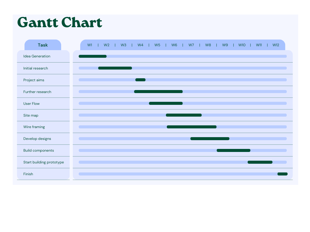
I created a simple Gantt Chart to help me with my time management and keep this project on track. Gilmore, in his analysis of project management, tells us that “the purpose of a Gantt chart is to equip you with the tools you need to oversee every aspect of your project” (Gilmore, 2016).
I have identified some key milestones, such as setting out the project objectives in week 4 after idea has been created. Weeks 9 & 10 will be another key aspect of the project as this is where I have selected to create the components for the app prototype. If this section of the project is rushed, it could mean the app is lacklustre and unfinished. Whereas, if I spend too long creating the components then other elements could suffer.
RESEARCH
Methods
When I undertook this project I knew that I would need to refrain from primary research due to the sensitivity that is associated with my desired target audience, Young Adult Carers. If I were to conduct primary research it could potentially breach the ethical privacy and well-being of this group. Instead, this project will rely heavily on secondary research methods to explore the challenges faced by young carers. Qualitative data will be an important aspect of this research as I will be looking at many personal accounts, literature and articles.
These types of insights will be vital in uncovering important aspects of the issues faced by young adult carers. Alongside this, I will also be using quantitative data extracted from relevant studies and reports. This will provide statistical analysis on the scale of specific challenges encountered by young adult carers. This quantitative angle aims to reinforce or counter the qualitative findings, offering a comprehensive view of the issues. This holistic approach will ensure that my app will be designed accordingly to my audience.
Existing apps
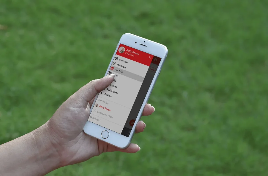
JOINTLY
Jointly is an app created by Carers UK, they described it as “Jointly makes caring easier, less stressful and more organised by making communication and coordination between those who share the care as easy as a text message.” (Carers UK, 2019) Features of the app include:
- Group communication and messaging
- tasks/lists
- Calendar
- Medication list
- Contacts
This app tries to cover all bases and is meant as a side companion for carers to help make their lives more manageable it also has a social side to it, direct messaging. However, I don’t find this a threat to my app because its very basic and not designed for organised events.
WHO IS MY AUDIENCE?
What defines a “Young Carer”:
The NHS define young carers as “under 18 and help to look after a relative with a disability, illness, mental health condition, or drug or alcohol problem.” (NHS Choices, 2023)
This means that my audience are not “Young Carers” as I want to aim my app towards the 18-25 age range. Instead, they are called “Young Adult Carers”. According to Carers.org (2023), there are around 376,000 Young Adult carers in the UK.
This video from Solihull Carers (2022) shows the everyday lives and struggles of young Adult careers and how what they do affects their mental health.
WHAT IS THE PROBLEM?
The RAS brief covers some of the problems that are faced by people who work in the care industry or who are unpaid carers. One of the Major issues cares face is how their care takes up so much of their time. After delving deeper into the specific age range of 18-25 (Young Adult Carers) I found that Carer.org has some well-researched insights into the issues surrounding this group. One of the biggest problems they report is that “Being a young adult carer can affect a person’s health, social life and self-confidence – over 45% reported a mental health problem” (Carers.org, 2023).
In the video by Solihull Carers (2022), several of the young adult features talk about how often people don’t even realise that they are career because it’s just looking after their family. This then starts to affect other aspects of life like college/university and their social life. Often Young Adult Carers find it hard to communicate their day-to-day struggles with their friends who haven’t experienced such difficulties in their lives. This can lead to Young Adult Carers feeling isolated and misunderstood (Learning and Work Institute, 2023).
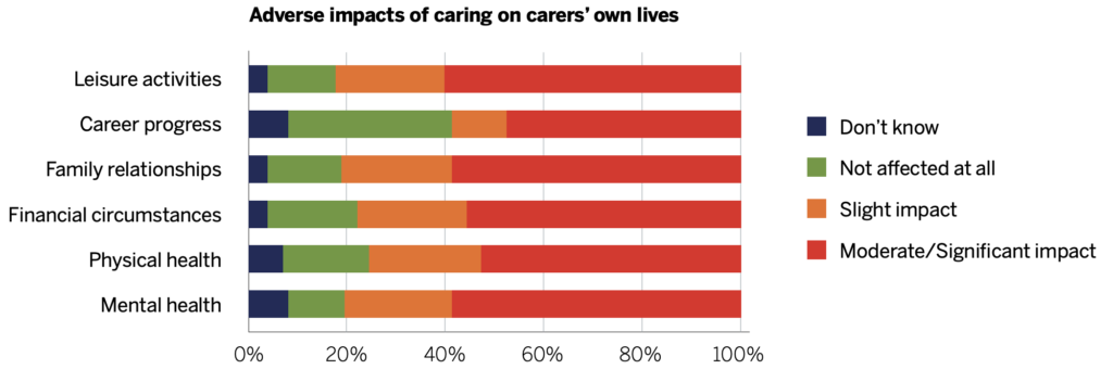
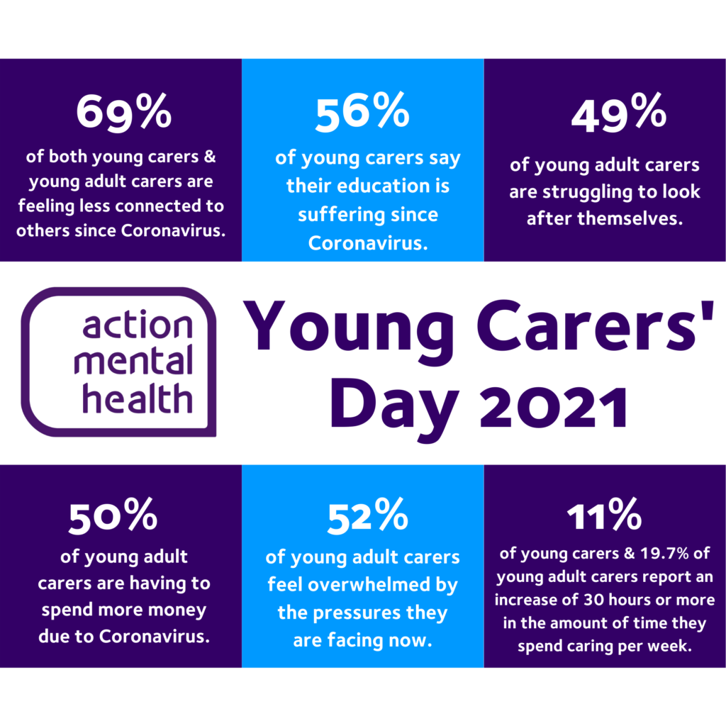
This infographic from Action Mental Health highlights some important statistics relating to both Young Carers and Young Adult Carers. These studies help reinforce the findings from Careers.org but also add to the depth of the research. It really shows the extent of issues that Young Adult Carers are facing and how they need as much help with their day-to-day lives and mental well-being as possible.
wicked problem- Mental health
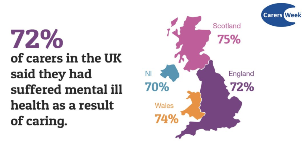
Design theorists Rittel and Webber (1973) create the term “Wicked Problem” as a social or cultural problem that’s difficult or impossible to solve. In the study “Mental Health Stigma: A Wicked Problem” (Yoh, Katelyn, 2020) the idea of mental health being one of these wicked problems is brought to light and delved into. Yoh & Katelyn explain that Mental Health comes under the classification of a wicked problem “It is difficult or impossible to solve because of needs that are too hard to acknowledge” (2020). A study by Carers Week (2018) found that on average 72% of carers in the UK suffer from mental health issues as a result of their work. so clearly working as a career, whether they are paid or unpaid. Yoh & Katelyn conclude their study with the sentence “Although it has greatly improved, there are still many problems today”(2020). In this project, I hope to help improve the effects of this wicked problem.
User NEEDS
USER-CENTERED DESIGN
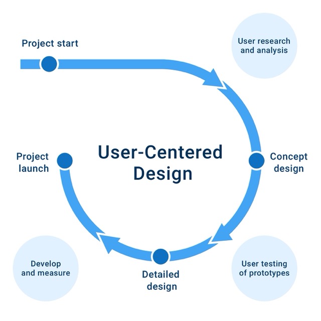
The User-Centered Design (UCD) process is used for designing and developing products with a focus on understanding the needs of the end-users (Usability.gov, 2023). There are several phases to UCD and Alimansyah (2023) breaks this down into several stages.
- User Research
- Beguin Designing
- User Testing
- Develop Prototype
- Finish
For this project taking a user-centric approach is going to be pivotal its the app’s success. I have first taken steps to understand who my target audience exactly is and now I will need to understand all of the needs.
PERSONAL INSIGHT
Now that I have a better understanding of my users and the issues they face it is important to realise their needs.
My Experience: From my own personal experience as a young carer I found it hard to come to terms with being labelled a ‘carer’. This quote from the NHS (2014) explains why so many people feel this way “Often younger carers are not known to be carers. They don’t tell relatives, friends or health and care professionals about their responsibilities because of a fear of separation, guilt, pride or other reasons.” other Charities and organisations have also picked up on this issue. This video from E-wellbeing (2023) aims to help young carers come to terms with their responsibilities. It also does a good job of telling the personal stories of some young carers that I find myself being able to relate to. Going forward it is important to remember the sensitivity behind being labelled a ‘carer’.
SECURITY
A huge issue with any app that takes a user’s personal data is making sure that information is secure. However, with an app that gets people to meet up in social situations, there needs to be a deeper level of security.
Apps like Tinder and other dating apps have this same issue. one way that they negate this is by using a verification system for their users. this lets other people know their identity is true and verified.
PARTNERSHIP
Kai Jun Eer is a researcher at EFI (Edinburgh Futures Institute). Kia’s research into digital security brought to light a new system called ‘Onboard.ID’. This new system aims to address the issue of verification by giving the user a decentralised identification system that they could manage. Users can create one-off digital identity verification that can be used across multiple platforms.
I believe that a service such as Onboard.ID could be a good potential partner for the app. This system would negate any identification problems and help create a secure environment for my users.
USER PERSONAS
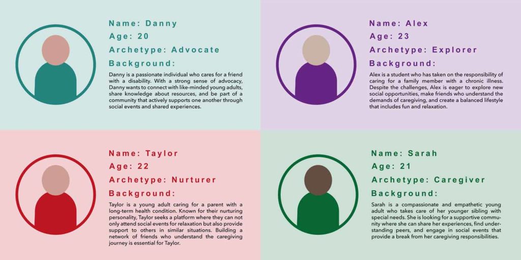
Using the research into my audience I created 4 user personas to display the range of my users. Each persona features the user’s name, age, Jungian Archetype and background. Jungian Archetypes can be used to create distinct user personas to help identify a brand’s target audience. You can see some of the research I did into Archetypes in my blog.
PEER FEEDBACK
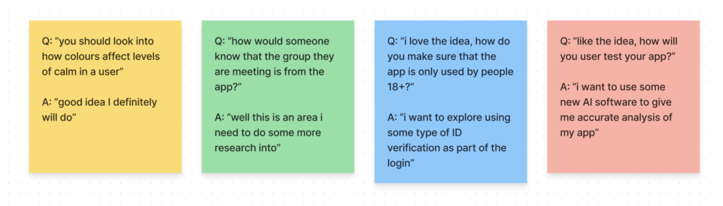
After receiving the feedback I immediately opened my notes and wrote down what people had said and how I responded. One concern that was raised was surrounding security issues. I have thought a lot about this issue and want to use some emerging technology to solve my issue. someone had also mentioned the use of colour psychology, something I have already had a look into during another blog.
EMERGING TECHNOLOGY
SECURITY ISSUES

While a system like Onboard.ID can provide this app with the necessary security of digital verification there are still issues that need addressing. To try and clarify these issues I sketched a very basic user flow for the app. I marked out with a start* the area of security issues. The first Issue highlighted was the user verification. However thanks to the research into Onboard.ID this issue has been negated.
The second and more prominent issue comes from a person going to an event and meeting up with people they might not have met before. A quote from my peer feedback was “How might the user be able to confirm the identity of a person/people they are meeting up with?” at first I thought that simply because of the user verification this separate problem would also be negated, but I think that this is an important point and so I want to investigate if there is any existing technology that I could adapt to work for this app.
MY PALN
I wanted to find a way for users to confirm the identity of a person that they are meeting with at one of the events. I wanted there to be some kind of physical interaction between people to give that feeling of a connection.
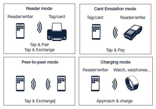
Apple, in 2023, launched its new “name drop” feature for a new IOS update. This new feature allows two people to share their contact information by simply holding their phone within a close perimeter.
HOW IT WORKS
Name Drop uses Near Field Communication (NFC). Lamberti (2020) Defines what an NFC is “NFC is an emerging short-range wireless communication technology that offers great and varied promise in services such as payment, ticketing, gaming, crowdsourcing, voting, navigation, and many others”. The variety of uses of the NFC technology can really benefit this project by helping make meet-ups/events more secure. another important factor is that this technology is not just used by apple phones. In fact most, if not all, modern smartphones feature NFC chips. This means that a feature local to my app would work across the different platforms.
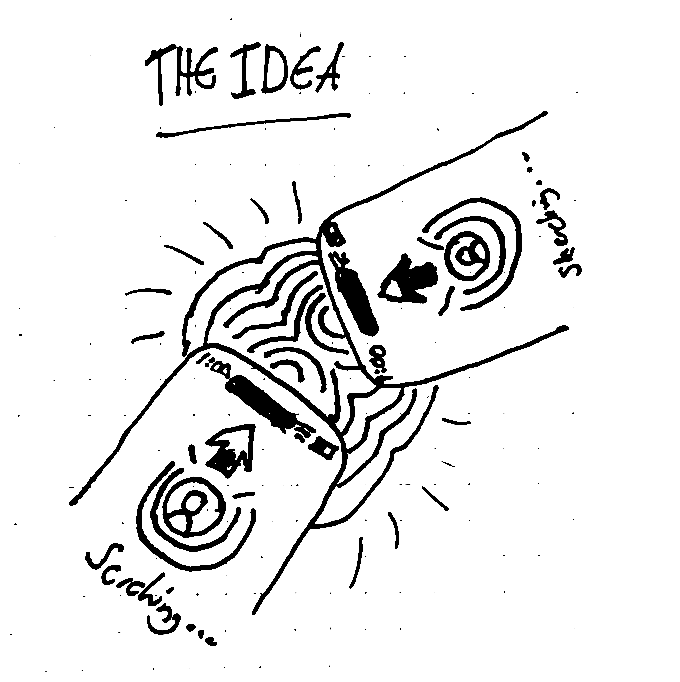
THE IDEA
I want my users to be able to confirm each other’s identities in person using my app. they will be able to select a ‘confirm identity’ button that will set their phone into search mode. when another user holds their phone close they will link up and confirm each other’s identities. I have produced a simple sketch of this idea.
STG GOALS
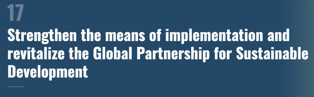
A crucial part of this project is ensuring that Connect aligns with the UN sustainability goals. Sustainable Development Goal 17 (SDG 17) focuses on “Strengthen the means of implementation and revitalise the Global Partnership for Sustainable Development” There are several this project can align itself with this goal.
-
Connect can become a tool for social good. It can enhance communication and collaboration among the users, making it easier to support Young Adult Carers and improve their overall quality of life.
-
Connect could play a crucial role in raising awareness about the challenges young carers face.
-
Connect has the potential to unite young carers globally, creating a sense of community and allowing knowledge to be exchanged between different regions.
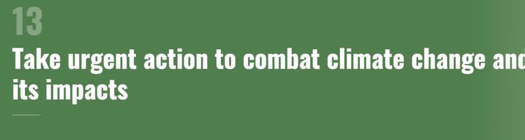
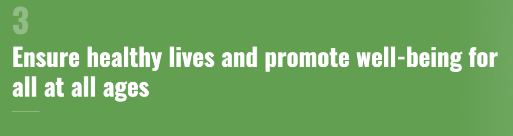
This project also aims to align itself with STG goals 13 & 3. I have listed ways that Connect can align itself to these goals.
Mental Health Support (STG 3): Connect will include features designed to provide mental health support for any of the users to be able to access. along with this the entire purpose of the app is to create an outlet for young adult carers.
Green UX Design (STG 13): At the top of any company’s priorities is sustainability, so to improve the CO2 emissions of the connect app there will need to be a conscious effort to design sustainably.
UX/UI RESEACH
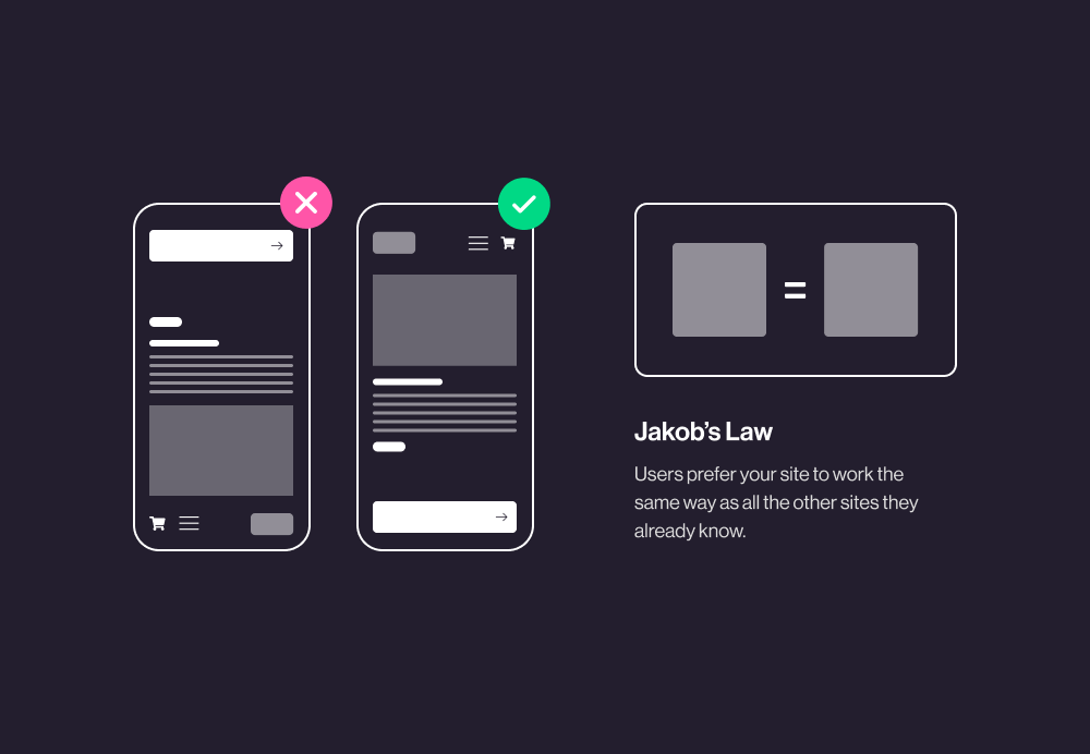
JAKOB'S LAW
The Nielsen Norman Group (2017) summarises Jakob’s Law by saying “Users spend most of their time on other sites. This means that users prefer your site to work the same way as all the other sites they already know. Design for patterns for which users are accustomed”. Users will have set expectations for the functionality and layout of the interface when visiting new websites or apps.
Examples of Jakob’s Law in practice:
- on any e-commerce website, you will nearly always find the ‘cart’ menu in the top right of the screen
- almost all social networking apps use the same basic menu system, a small navigation at the bottom of the screen with the home on the left side.
- the search bar function that features on many websites and apps will always appear at the very top of the screen.
Using the basic design principles that Jakob’s law brings to light, I will be able to produce an app that will be user-centred and function as an app is expected to.
fitt's LAw
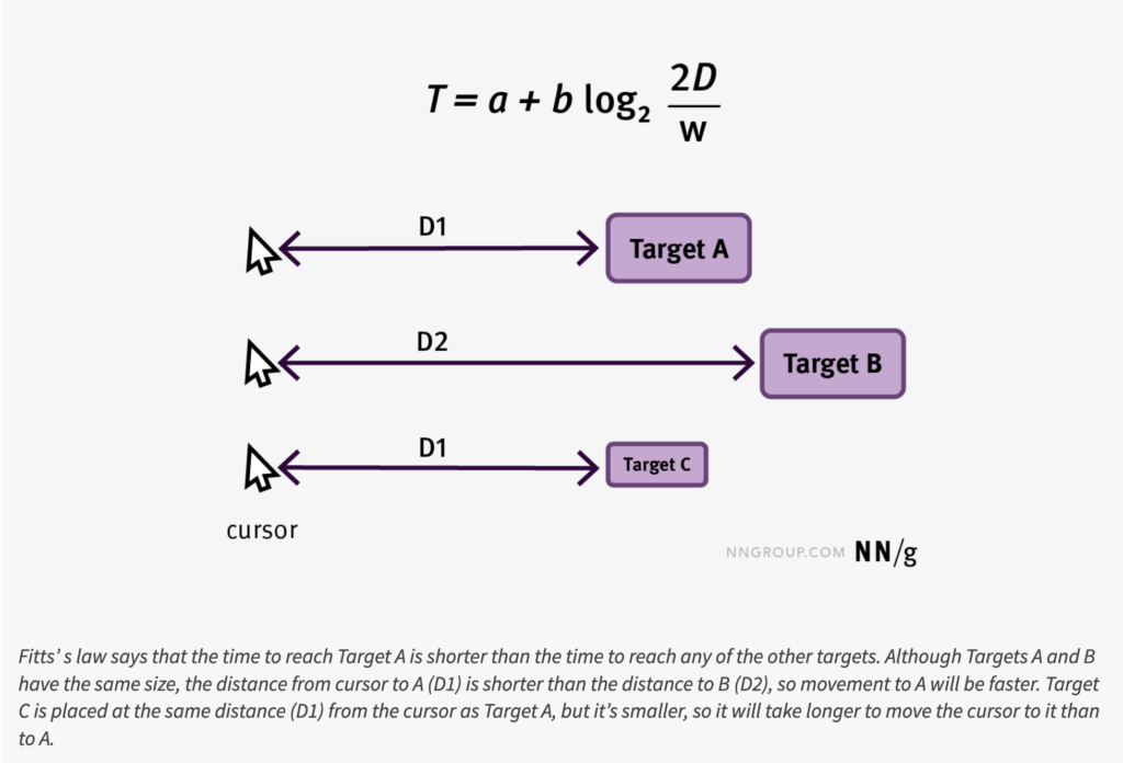
During One of my blogs this semester I took a look into the basic idea of Fitt’s law. you can read the blog by clicking the button below. The Nielsen Norman Group, define Fitt’s Law as “Fitts’s law gives us the relationship between the time it takes a pointer to move to a particular target to interact with it in some way” (2022). Essentially how users interact with UX and how to design to make it as efficient as possible.
Implementing Fitt’s Law into UX design helps create a seamless and easy-to-navigate interface for the user. Users are more likely to respond positively to an easy to use interface that makes their experience compatible, it will also create reasons for them to continue using the app. So when it comes to creating my designs for my App there will need to be a heavy consideration of the sizing and layout of the key interactive elements.
CARD SORTING
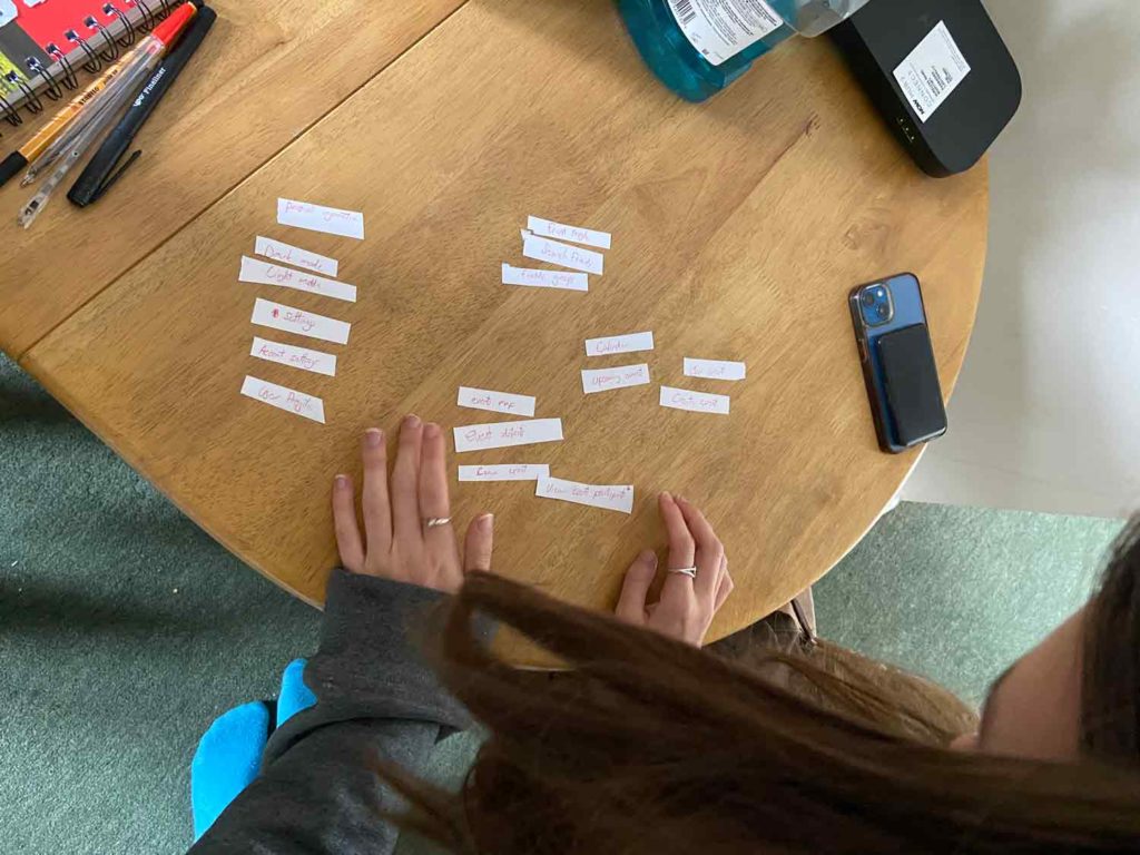
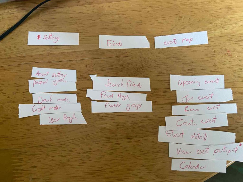
To be able to help enhance the usability of my app it will be crucial to organise information like menus and features in a way that aligns with other people’s opinions and not just my own. The Nielsen Norman Group (2018) conducted a study of 43 websites and found that the number 1 usability issue that that websites had cleanly been laid out in a way that made sense to the company but not the user. The process of card sorting is simple.
- I wrote out all the menus and features of the app on small bits of paper.
- I used one of my peers to begin grouping the cards into categories.
- once they have separated all of the cards into categories I can then document what they have done and take it into consideration.
When conducting my card sorting I noticed new patterns that I hadn’t before. My peer had separated the cards into 3 clear groups, Friends, Events and Settings. This practice was incredibly insightful and provided me with a strong basis to go on and create a site map using these categories.
site map
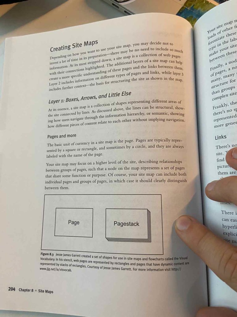
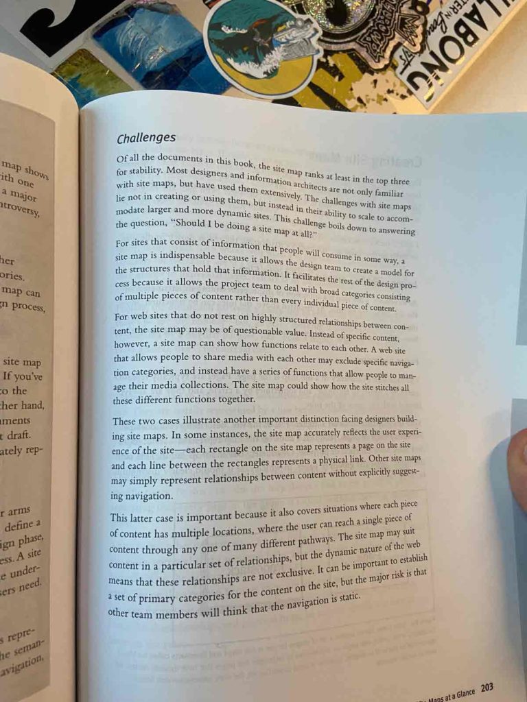
I used the research in the book “Communicating Design: Developing Web Site Documentation for Design and Planning” (brown, 2015) to help me create the early stages of development for my App. I took several photos of pages I found useful to later use as references.
Using the categories that had been created in the card sorting, I began laying out a basic site map highlighting the layout of the menus and key features. Most of the categories I used were based on card sorting however I did make some minor adjustments.
user flow
Creating visual flow of how a user will navigate thought my App. User flows can help highlight potential issues and hurdles that a user could face. This user flow demonstrates the full functionality of the app now called “Connect”. It shows the stage at of the sign up and having to prove a user identity with third part technology. They are then presented with the dashboard or ‘home page’ from witch the rest of the navigation can happen. Users will be prompted to customise their preferences such as location preferences. After this the user can progress through the app to the events page, from witch they join events and socials with peers.
CREATING A BRAND
I wanted to spend as little time as possible on the branding for this project as my main focus was ux/ui design. I had come up with the simple concept name of “Connect” and went straight into making a simple and basic logo. The logo I created represents the connection of individuals and the socialisation of groups. I wanted the branding to feel professional and simple and I believe I achieved that goal. I also created some sketches for an animation that can play as the user opens the app.
WIREFRAMING
Low fidelity wireframes
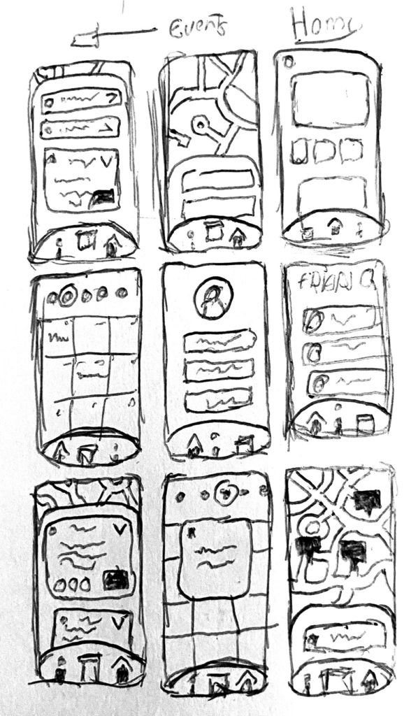
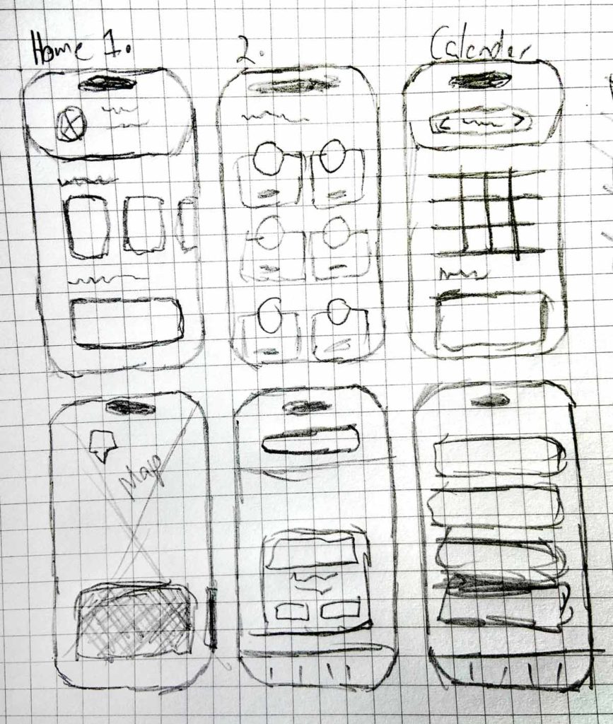
I began the designs with some low-fidelity wireframes to get my initial thoughts and ideas onto paper. The first image shows the very early sketches where I mainly focused on a geo-map events page. I added some slidable navigation menus with drop-down features to show all the local events. I also laid out what I thought the calendar page and home page would look like. The second image shows those sketched enhanced and altered. I came up with a unique interface for the dashboard/home that featured a drop-down user profile. I also went into more detail on the events page changing the interface slightly. I sketched some ideas for components to be used in the friends section of the app.
HIGH FIDELITY WIREFRAMES
I took my sketches and began developing some fidelity wireframes where I could start creating the basis for the entire app. It was during this part of the development that started to implement Fitt’s Law by making sure all buttons were of the correct size and within the thumb’s reach. I was also able to start layout out each section of the app using my site map to help label all the areas I needed.
PROTOTYPING
CREATING COMPONENTS
Components play a crucial role when designing an app in Figma as they can be used as a very efficient way to create consistency across my prototype. Components are reusable design elements that can be easily edited and changed across the project, for example, if I needed to change one small part of a component that features on the page, editing the master component will change all repeats. Below I have listed some reasons why I found using components essential to this project:
Time Efficiency: Time Efficiency: As mentioned before, if I needed to change any part of my design across the whole project all I would need to do is make the change to one master component thus saving countless amounts of time.
Animation: Components in Figma have the ability to animate independently from the frame making micro-interactions feel seamless across the prototype.
Library Management: Figma allows me to be able to organise all of my components into libraries. this makes it easy to assess and sort through all of the different parts of my design.
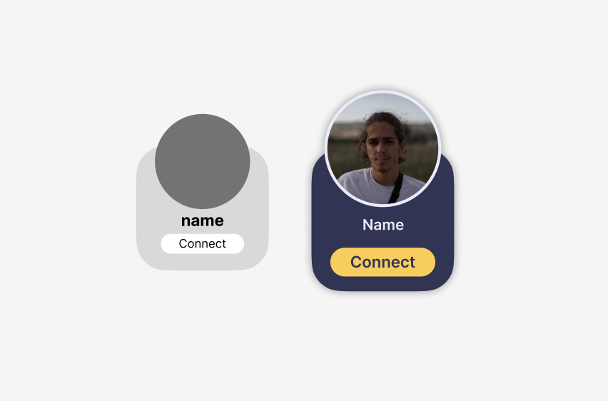
The first step to creating a component for my project is making a basic layout in my high-fidelity wireframes. These basic versions are smaller and only feature the necessary elements. In this example, I wanted to create a widget to be displayed on the homepage under the “quick connections” part. This widget needed to feature a user’s profile image and name along with a “Connect” button. I also used this stage of the design process to test out a micro animation, but as you can see it was not 100% smooth.
After the components had been created in the wireframes they then used them as a reference when creating the final prototype. In the image, I have shown the wireframes vs the final design and as you can see I adjusted the size and the typography, but the basic look stayed the same.
APPS FUNCTIONS
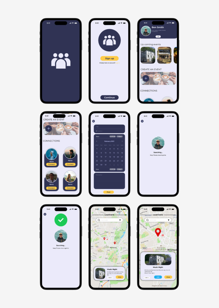
SIGN UP
Many apps feature a small animation of the logo as the user clicks into the app. This can be for many reasons but it mainly provides the user with visual feedback letting them know that their action has been registered and the app is loading. Here you can see the very small animation I created to front the Connect app.
When sketching the design of the logo I had intended for a small animation to be created and thus create a short storyboard of the action. The idea was simple, have a stand-alone icon to signify the single user with two more appearing from behind, signifying the user making new connections.
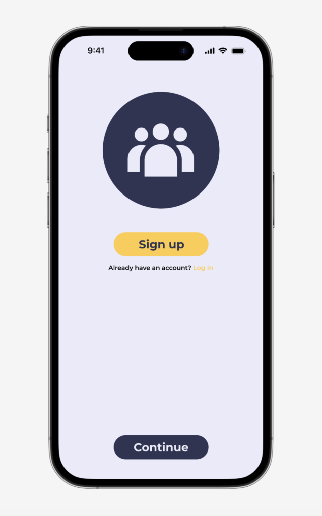
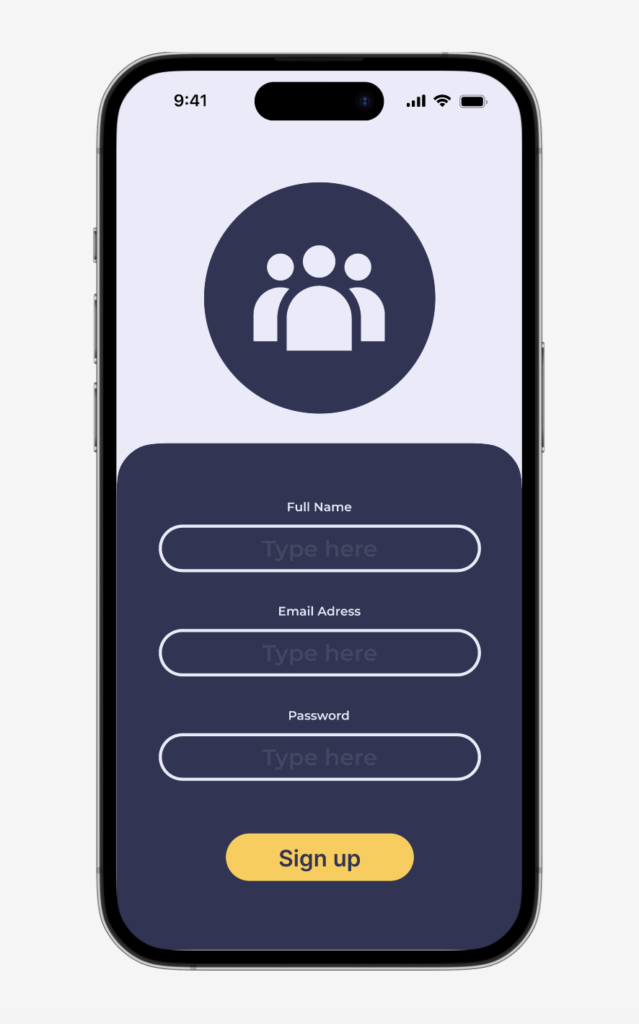
After the short loading animation, a new user will be dropped into the “Sign Up” page. This is going to be a necessary part of Connect as users will need to have their own profiles. As there will also be a big emphasis on identifying the users to ensure they are 18+ it will be necessary to collect their information. I have made this page as simple as possible to allow the user to process the information in a logical manner. I have also given the user an option to skip the sign-up if they already have an account.
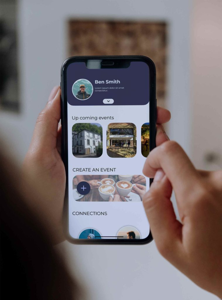
HOME PAGE
I have designed the Dashboard/homepage with a focus on simplicity and user-friendliness, as overwhelming design can often be of putting to a user. At the top of the home page, the users have quick access to their profiles allowing for personalisation and settings management.
The central section of the home page shows the user some of the upcoming events in their area, ensuring users are informed and encouraging active participation within the community. This chronological display of events serves to keep users engaged and connected with the interface. Directly beneath there is a feature that enables the user to create their own events. This function will take the user away from the home page so I will cover this in the next section.
Towards the bottom of the home page, there is a list of recommended connections. these connections are tailored to match user profiles and the event they have recently been to. By suggesting potential connections, the app seeks to broaden social circles hence the name “connect”.
If the user chooses the create their own social event from the home page they will be taken to this menu. This menu provides the user with everything they will need to create a new event that will appear on other users’ Geo-maps. I wanted all of the options on this page to work as dropdowns so, once again, the user didn’t feel overwhelmed by information. you can this this drop-down functionality working in the example provided.
The options the user is provided with are as follows.
- Title: e.g. “Live Band and Drinks”
- Location: This will pin the event location for other users to see
- Date and Time: This allows other users to easily put this into their calendar and even receive notifications when the event is about to start.
- Description: A short description of the event for other users to help them understand what the event will entail.
EVENTS
This is the events page of the Connect app. Users can access this through the navigation menu. The page uses Google Maps to show all of the upcoming events in the user’s area. The use of Geo-map locations offers the users an easier way to explore the local events based on their location.
At the top of the page is a search bar, allowing the user to easily find their local area or check out other places. At the bottom of the screen, a scrollable menu feature allows users to browse through various events in their chosen area. Clicking on one of the events will bring up some more information about the event and give the user a choice to join the event or close the menu. After joining an event, it is automatically added to the user’s calendar, ensuring that users do not miss the event.
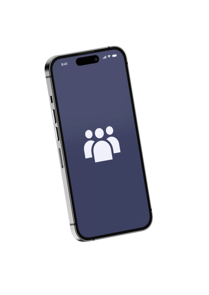
FRIEDNS
In the background of this page, there is a pulsing animation I created using Components that act solely as a visual clue to the user to show them that the app is functioning as expected. As a UX designer, my primary focus of this page is to give visual feedback to the user. Users need assurance that the app is actively working on their requests, and the pulsing animation is an indicator of ongoing searching processes.
Users will be able to easily access this function directly from the home page. This allows for quick and straightforward navigation. Below, an example illustrates how the function works. When the users initiate the function and hold their phones close together they will immediately receive feedback from the app showing the function working. This is the part of the app that will use Near Field Communication (NFC) technology to help users connect and confirm each other’s identities.
OUTCOME
I have completed the creation of a prototype app that has multiple pages and functions, providing a strong representation of the Young Adult Carers app. The designs underwent a series of iterations, refining all of the features to optimise user experience. This iterative approach was rooted in user-centric design and allowed a more precise targeting of my target audience.
The prototype features various functional pages, including a home page, events page, calendar, and specialised identification features that use NFC technology. Each page has its own purpose and functionality aimed at helping my target audience.
REFLECTION
As part of my project reflection I have listed what went well and areas I could have improved if given more time.
What Went Well:
- Thorough Research: I am proud of the level of research that was conducted during this project. without this, I wouldn’t have been able to understand the complex needs of my audience thus affecting my ability to design a good app.
- Application of User Needs: The needs of the users that had been identified were well integrated into the app design. this ensured that the final product was able to address these needs and give my users a comfortable and safe experience
- Design Process: I was able to go through all the stages of design, Research, initial design, feedback, iterations and final results. This was because I had a comprehensive methodology and time management.
- NFC Security Function:
- Successfully creating the NFC security function demonstrated a commitment to user safety. This technology enhances the overall security of the app, particularly in facilitating user verification during meetups.
Things I Would Do Differently:
- Branding Focus: If I was able to dedicate more time to the branding it could have helped further strengthen the app’s Identity however for this project that was not the top priority.
- Advanced Prototyping: If I was able to have more time then I would have taken the prototyping to the next stages allowing for more refinement and detail. I may have been able to add in some more advanced interactive elements to further strengthen the user experience.
Recommendations:
- NFC Technology Research: I would recommend that there is further research into NFC technology so that security functionality remains at the app’s heart.
- Brand Development: The creation of a complete brand for marketing purposes.
- User Testing: As I was unable to conduct user testing on my intended area due to sensitivity issues, so if this project was taken further then conducting user testing would only help enhance this app.
Conclusion:
The strong research foundation, successful integration of user needs, and the creation of the NFC security function contribute to a robust and user-friendly app. Acknowledging areas for improvement, such as branding and prototyping, provides valuable insights for future projects. Overall, this project stands as a testament to effective research, design, and the pursuit of a user-focused approach.
In Conclusion because of my strong foundation of research, my application of user needs, and the creation of the security NFC system i believe have created a robust and user-friendly app. I have also made sure to meet all of the objectives that I had laid out at the start of the project. Objective 1 was to “Produce an interactive prototype of the app in Figma”, This objective was the overall goal of the project, and I believe I have fully met this objective by creating full prototypes for all functions of the app. Objective 2 was the “Integration of Emerging Technologies” and this was completed through the use of NFC Technology to create a secure way for my users to identify each other in person. Objective 3 was to “Address Mental Health Issues In Young Carers”, This was, in my opinion, the main objective for this project and I feel like my app is a sociable and sensitive way to help young Adult carers find social circles where they can meet likeminded individuals and participate in group events. All of these factors will help lead to improved mental health in young carers across the country.
BIBLIOGRAPHY
Action Mental Health | Enhancing quality of life and employability for people with mental health needs. (2021). If you know a young carer, can you lend an ear of support by phone or by zoom? | Action Mental Health. [online] Available at: https://www.amh.org.uk/if-you-know-a-young-carer-can-you-lend-an-ear-of-support-by-phone-or-by-zoom/ [Accessed 22 Nov. 2023].
Alex, A. (2023). Understanding User Needs: The Core of User-Centric AI. [online] Medium. Available at: https://bootcamp.uxdesign.cc/understanding-user-needs-the-core-of-user-centric-ai-74420cc08901 [Accessed 7 Jan. 2024].
Android Developers. (2023). Near field communication (NFC) overview. [online] Available at: https://developer.android.com/develop/connectivity/nfc [Accessed 27 Nov. 2023].
Apple Support (2023). How to use NameDrop on iPhone | Apple Support. YouTube. Available at: https://www.youtube.com/watch?v=aZL5D1k-4aI [Accessed 27 Nov. 2023].
Carer Support Dorset (2020). Helpful apps for carers. [online] Carersupportdorset.co.uk. Available at: https://www.carersupportdorset.co.uk/information-hub/helpful-apps-for-carers/ [Accessed 7 Jan. 2024].
Carers UK. (2019a). About us | Carers UK. [online] Available at: https://www.carersuk.org/about-us/ [Accessed 7 Jan. 2024].
Carers UK. (2019b). Jointly app for carers | Carers UK. [online] Available at: https://www.carersuk.org/help-and-advice/technology-and-equipment/jointly-app-for-carers/ [Accessed 7 Jan. 2024].
Caring Together. (2017). NHS England – Young Adult Carers – Caring Together. [online] Available at: https://www.caringtogether.org/news/nhs-england-young-adult-carers/ [Accessed 21 Nov. 2023].
Co, P. (2020). Popl – Digital Business Card. [online] Popl. Available at: https://popl.co/pages/namedrop [Accessed 27 Nov. 2023].
e-wellbeing (2023). Realising you are a Young Carer. YouTube. Available at: https://www.youtube.com/watch?v=kbYjUIZf4s8 [Accessed 25 Nov. 2023].
Ecky Alimansyah (2023). Understanding User Needs: A Guide and Some Tips to Conducting Effective UX Research. [online] Medium. Available at: https://uxplanet.org/ [Accessed 7 Jan. 2024].
Gilmore, N. (2016). The Advantages of Gantt Charts in Project Management. [online] Teamgantt.com. Available at: https://www.teamgantt.com/blog/10-benefits-of-using-a-gantt-chart-of-your-next-project [Accessed 21 Nov. 2023].
Harle, E. (2023). Nearly 140,000 young people providing unpaid care to loved ones, census finds. [online] CYP Now. Available at: https://www.cypnow.co.uk/news/article/nearly-140-000-young-people-providing-unpaid-care-to-loved-ones-census-finds [Accessed 21 Nov. 2023].
Health (2016). Strong relationships, strong health. [online] Vic.gov.au. Available at: https://www.betterhealth.vic.gov.au/health/healthyliving/Strong-relationships-strong-health [Accessed 22 Nov. 2023].
https://www.smashingmagazine.com/author/steven-hoober (2022). Fitts’ Law In The Touch Era — Smashing Magazine. [online] Smashing Magazine. Available at: https://www.smashingmagazine.com/2022/02/fitts-law-touch-era/ [Accessed 22 Dec. 2023].
Jointlyapp.com. (2024). Jointly. [online] Available at: https://jointlyapp.com/ [Accessed 7 Jan. 2024].
News, I. (2018). Young adult carers | ITV News. YouTube. Available at: https://www.youtube.com/watch?v=IVX2X_UYD2A [Accessed 21 Nov. 2023].
Nielsen Norman Group. (2022). Fitts’s Law and Its Applications in UX. [online] Available at: https://www.nngroup.com/articles/fitts-law/ [Accessed 22 Dec. 2023].
Player, P. (2020). What is User-Centered Design? – The Product Playbook – Medium. [online] Medium. Available at: https://medium.com/is-that-product-management/what-is-user-centered-design [Accessed 7 Jan. 2024].
Pringle, F. (2022). Improving online identity verification processes and reimagining data security – Edinburgh Futures Institute. [online] Edinburgh Futures Institute. Available at: https://efi.ed.ac.uk/improving-online-identity-verification-processes-and-reimagining-data-security/ [Accessed 25 Nov. 2023].
ResearchGate. (2022). Worsened carer mental health, increased stress and reduced social… [online] Available at: https://www.researchgate.net/figure/Worsened-carer-mental-health-increased-stress-and-reduced-social-network-reported-in-the_fig3_358587654 [Accessed 22 Nov. 2023].
Solihull Carers (2022). Young Adult Carers in Solihull. YouTube. Available at: https://www.youtube.com/watch?v=gPQkmK2FVvA [Accessed 21 Nov. 2023].
STMicroelectronics. (2022). What is an NFC Chip? – STMicroelectronics. [online] Available at: https://www.st.com/content/st_com/en/support/learning/essentials-and-insights/connectivity/nfc/nfc-chips.html [Accessed 27 Nov. 2023].
UXPin (2023). Top Methods of Identifying User Needs. [online] Studio by UXPin. Available at: https://www.uxpin.com/studio/ [Accessed 7 Jan. 2024].
Vedat Çoşkun, Büşra Özdenizci and Ok, K. (2015). The Survey on Near Field Communication. Sensors, [online] 15(6), pp.13348–13405. doi:https://doi.org/
X (formerly Twitter). (2023). Available at: https://twitter.com/CarersUK/status[Accessed 22 Nov. 2023].
Yoh, K. (n.d.). Mental Health Stigma: A Wicked Problem Mental Health Stigma: A Wicked Problem. [online] Available at: https://research.library.kutztown.edu