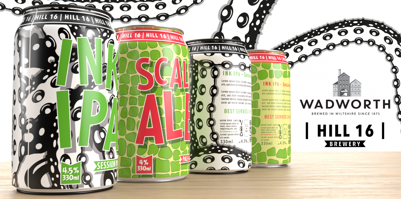
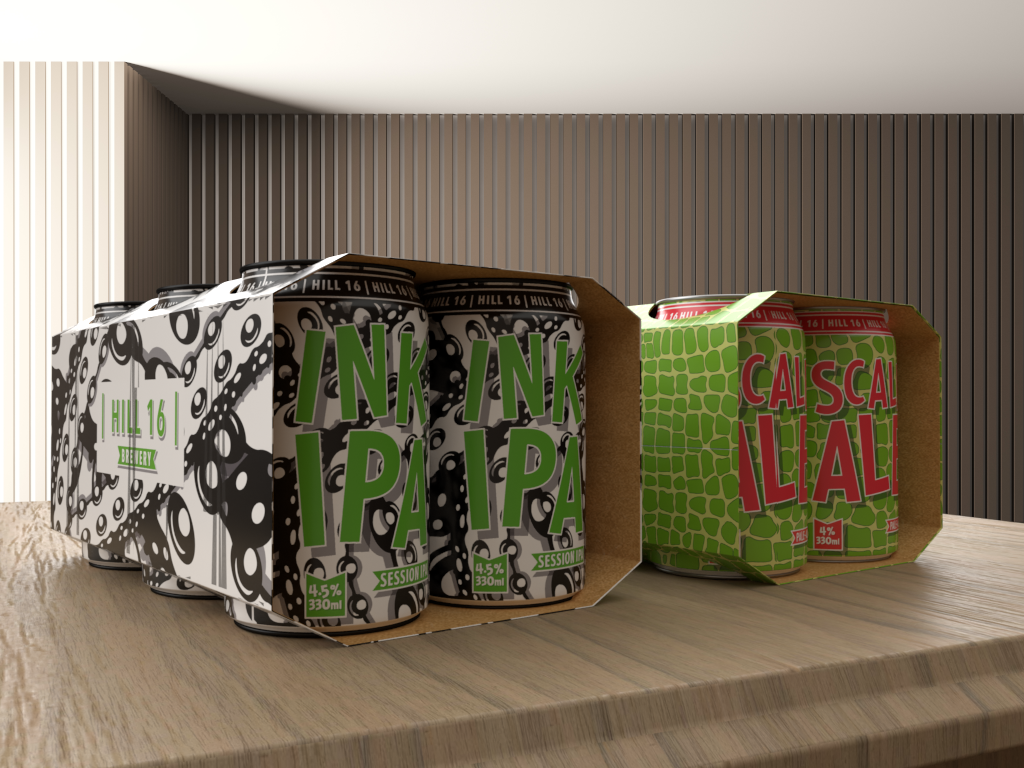
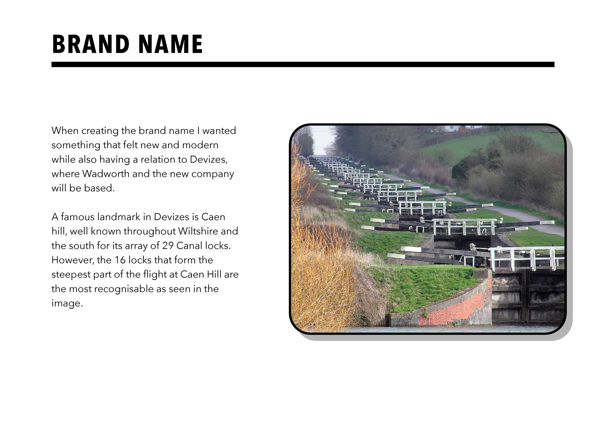
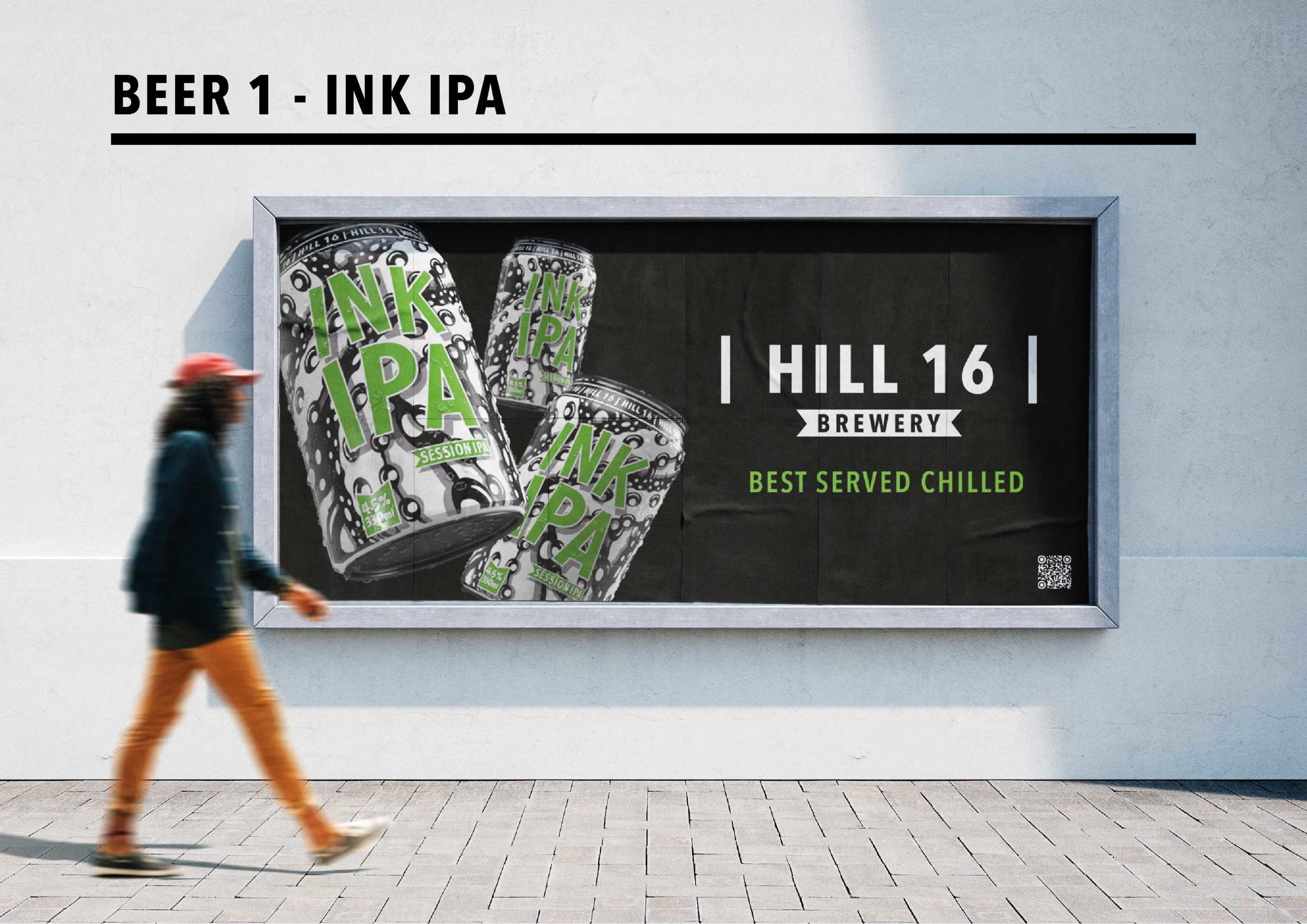
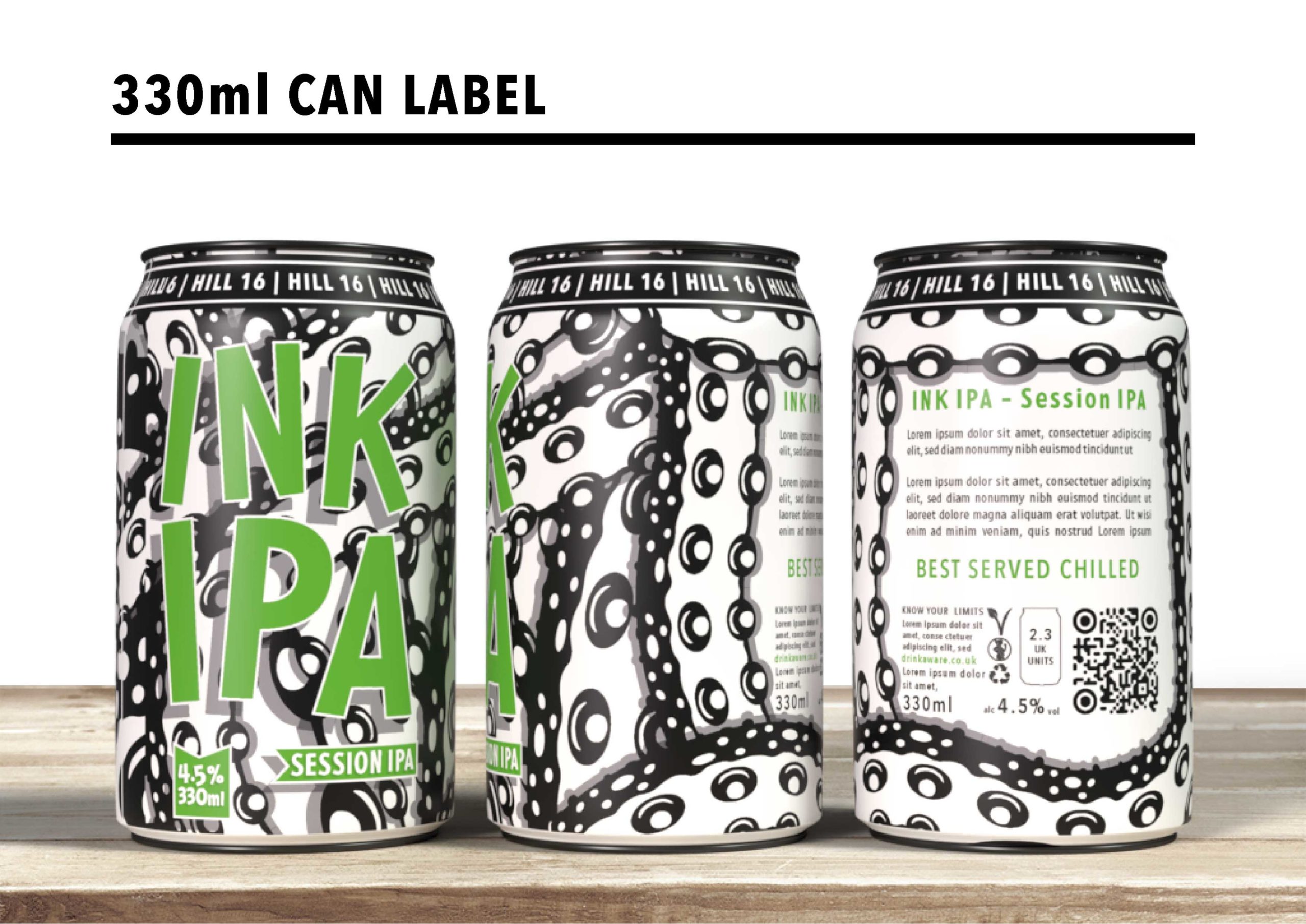
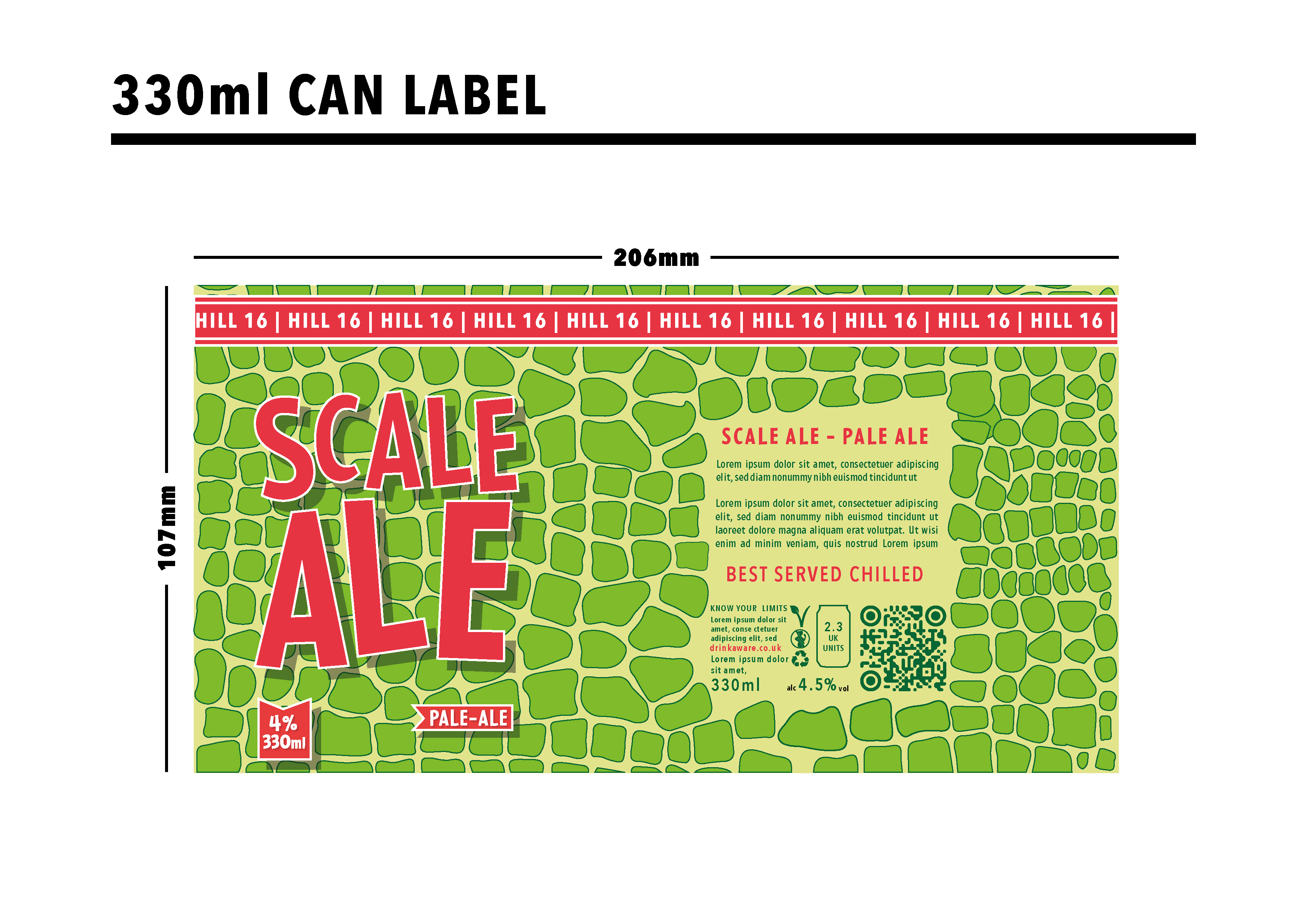
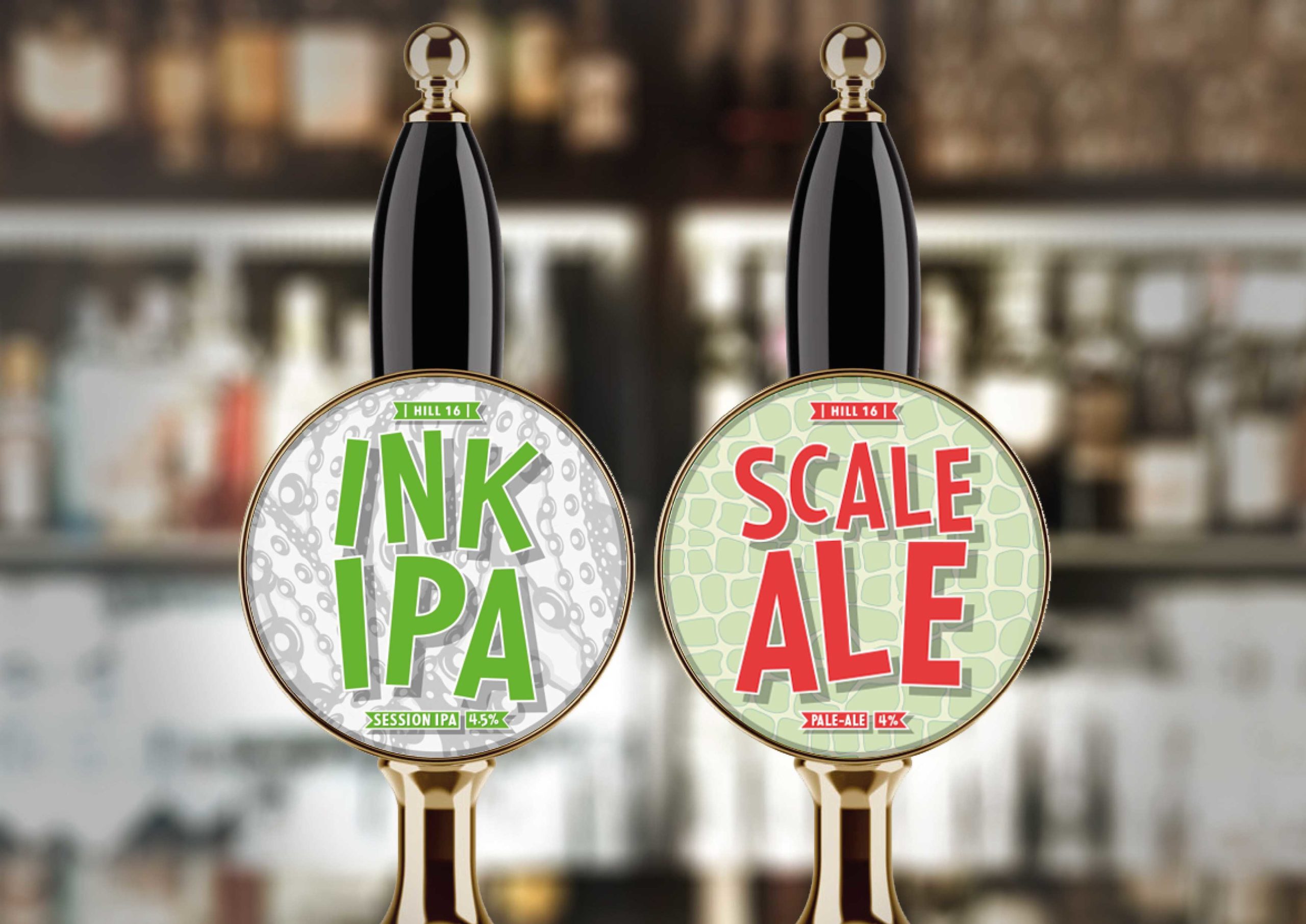
This Project is my entry for the WADWORTH branding competition for their new brewery. For this project, I needed to come up with the brand name, logo, and two beer can designs. Firstly I created the brand “HILL 16”, a name I came up with based on the Cean hill locks in WADWORTH’s home town Devizes. After creating the brand name and logo I began my work on the beer can designs. I wanted to focus my design around nature while also being able to make them stand out on the shelves. INK IPA’s design is based around octopus and squid as their alien-like tentacles made an eye-catching design. SCALE ALE’s design uses classic reptile scales to create a unique-looking design
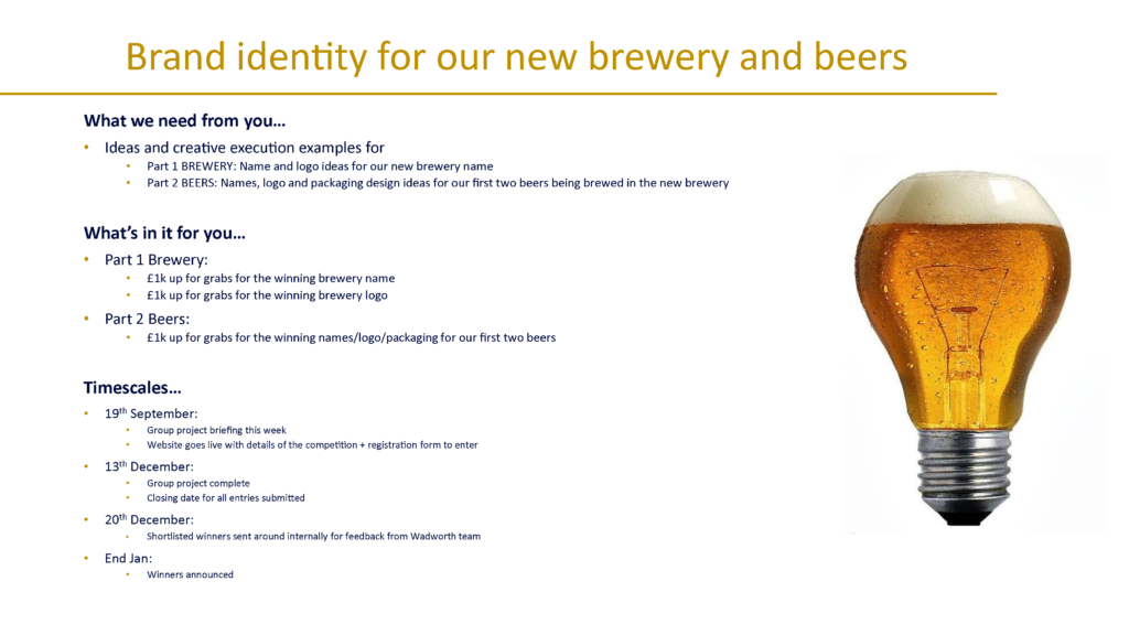
THE BRIEF
TIME MANAGEMENT
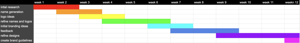
I organised a timeline for this project as soon as I read the brief, as it had a strict competition deadline. This timeline was mapped out to include all of the goals I wanted to achieve and was clear and concise. Creating a timeline before starting a project is a great way to stay on track and can provide smaller deadlines to work towards.
RESEARCH
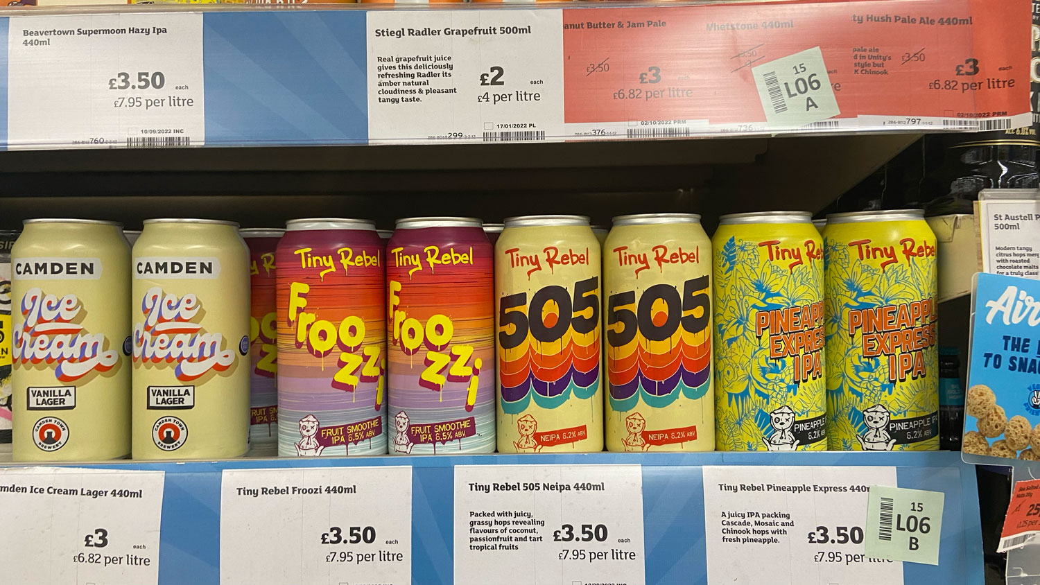
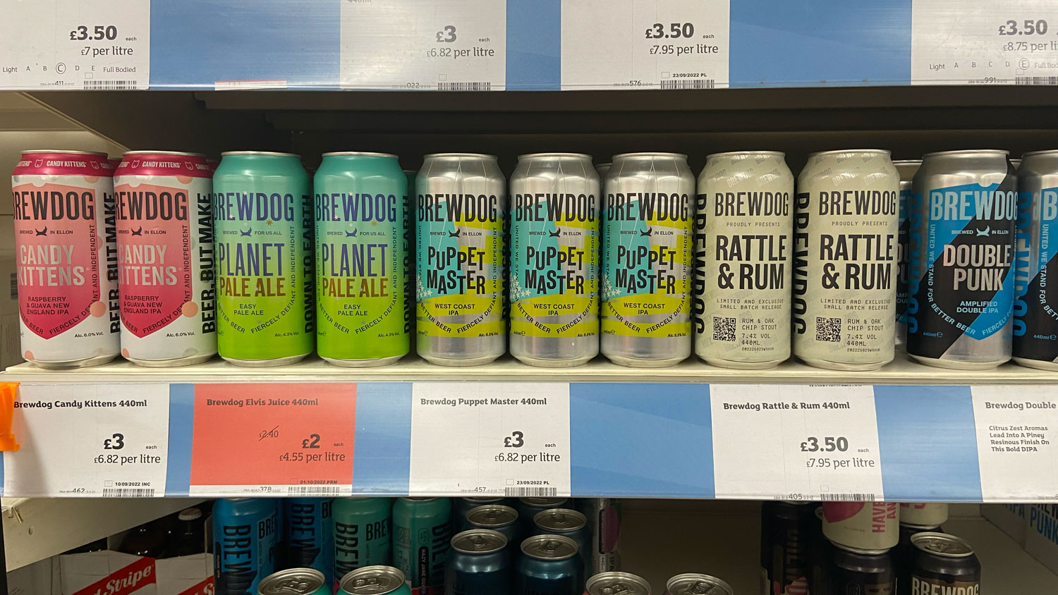
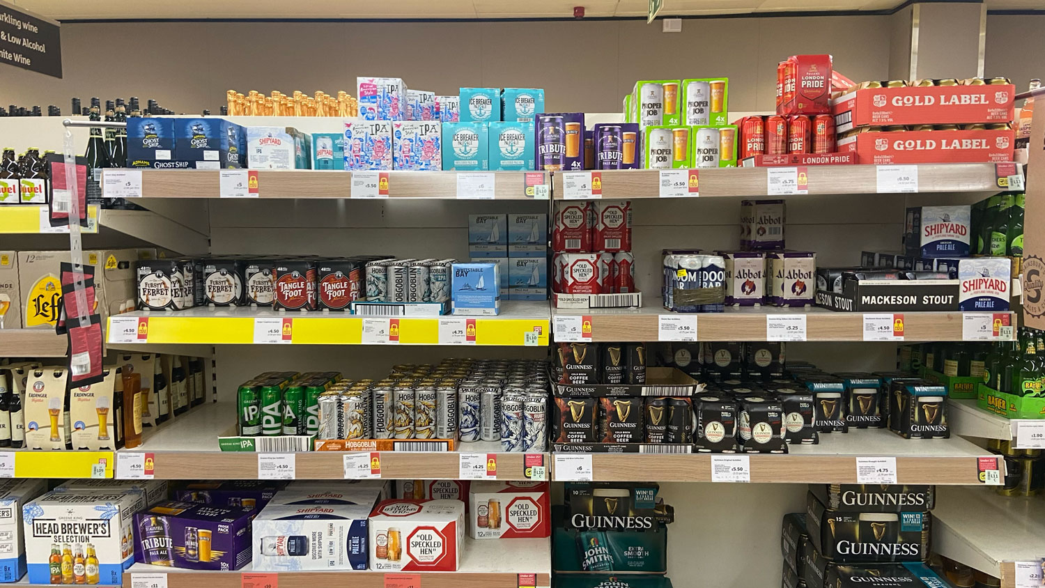
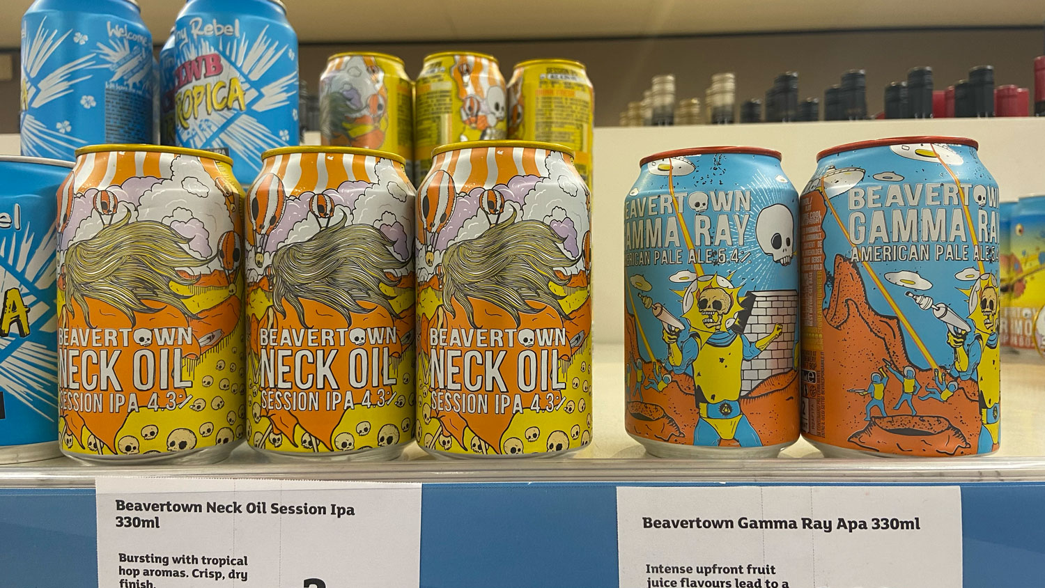
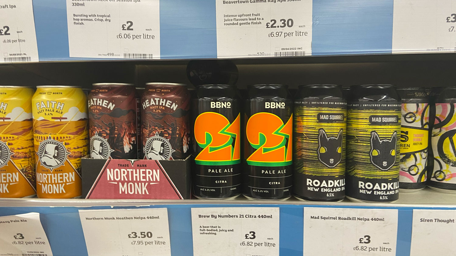
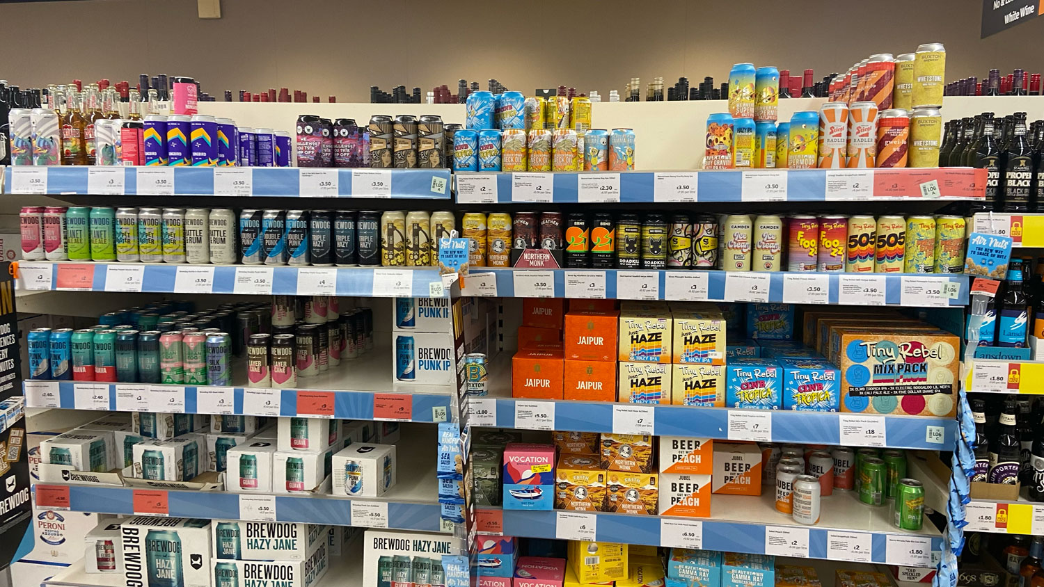
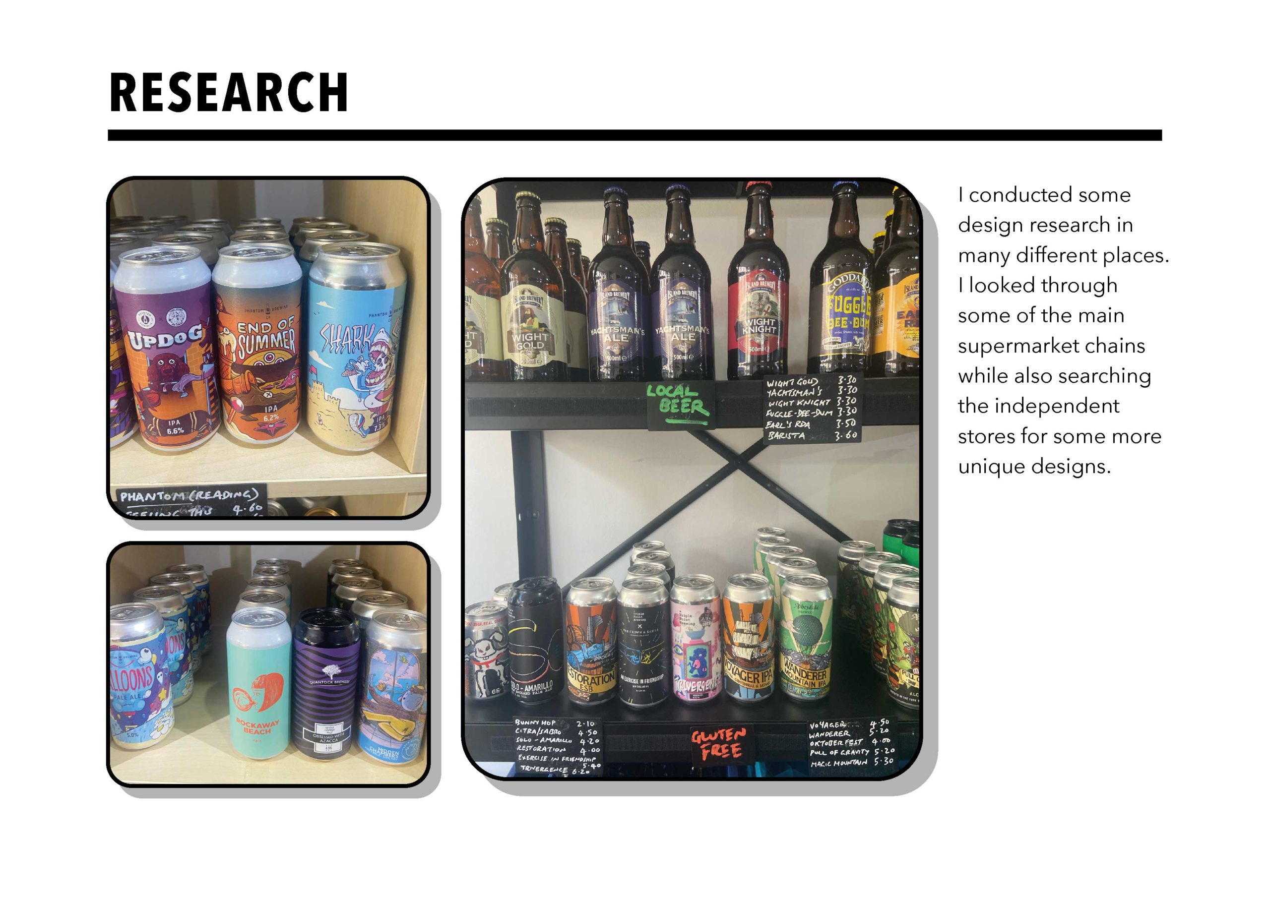
After receiving the brief, I conducted initial research into top brewing companies by visiting supermarkets to observe their current stock. The three biggest brands I observed were BREWDOG, BEVERTOWN, TINY REBEL, and CAMDEN. Each of these companies used unique styles of branding that were easy to identify and select from the shelves. BEVERTOWN and TINY REBEL opted for graphical designs, using artwork as the main feature of their cans. Meanwhile, BREWDOG and CAMDEN had chosen a bolder, modern style, with typography as the main feature.
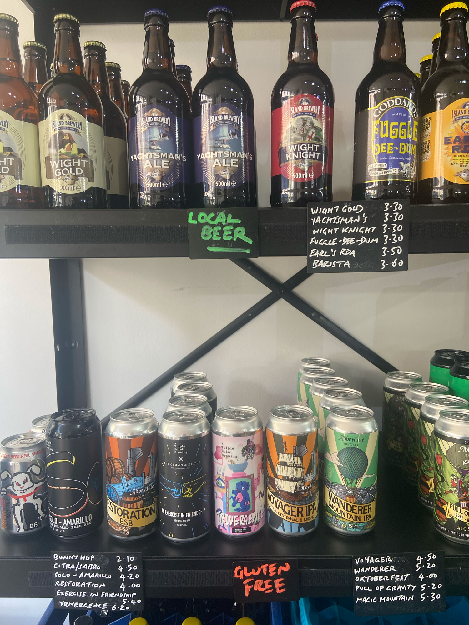
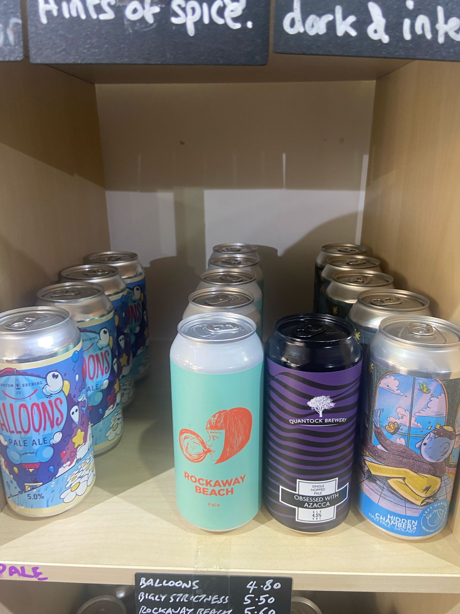
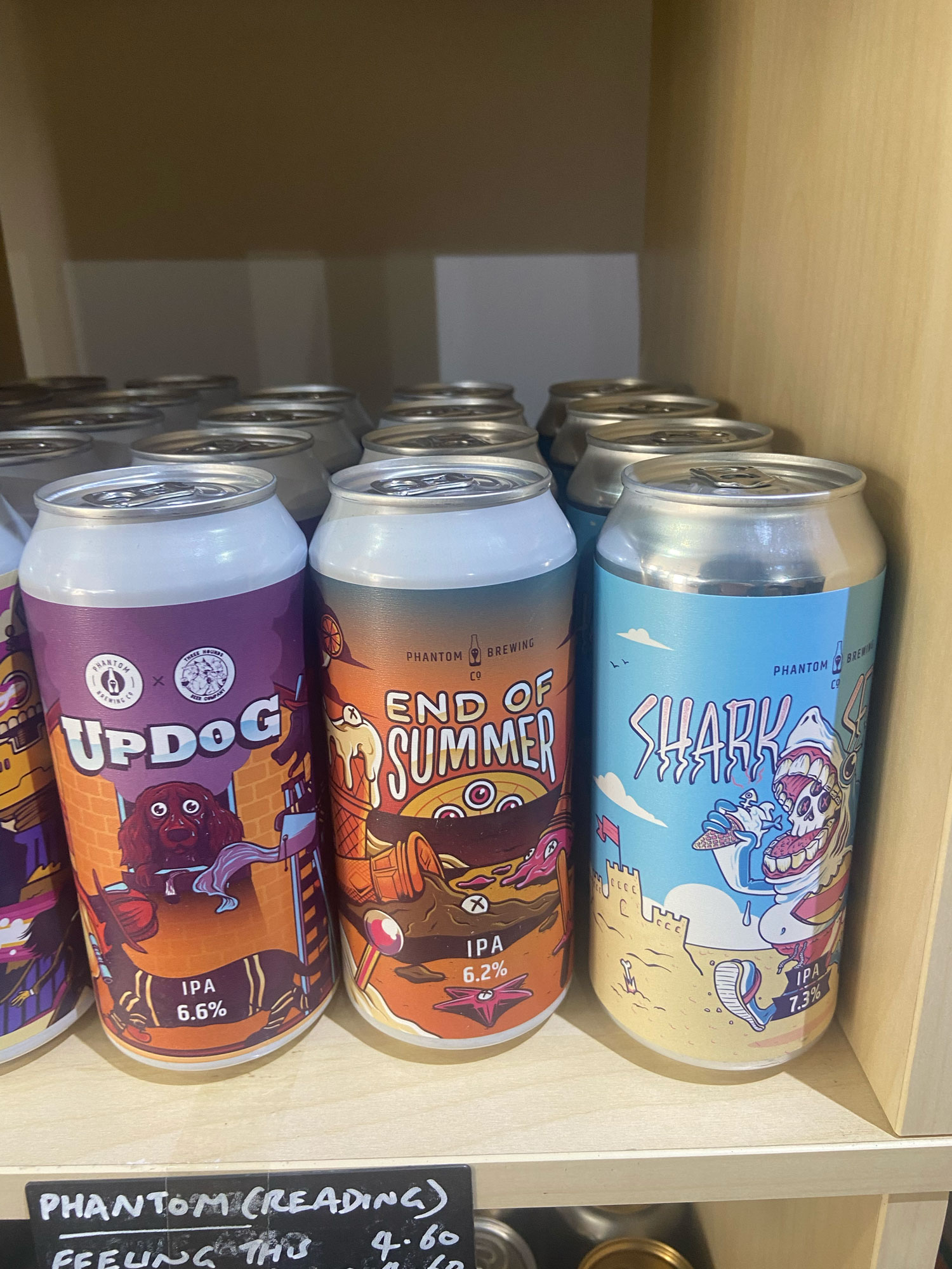
After visiting the larger supermarkets, I ventured to independent, craft beer stores, where I found an impressive selection of unique brews. My eye was immediately drawn to “Phantom Brewing” which had particularly captivating graphic artwork on its cans. I was so enchanted by the visuals that it inspired me to create my own graphic–style designs for beer cans.
NAME GENERATION
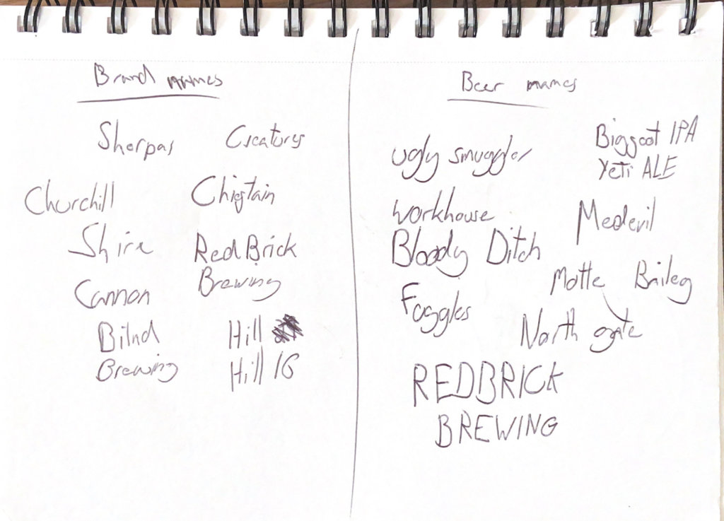
With my research into the local area complete, I was ready to start brainstorming potential names for my beers and the overarching brand. Eventually, I settled on “HILL 16“ as the overarching brand name, a nod to the Ceasnor Hill locks in Devizes. For the individual beers, I only found one name that I felt was suitable – UGLY SMUGGLER – which I thought was apt due to the area‘s rich smuggling history. Now, I was ready to begin work on the logo.
DESIGN SUSTAINABILITY
Making sustainability a core part of my design process has become increasingly important in recent years, due to the rapid expansion of User Experience (UX) design. Many businesses are embracing UX to enhance their products and services (Adobe Ideas, 2021)[online], which refers to the process of creating an interface that is both user–friendly and enjoyable. To achieve sustainability in my designs, I focus on techniques such as choosing darker colours, and optimising images or designs so they are PNGs or small file sizes.
LOGO DEVELOPMENT
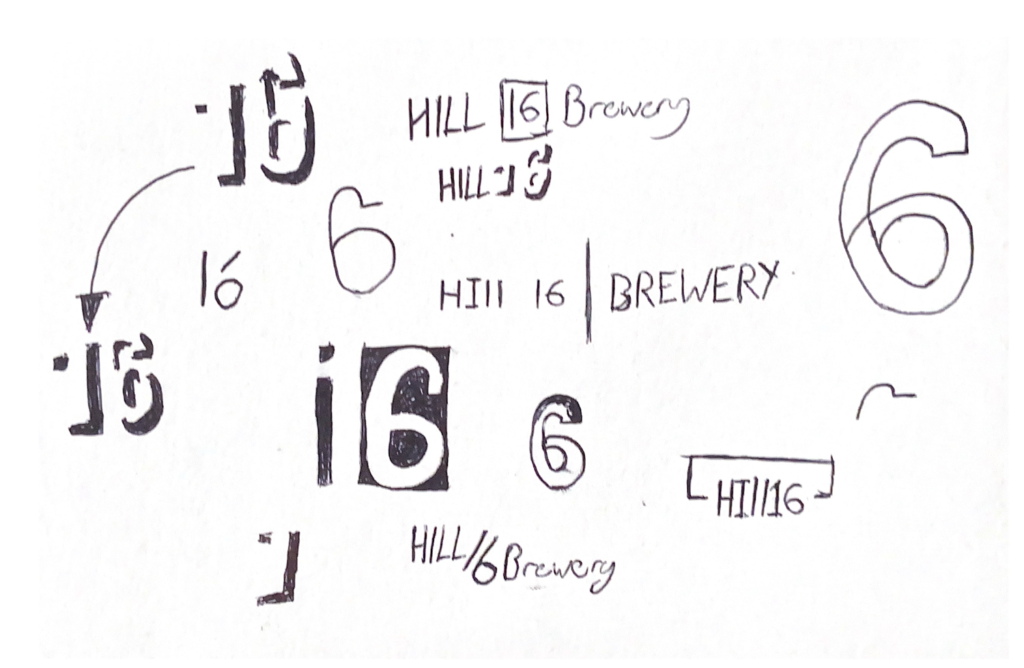
I began with some simple sketches to grasp an understanding of my design style and choices. I aimed to create a logo that felt slick and modern while also calling back the heritage of the company.
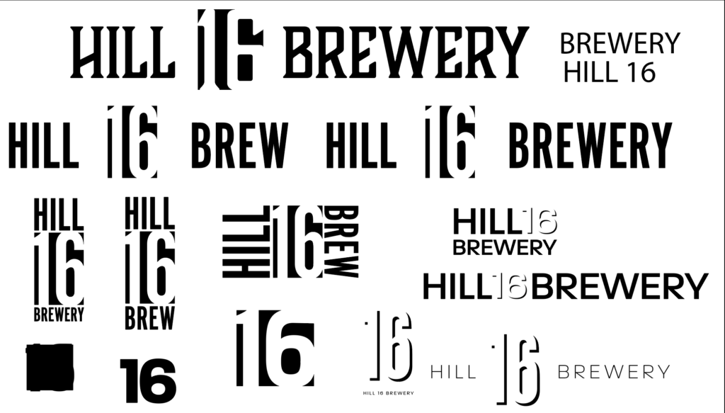
Beginning with a few ideas sketched on paper, I moved the design to Adobe Illustrator to begin experimenting with fonts, layouts, and other elements. I created a variety of designs, allowing the client and me to refine and decide on the best possible outcome for the project. This approach gives us both more options for the final design.
I then refined the designs until I was left with these designs. I would go on to use these designs through some of the initial beer design concepts then later after feedback, I would go on to adjust these designs
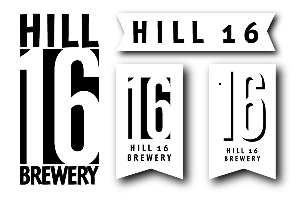
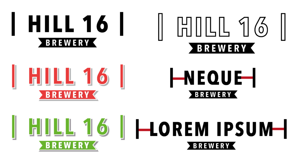
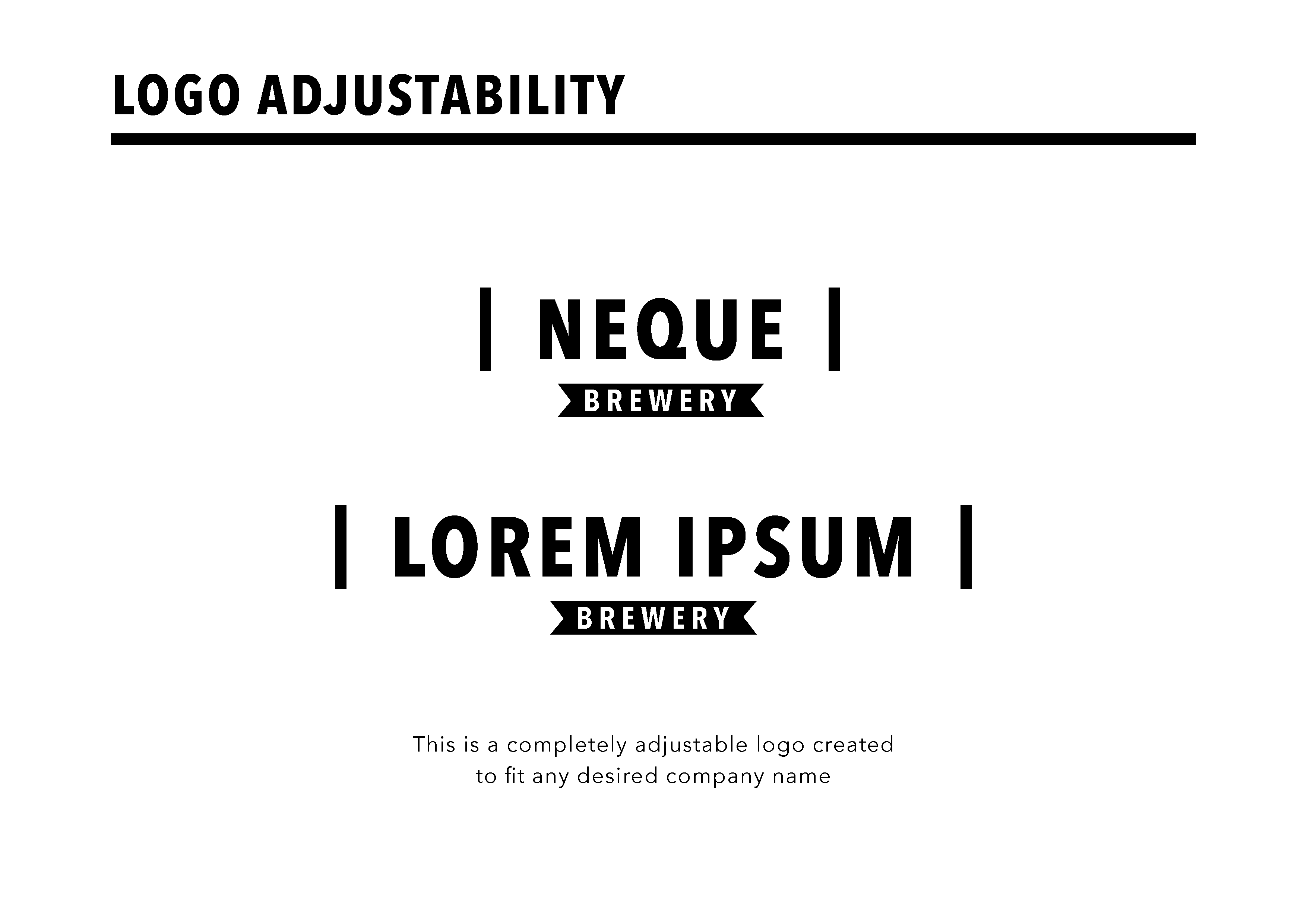
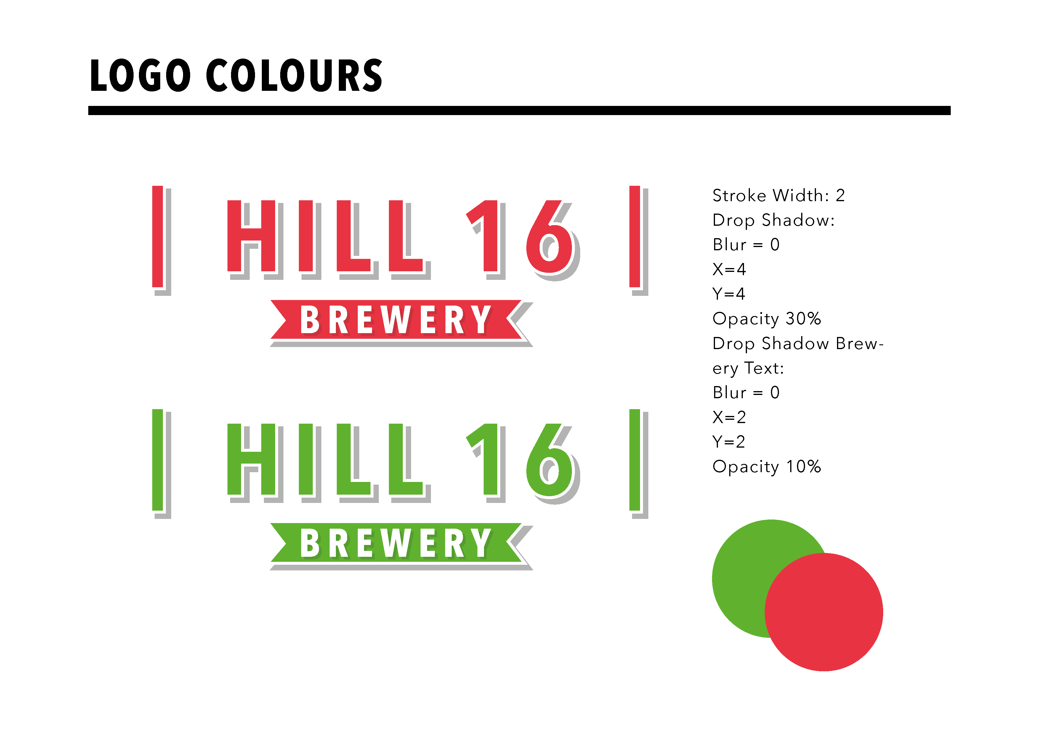
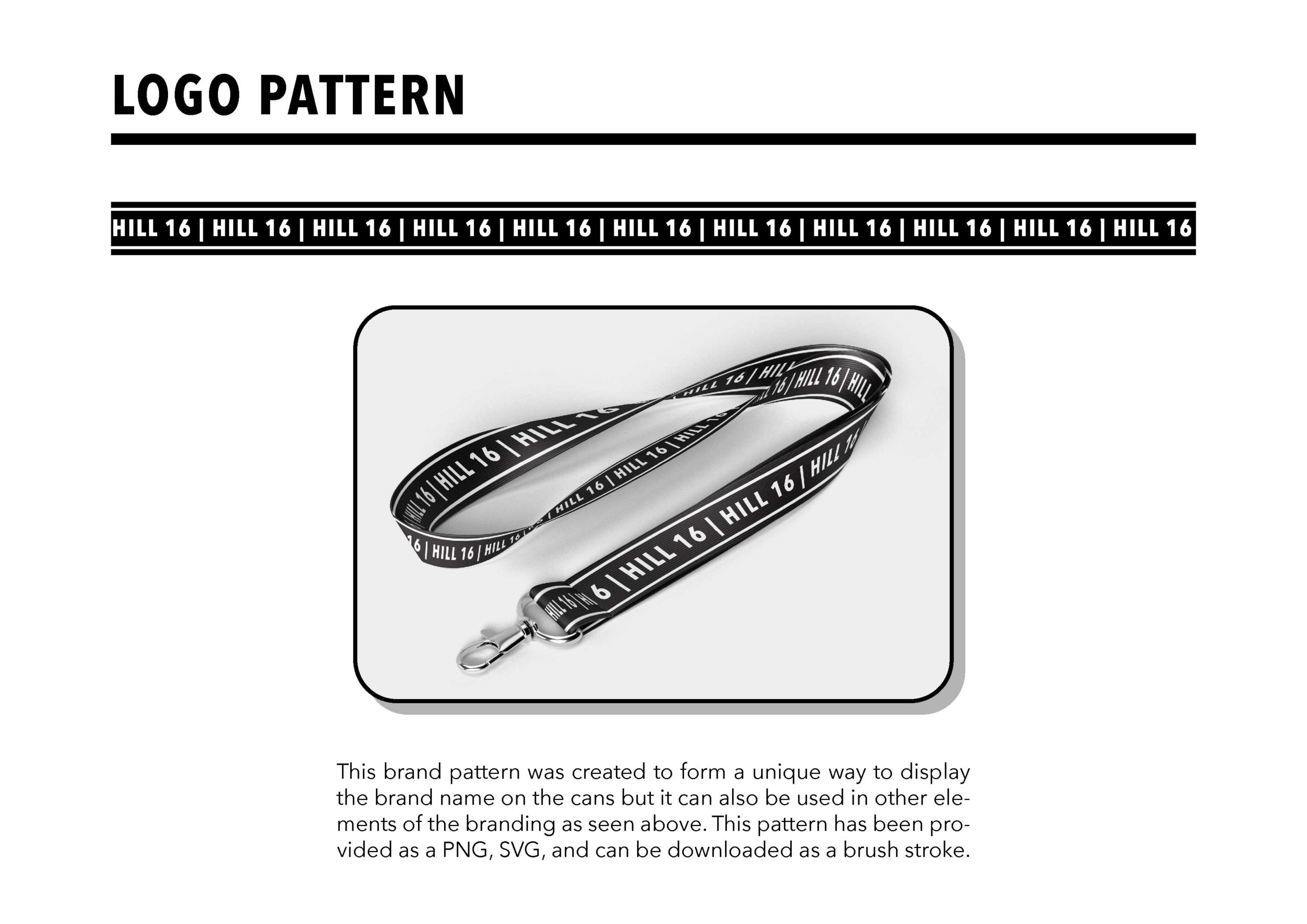
In the image above you can see the final logo. It shows the logo in its different colour forms and it shows the adjustability of the logo.
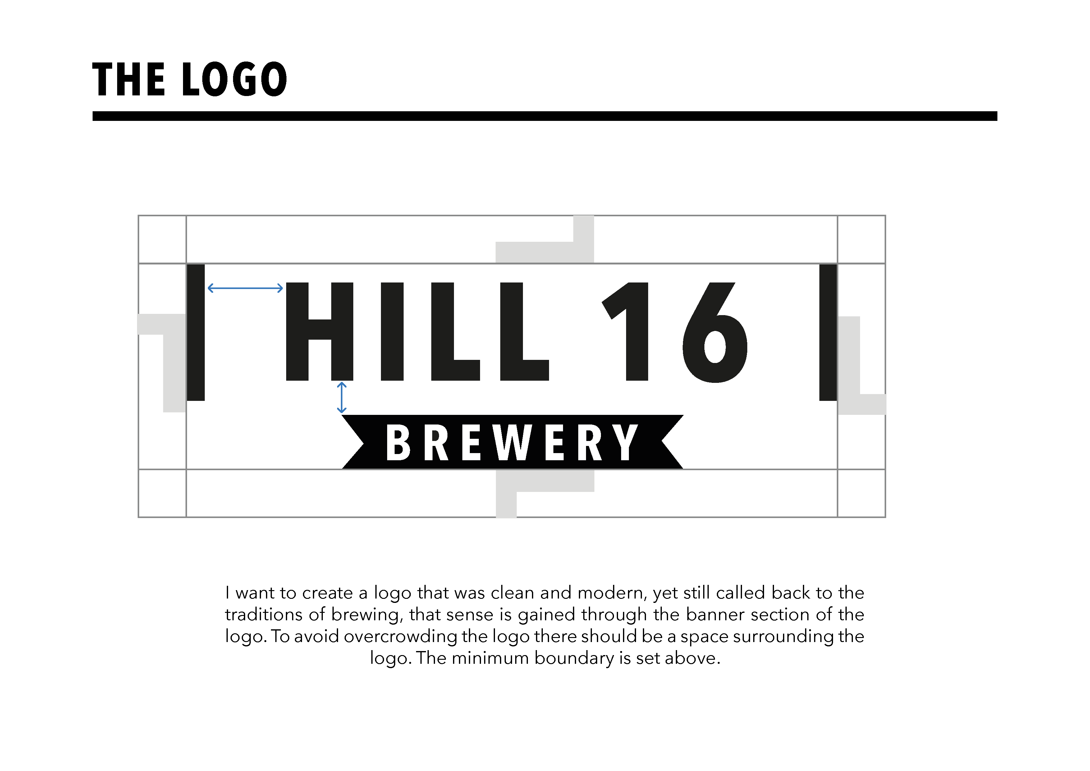
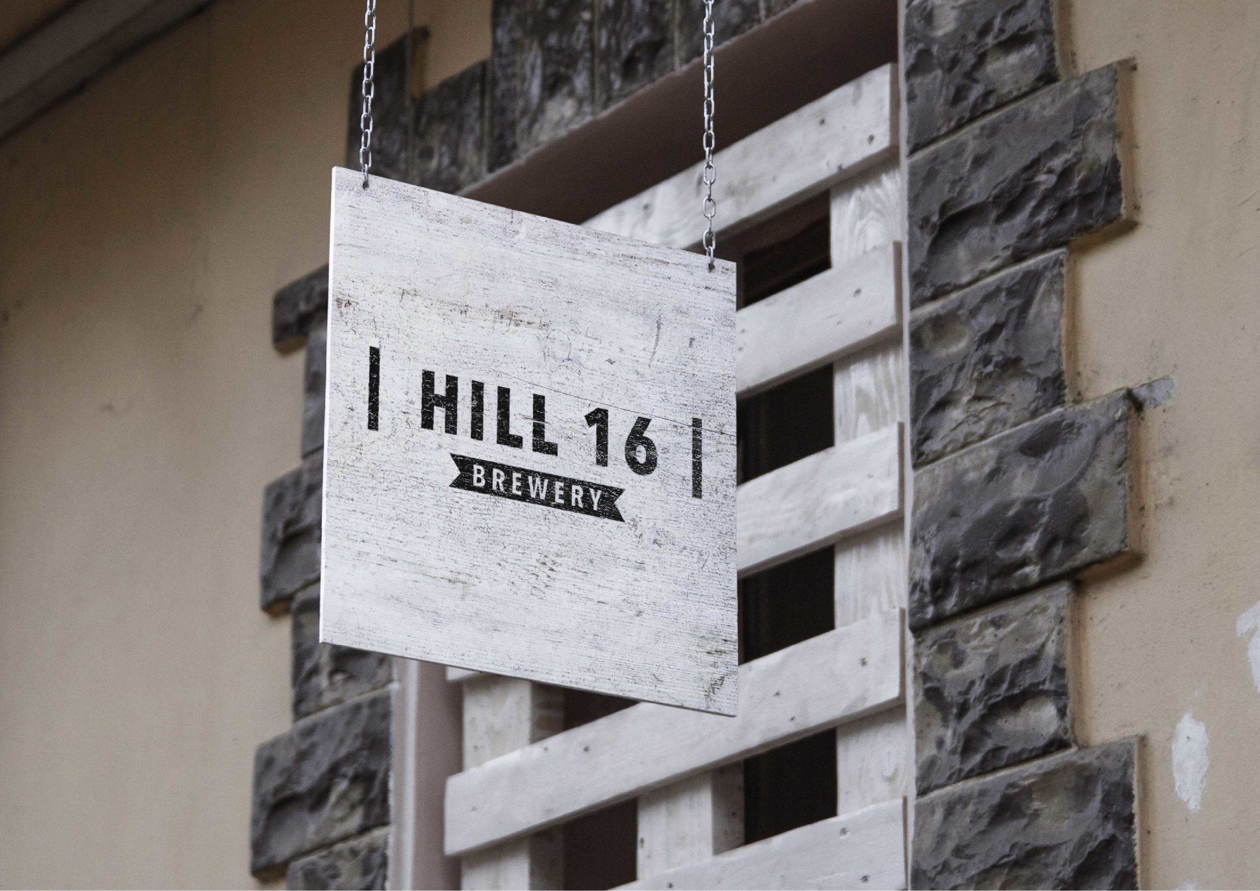
FINAL LOGO
I designed a logo that is both modern and evokes the traditional brewing process. To ensure the logo isn’t overcrowded, I created white space around it, which can be adjusted according to the company name. Additionally, I included this information in the final branding guidelines so the logo can be tailored to suit any desired name.
LOGO ANIMATION
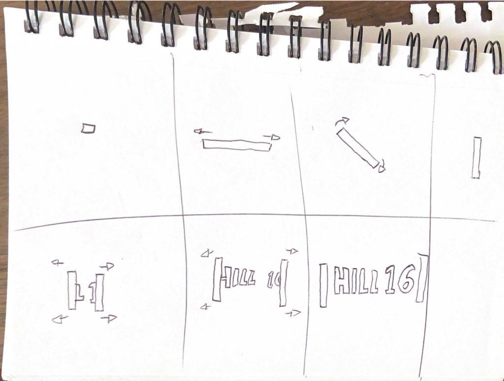
After designing a final brand logo, I set out to create an animation. To ensure a successful outcome, I began by sketching out a frame–by–frame storyboard for the animation. As I am constantly striving to improve my logo animation skills, I took this opportunity to put them to the test using Adobe After Effects. When you reload the page, you can see the animation I created. The animation is effective and will be included in my handover document for future adaptations.
BEER DESIGN IDEAS
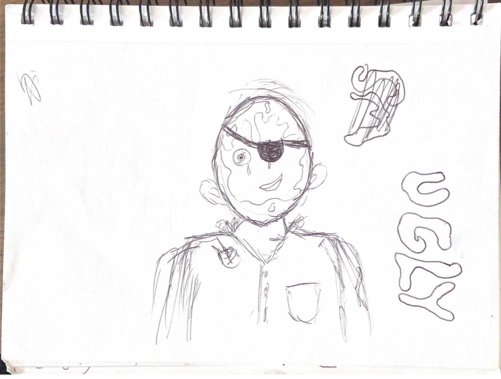
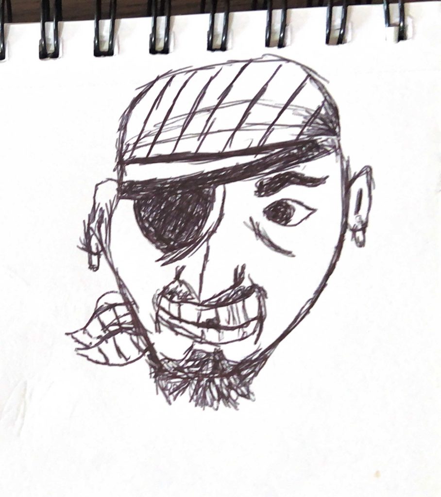
I kicked off the design process by sketching out my initial concept, which was to have a comic–style graphic character featured on the can. My goal was to create a pirate–like character, as the beer was to be called “Ugly Smuggler.”
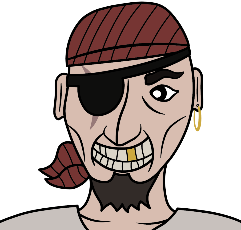
I then converted my initial sketches into a cartoon style by digitszing them using Adobe Illustrator.
As I colored the character and added shading, I found myself growing increasingly dissatisfied with the overall design. Despite my misgivings, I decided to press on and add more detail to the design, hoping it would bring about a meaningful improvement.
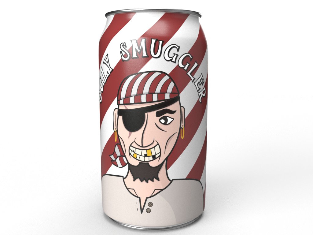
After adding more intricate details such as shading and broken teeth to the design, I viewed the design on a 330ml can in Adobe Dimensions. This only further confirmed my doubts about the design, as I felt it would not be attractive to the intended target audience.
THOUGHT PROCESS
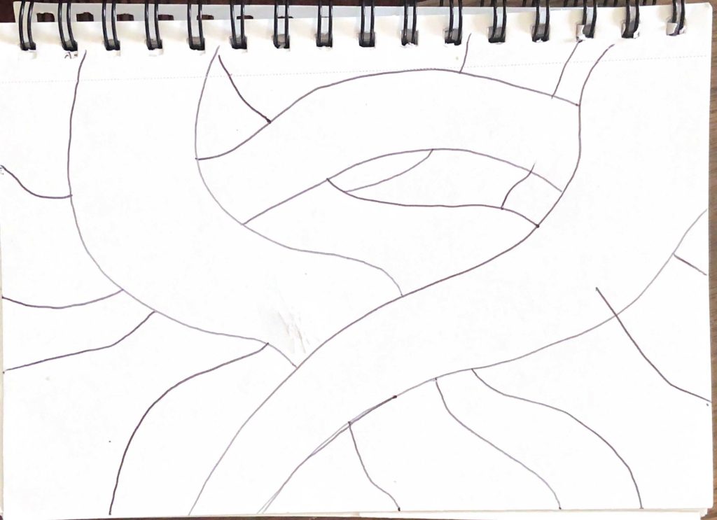
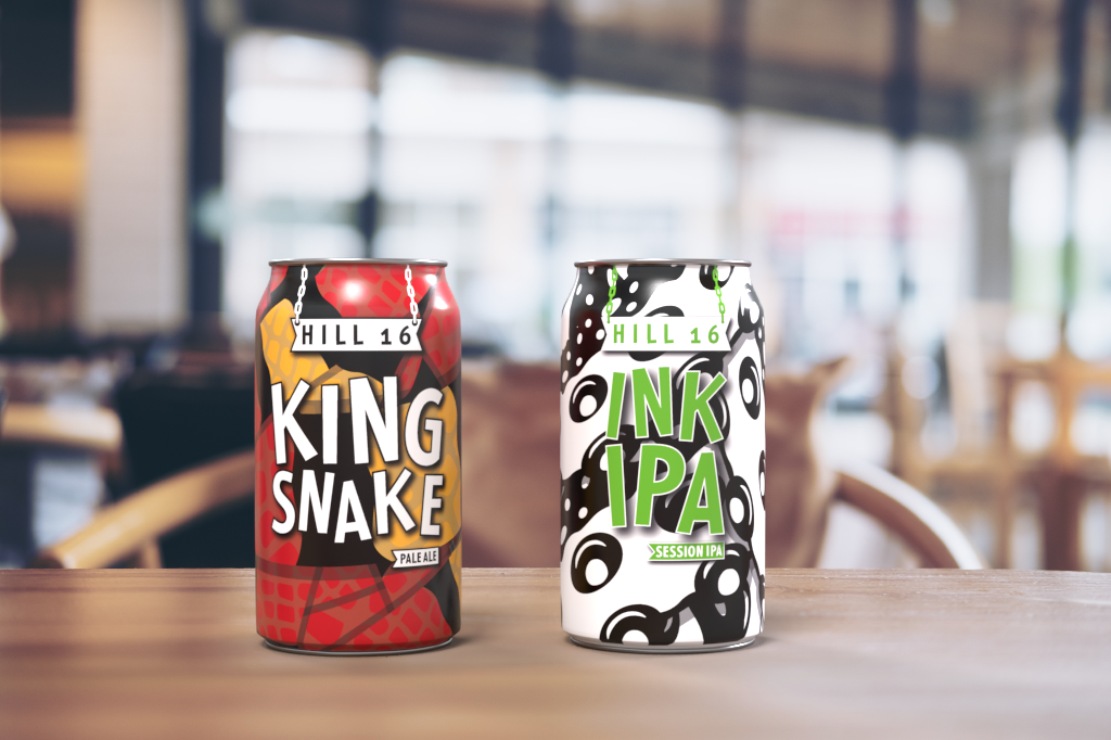
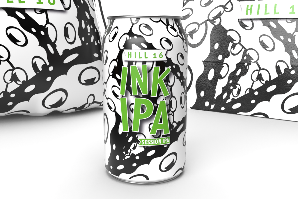
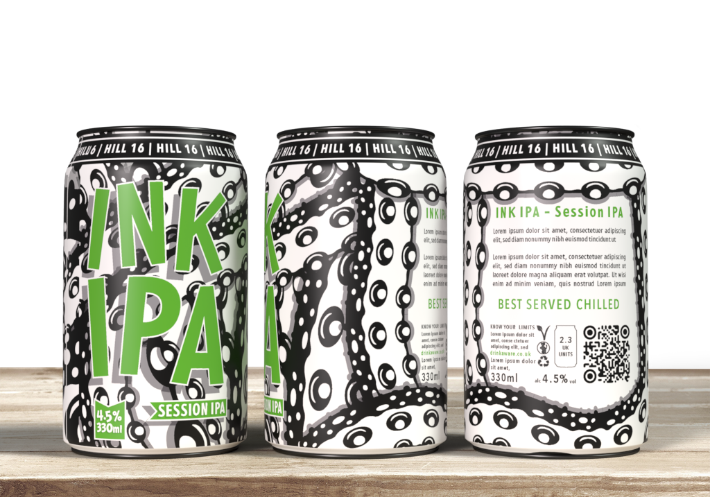
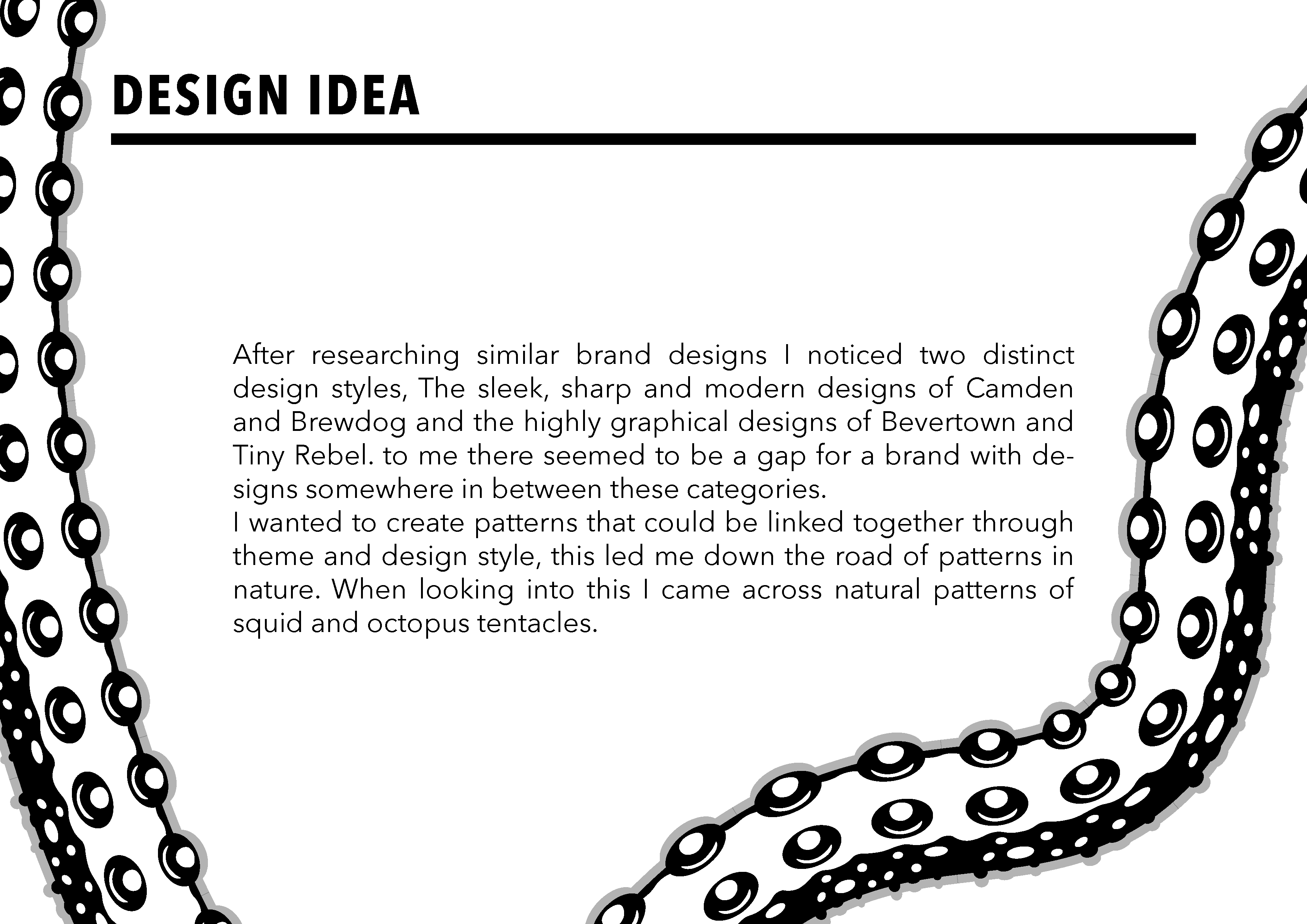
After researching similar brand designs, I noticed two distinct design styles: the sleek, sharp, and modern designs of Camden and Brewdog, and the highly graphical designs of Bevertown and Tiny Rebel. I felt there was an opportunity for a brand with designs somewhere in between these two categories. To fill this gap, I chose to create patterns that could be linked together through theme and design style, eventually leading me to the natural patterns of squid and octopus tentacles. I started by sketching my vision for the design and then moved on to creating the digital version.
INTAL DESIGNS
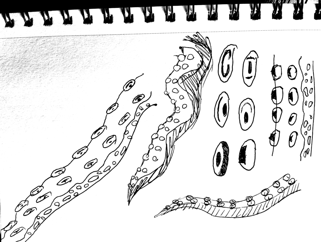
I researched various images of tentacle designs to inform my sketches of my own ideas for the design. I broke down the components of the design to better understand their structure and composition.
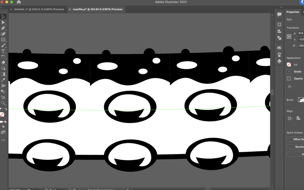
I put my newly–acquired skill to use by creating a design in Illustrator and then transforming it into a brush stroke. It was exciting to be able to apply this technique in a meaningful way.
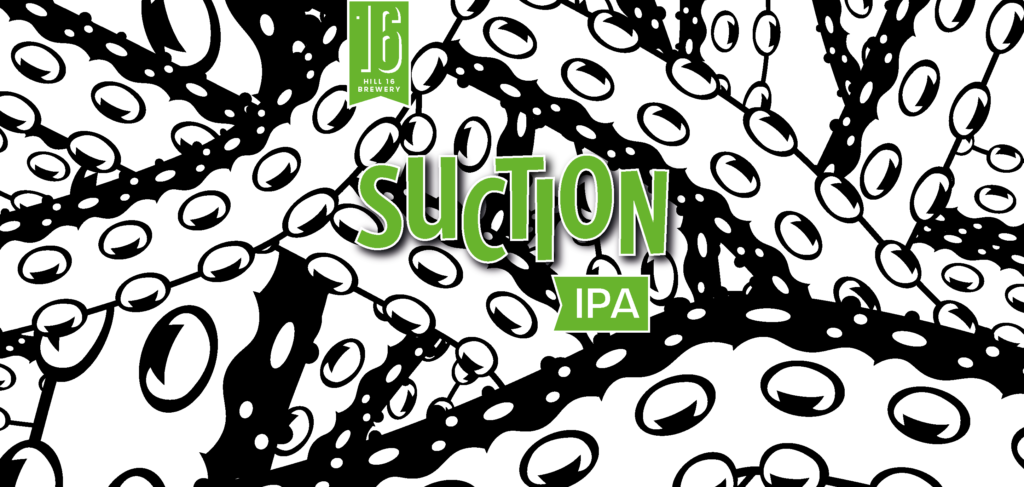
I hastily compiled some text and the logo I had initially selected. While I was content with this initial concept, I was aware that much more effort was required. The title I had chosen for the beer was “Suction IPA“, however after assessing its readability, I decided to abandon that notion.
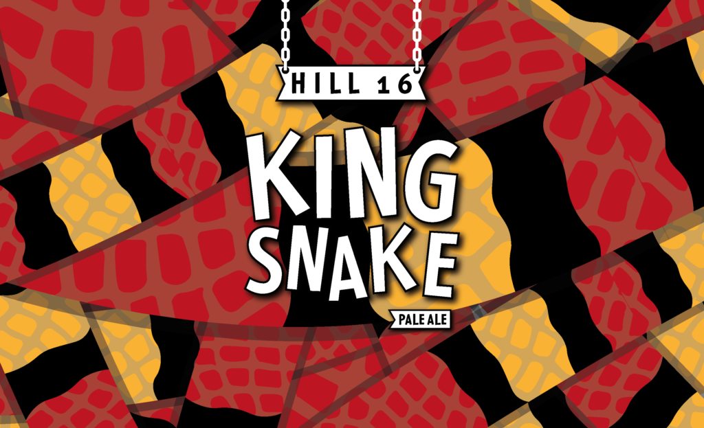
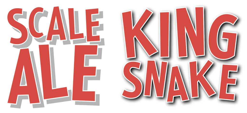
I created a second design inspired by the King Snake, using the same brush stroke technique, but with some modifications to the logo. This version featured chains, giving it a hanging effect that evoked traditional brewing methods before I arrived at the final logo.
After creating two design concepts, I rendered them in a 3D environment to evaluate their readability and aesthetic appeal. I then presented the results to the Client, who provided invaluable feedback to improve the designs.
I then created several initial design concepts in a 3D environment to present to the client, which allowed them to gain a better visual understanding of the product.
FEEDBACK
Getting feedback from a client is essential to ensure that we are providing services and products that are meeting the needs of our customers. By gathering feedback, we can pinpoint areas of improvement, measure customer satisfaction, and strategize for the future. Additionally, we can strengthen the bond with our clients and foster open dialogue.
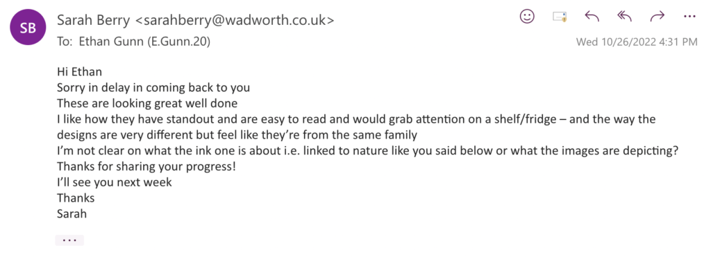
As I worked on the Wadworth project, I held several meetings with the client to review my designs. Her feedback was invaluable; she consistently emphasized the need for a strong narrative that customers could connect with.
REFINING MY IDEA (SDG-12)
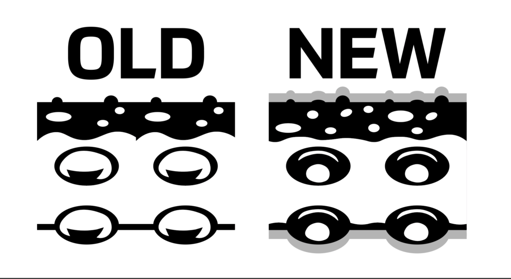
After receiving feedback, I took a step back to assess my work. Although I liked the overall design, I knew it needed more refinement. To start, I revamped the tentacle design by adding shadows and texture to make the look more natural.. Along with the design changes I made adjustments to the colours I was using in the banding. Pantone colours for my branding project because of their unparalleled accuracy and consistency. As the industry standard for colour, Pantone colours are trusted by professional designers and printers to guarantee that the same colours are used across all mediums and platforms. This is especially essential for branding projects, as it ensures that the colours used in the logo, website, and other materials are consistent and recognizable.
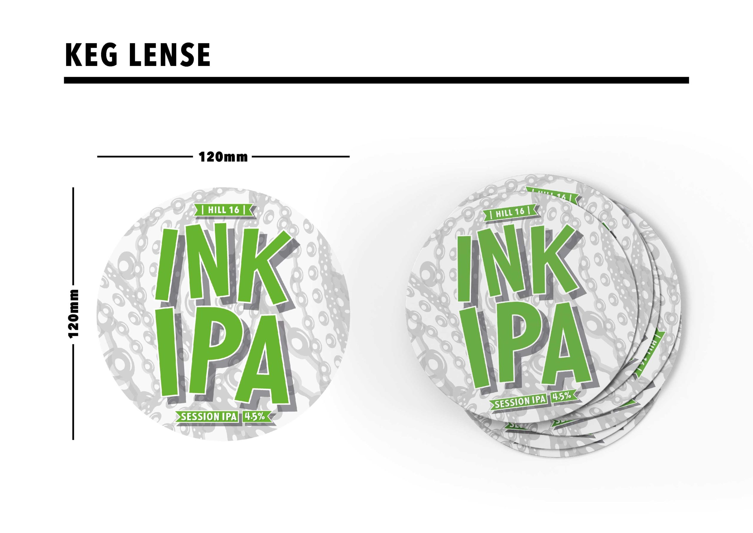
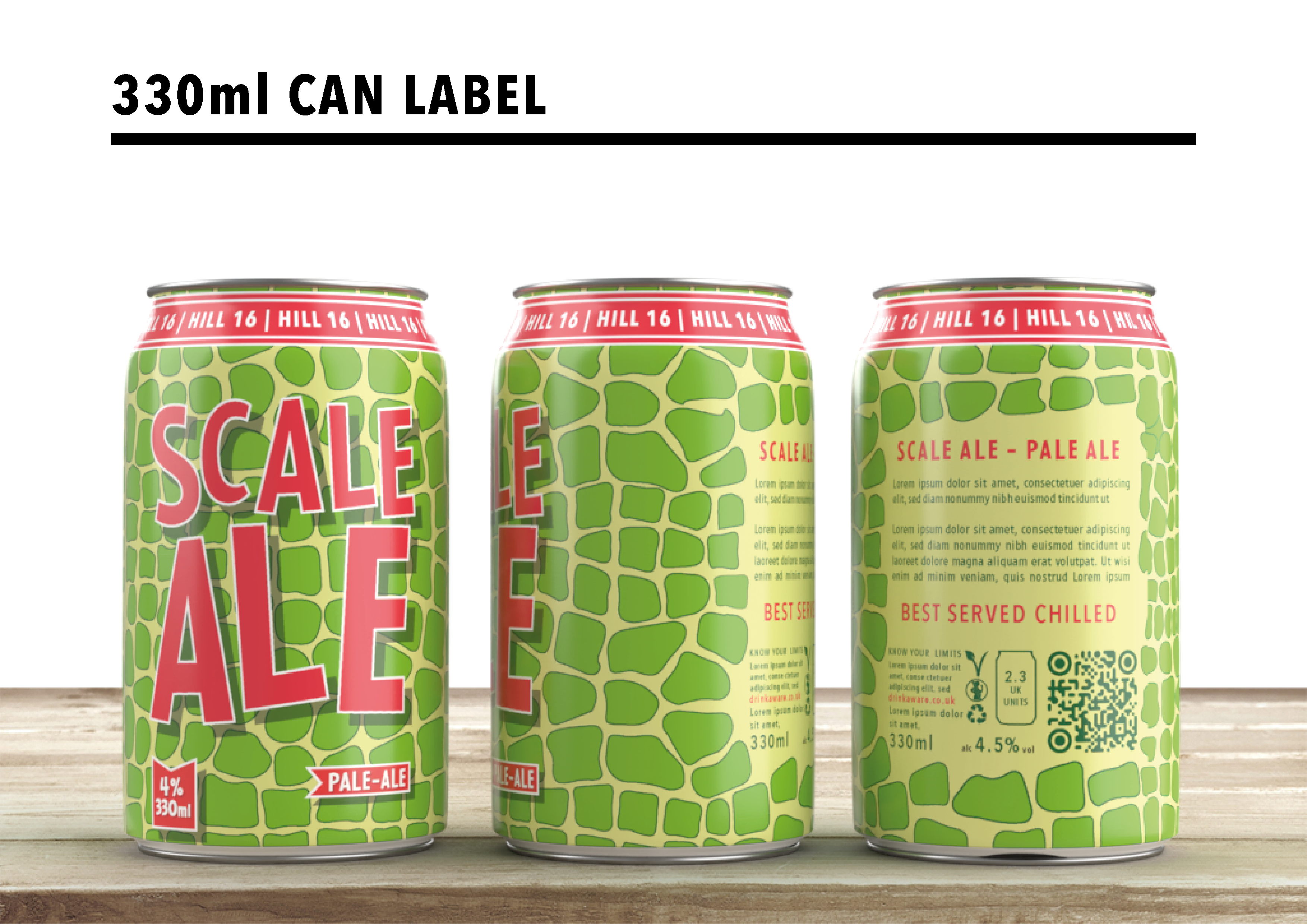
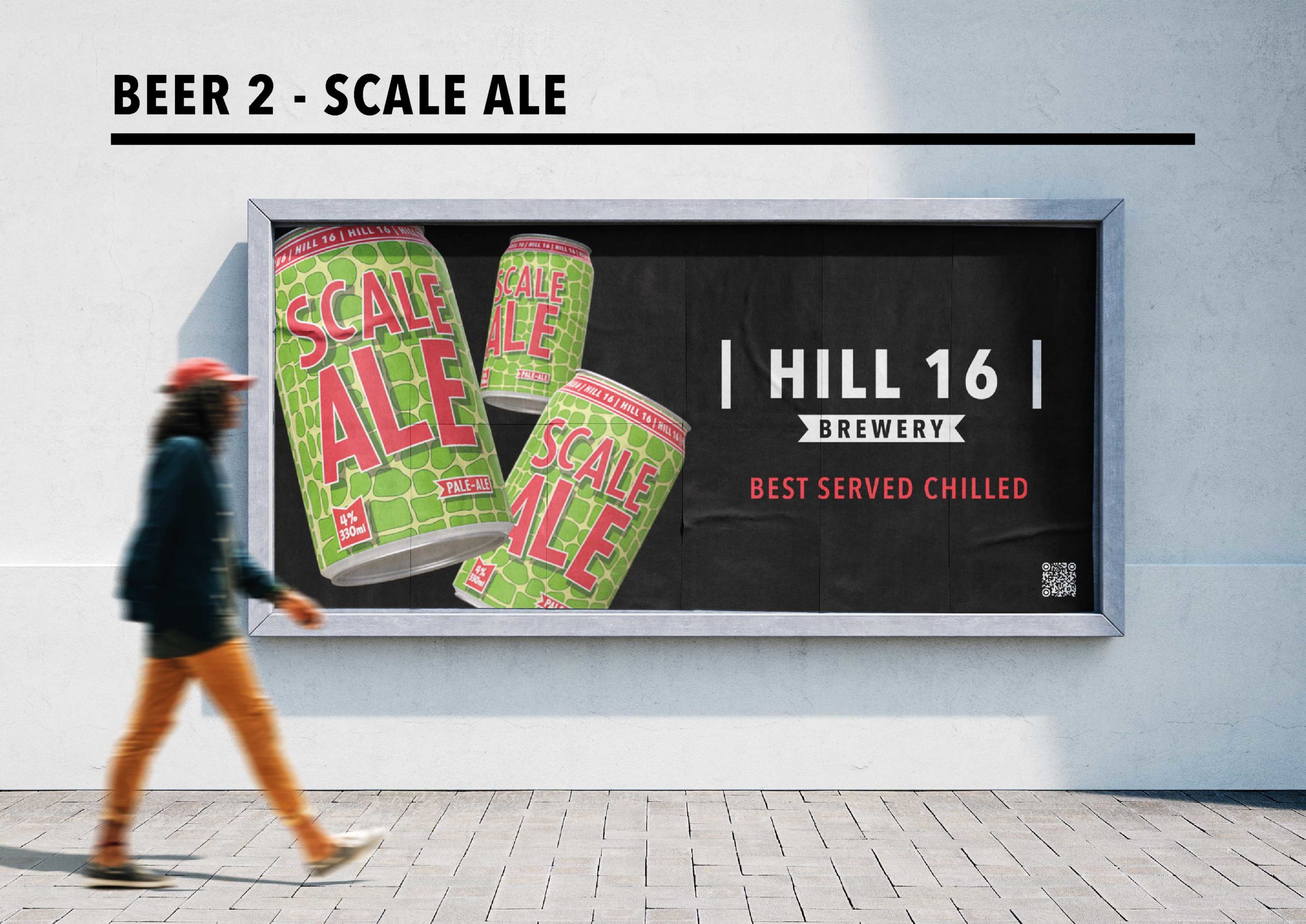
I made an important change to the “King Snake“ design and name after I received feedback and conducted peer assessment. It became evident that King Snake wasn‘t as unique as Ink IPA, so I brainstormed new names until I settled on Scale Ale. To ensure consistency across both beers, I used the same branding style for Scale Ale that I used for Ink IPA. Brand recognition is essential, so it was important that I maintained a unified look for both beers.